Chapter 11 Interactive and Web Applications
“A user interface is like a joke. If you have to explain it, it’s not that good.”
- Martin LeBlanc, Iconfinder cofounder
11.1 Introduction to GUIs
GUIs (Graphical User Interfaces) allow users to interact with software using graphical icons and point-and-click specifications. The interactive control components of a GUI are called widgets. The following are some commonly used GUI widgets:
- button: typically a GUI controller for binary (e.g., on/off or run/don’t run) operations.
- radiobutton: A controller allowing selection from a group of mutually-exclusive options which are linked to specific operations.
- checkbutton: A controller that allows selection binary of multiple mutually-exclusive options, and is often linked to a second variable, allowing flexible rendering of a secondary set of widgets.
- spinbox: Provides a “spin-able” set of mutually exclusive options that can be selected and linked to operations.
- combobox: A text field with a popdown selection list.
- slider: A sliding controller that defines the numeric value of a linked variable that changes uniformly over some range.
- message box: A message window that typically prompts a user response and a corresponding linked operation.
- scrollbar: A modifiable viewport for a scrollable object (e.g., text that can be examined line by line).
- pulldown menus: Interactive menus with pulldown tabs and menubuttons that specify operations, potentially including links to other GUIs.
R allows building of GUIs to run functions and interact with graphics using a number of methods and language frameworks.
It should be noted that R GUIs are are a mixed bag. On the plus side, R GUIs: 1) increase user-friendliness by allowing point and click operations, 2) allow rapid visual assessment of alteration to function arguments via widgets, 3) are often very amenable to graphics manipulations, and 4) are often very useful for data exploration or heuristic demonstrations. On the other hand, R GUIs: 1) often result in a loss of flexibility in controlling functions, 2) may contain a visually confusing mish-mash of widgets, and 3) constitute mysterious black boxes, which is contrary to the “mission statement” of R (Chambers 2008). Further, command line (non-GUI) code entry allows an exact record of characteristics given to objects, and specifications provided to functions. This allows straightforward tracking, dissemination, and repeatability of computational analyses.
I will explore three methods for generating GUIs, named for the principal R package allowing their implementation: tcltk, plotly, and shiny.
11.2 tcltk
The R distribution package tcltk (pronounced: tickle tee kay) allows building of GUIs by providing a binding wrapper for the Tcl language, via the Tk toolkit, under a configuration called Tcl/Tk (Ousterhout 1991)1. In programming, binding refers to an application programming interface (API) that provides glue code to allow a programming language to implement a foreign language or software package (Wikipedia 2024). Python bindings for Tcl/Tk are provided by the Python library tkinter which is included in the Python standard library of packages. Much better support exists for tkinter than tcltk. Additionally, many non-Tcl/Tk approaches exist for GUI building in Python, although they are not included in the Python standard library.
Lack of guidance for the tcltk package is likely due to the absence of a large user group. Assistance for the creation of tcltk GUIs can be found in several older articles from R News (which has since been replaced by the R Journal) (Dalgaard 2001, 2002; Fox 2007), the book “Programming GUIs in R” (Lawrence and Verzani 2018), and in the GUI code for a number of newer R packages, including Rcmdr (Fox 2005; Fox, Marquez, and Bouchet-Valat 2023) and asbio (Aho 2023). Despite resources, however, it is expected that users refer to the Tcl/Tk package manual for argument lists and descriptions of tcltk functions. Arguments in tcltk functions (generally) have the same names and functionality as their Tcl/tk equivalents, although some experimentation may be necessary.
Tcl/Tk itself is cross platform, and uses facilities particular to the underlying OS. These are Xlib (X11) (a windowing system, written in C, for bitmap displays) for Unix/Linux, Cocoa for Mac OS, and the Graphics Device Interface (GDI) for Windows.
So-called Themed Tk (Ttk) GUIs often have advantages over older Tk GUIs, including anti-aliased font rendering, and have been a part of the Tk distribution since Tcl version 8.5. Naming conventions in tcltk indicate whether functions are binding for Tk or Ttk operations. The former function names start with tk, while the latter start with ttk.
Notably, tcltk GUIs that use or manipulate R graphics devices, particularly those with slider widgets, may work poorly with the native RStudio graphics device: RStudioGD. Thus, to run these sorts of GUIs in RStudio, one should open a non-RStudioGD device using:
Example 11.1 \(\text{}\)
The binding mechanisms of tcltk can be viewed by examining underlying code from some its seminal functions. The tcltk function tcl() provides a generic interface for calling any Tk or Tcl command2. Indeed, many other tcltk commands are simply calls to tcl().
We see that tcl() calls .Tcl.objv() whose arguments, in turn, are formatted by .Tcl.args.objv().
function (...)
.Tcl.objv(.Tcl.args.objv(...))
<bytecode: 0x000001d2b2478940>
<environment: namespace:tcltk>
The function .Tcl.objv() calls an underlying C algorithm, .C_dotTclObjv(), using .External() that ostensibly binds tcl() to Tcl/Tk.
function (objv)
structure(.External(.C_dotTclObjv, objv), class = "tclObj")
<bytecode: 0x000001d2b24792e0>
<environment: namespace:tcltk>
The compiled C executable (Section 9.1), tcltk.dll, is housed in the tlctk package libs/x64 directory (Ch 10).
DLL name: tcltk
Filename: C:/Program
       Files/R/R-4.4.2/library/tcltk/libs/x64/tcltk.dll
Dynamic lookup: FALSE
\(\blacksquare\)
Example 11.2 \(\text{}\) As an initial foray into tcltk GUI-building we will create a button interface whose only purpose is to provide a message, and a means for its own destruction.
tt <- tktoplevel()
hello <- tkmessage(tt, text = "Hello world!")
spacer = tklabel(tt, padx = 20)
DM.but <- tkbutton(tt, text = "Exit", foreground = "red",
                   background = "lightgreen", padx = 10,
                   command = function() tkdestroy(tt))
tkpack(hello, spacer, DM.but)- On Line 1, I load the tcltk package.
- On Line 2, I use use
tktoplevel()to hierarchically define the “top level” widget as the objecttt. - On Lines 3-4, I create a text message object,
hello, and a spacer object,spacer. That latter is used to make room between the message and a button created in the next two lines of code. - On Lines 5-6 the button widget object
DM.butis created, using the functiontkbutton(). The first argument is name of parent widget,tt. Thetextargument provides a text label for the button. The argumentsforeground,background, andpadxare used to define the foreground color (the color of the button text label), the background color of the button, and to make the button wider, respectively. Thecommandargument defines the function that the button initiates. In this case, the functiontkdestroy(), which destroys the GUI. - On Line 8,
tkpack()is used to place the button on the parent widget.
The GUI itself is shown in Fig 11.1.
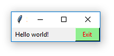
Figure 11.1: A simple tcltk GUI.
\(\blacksquare\)
11.2.1 Assigning and Manipulating Widget Values
It is often useful to “remember” object characteristics and assignment values over the course of a GUI’s usage. For example, it may be necessary to count the number of times a button is pressed, or display a particular message based on a previous response. Because GUI actions will be carried out by local variables in functions, modifications to those variables will be lost when the function exits. While not usually good practice, one can use the super assignment operator <<- inside a function to create global variables. These will retain their values after the function exits.
The tclVar() function can be used to create an empty or specific values, which can then be used in call to other functions in the tcltk package. For example, to specify an empty tclVar() value, one could use:
To access myvar information in widgets with R one could then use:
Conjoined use of the super-assignment operator with tclVar() and tcl() is often very important when altering object parameters within tcltk functions.
11.2.2 User functions and tcltk GUIs
Callbacks are functions that are linked to GUI events. In tclk these functions can be user-defined, although they should not have arguments. Callbacks, user defined or otherwise, are generally executed using the command argument in a widget function. Recall, for example, use of tkbutton(tt, command = functiton() tkdestroy) in Example 11.2. In general, a callback function foo() is called using command = foo() or command = substitute(foo()). Use of substitute(foo()) allows substitution of variable values in foo(). Calling a function bar() from within the callback foo() may require coding similar to foo <- function(){substitute(bar())}. See, for instance, asbio::anm.ci.tck().
Example 11.3 \(\text{}\)
Consider the following silly example for finding the sum of two numbers.
tt <- tktoplevel()
tw1 <- tclVar(''); tw2 <- tclVar('')
tke1 <- tkentry(tt, width = 6, textvariable = tw1, justify = "center")
tke2 <- tkentry(tt, width = 6, textvariable = tw2, justify = "center")

sumf <- function(){
  temp <- as.numeric(tclvalue(tw1)) + as.numeric(tclvalue(tw2))
  tkconfigure(ans, text = paste(temp))
}

ans <- tklabel(tt, text = '', background="white", relief = "sunken", padx = 20)
tkgrid(tke1, tklabel(tt, text = '+'), tke2, tklabel(tt, text = '='), ans)
tkgrid(tklabel(tt, text = ''), columnspan = 5)
tkgrid(tkbutton(tt, text = 'Get Sum!', foreground = "red",
                   background = "lightgreen", command = sumf),
columnspan = 5, sticky = "e")- On Line 1, I use
tktoplevel()to define the “top level” widget. - On Line 2, I specify empty initial values for the variables
tw1andtw2usingtclVar(). These values will be editable by users viatkentry()widgets. - On Lines 3-4, I use the function
tkentry()to provide widgets for users to enter numbers to be summed. - On Lines 6-9, I create the function
sumf. The functiontclvalue(), used to compute the summation objecttemp, allows Tcl variables fromtclVar()to be evaluated in R. These variables, however, will have classcharacter, and will requireas.numeric(), as shown, for mathematical evaluation. One Line 8 (the final line of code insumf,tkconfigure()is used to potentially changeans, atkentry()object defined on Line 11. - On Line 11, the
tkentry()objectansis created and an initial empty value is assigned. - On Lines 12-16, widgets are placed in the GUI using
tkgrid(). The use of grid geometry approaches includingtkgrid()is elaborated next. Thetkbuttonwidget in the final (bottom) grid of the GUI calls thesumfusing eithercommand = sumf, as shown, orcommand = substitute(sumf()).
The resulting GUI is shown in Fig 11.2.
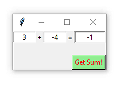
Figure 11.2: A simple tcltk GUI, demonstrating the use of tclVar() and tclvalue().
\(\blacksquare\)
11.2.3 GUI Geometry
An important consideration in GUI development is geometry management, e.g., the dimensions of the GUI and the organization of widgets. By default, Tcl/Tk GUI windows are autosized to hold widgets as they are added. Widgets may be reorganized as the sizes of windows are altered. If a Window becomes too small to contain widgets, the last widget added will be the first removed.
The initial size of GUIs can be specified using the function tkcanvas(). The result of the code below is shown in Fig 11.3
tt <- tktoplevel()
tktitle(tt) = "Wide GUI"
dim <- tkcanvas(tt, height = 30, width = 500)
tkgrid(dim)
Figure 11.3: A tcltk GUI whose initial width was specified using tkcanvas().
Three different geometry managers are available in Tcl/Tk for inserting widgets in GUIs. These are called placer, packer, and grid manager. The placer tool is seldom used in GUI creation (Dalgaard 2001). Thus, we will concentrate on GUI construction using packer and grid manager approaches. Only one of these approaches is generally used in the creation of a GUI. The initial Examples 11.2 and 11.3 use simple applications of packing and grid management, respectively.
11.2.3.1 Packing
The function tkpack() packs widgets around the edges of a conceptual cavity. Control of this process is provided by the side, which has options: "left", "right", "top" or "bottom".
Example 11.4 \(\text{}\)
Note the result of the code below (Fig 11.4).
tt <- tktoplevel()
edge <- c("top","right","bottom","left")
buttons <- lapply(1:4,
                  function(i) tkbutton(tt, text = edge[i],
                     background = "lightgreen", foreground = "red"))
for (i in 1:4)
tkpack(buttons[[i]], side=edge[i], fill = "both")- On Line 1, the top level widget is designated.
- On Line 2, a character vector is created, containing all the possible
sideoptions for the functiontkpack(). - On Lines 3-5, a four item list is generated containing four
tkbuttonwidgets. - In Lines 6-7, buttons are accessed from the
buttonslist and packed, in order, at the specified locations"top","right","bottom", and"left". The argumentfill = "both"ensures that the buttons will occupy all of their allocated parcels with respect to thetkpack()conceptual central cavity. Because thetopbutton was specified first, it takes up the entire top of the GUI. Therightbutton, codified next, occupies the entire right-side of the GUI, except for the area now occupied bytop, and so on. If an object does not fill its parcel it can be anchored to a GUI location using thetkpack()argumentanchor. This is accomplished by specifying compass-style values like"n"or"sw"which place a widget the middle top, and bottom left of the parcel, respectively. The default option isanchor = "center".
![A demonstration of the result of packing using `tkpack()`. Code follows [@dalgaard2001].](figs11/pack.png)
Figure 11.4: A demonstration of the result of packing using tkpack(). Code follows (Dalgaard 2001).
\(\blacksquare\)
Example 11.5 \(\text{}\)
Calculator construction is often used as a pedagogic exercise in computer programming. As an extended example of packing using tkframe(), we will build a tcltk calculator GUI. For this example I am indebted to lecture notes for a 2011 statistical programming course at UC Berkeley.
The most important coding concept used here is the pairing of the base R functions parse() (which converts a string to an expression) and eval() (which evaluates an expression). This combination allows the mathematical evaluation of a character string. Consider the string "9 * 3". The mathematical solution can be obtained using:
[1] 27
Our calculator GUI will require three functions: mkput(), clearit(), and docalc(). Each of the functions creates a global variable, calcinp, using the super assignment operator, <<-, that provides input to the calculator. Further, in all three functions, tkconfigure() is used to change the calculator’s display, based on input from the GUI calculator keys.
calcinp <- ''

mkput <- function(sym){
       function(){
          calcinp <<- paste(calcinp, sym, sep='')
            tkconfigure(display, text = calcinp)
          }
}
On Line 1 in the chunk above,
calcinpis initially set to be an empty character string, i.e.,calcinp <- ''.On Lines 3-8, the callback function
mkputis defined. Note thatmkputitself contains an argument-less function. This allowsmkputto have an argument,sym, while satisfying the tcltk requirement for argument-less callbacks. The code on Line 5,calcinp <<- paste(calcinp, sym, sep=''), generates a global, updated form ofcalcinp, that combines an oldercalcinpvalue with a new calculator key specification,sym. The resulting string is placed in the display usingtkconfigure().The callback function
clearitbelow, clears the display (Line 10), and redefinescalcinpas an empty string (Line 11).
- The callback function
docalcbelow, evaluates the generaleval(parse(text = calcinp))framework created by key entry, and provides exception handling in the case of key stroke errors by usingif(class(result) == 'try-error'); calcinp <<- 'Error'on Lines 15-16. Importantly, the functiontry()(Line 14) will assign the classtry-errorto an expression that fails.
docalc <- function(){
      result = try(eval(parse(text = calcinp)))
      if(class(result) == 'try-error')
        calcinp <<- 'Error'
      else calcinp <<- result
      tkconfigure(display, text = calcinp)
      calcinp <<- ''
      }
We call these three functions in the GUI itself, which is generated in the code below (Lines 21-60).
- The largest calculator code component defines the form and arrangement of calculator key (27-60). Note that buttons are packed, by row, using
tkpack()withintkframe()objects. All button widgets usecommand = mkputexcept for the clear key, which usescommand = clearit, and the equals key, which usescommand = docalc.
base <- tktoplevel()
tkwm.title(base,'Calculator')

display <- tklabel(base,justify='right',background="white",
                   relief="sunken", padx = 50)
tkpack(display,side='top')
row1 <- tkframe(base)
tkpack(tkbutton(row1,text='7',command=mkput('7'),width=3),side='left')
tkpack(tkbutton(row1,text='8',command=mkput('8'),width=3),side='left')
tkpack(tkbutton(row1,text='9',command=mkput('9'),width=3),side='left')
tkpack(tkbutton(row1,text='+',command=mkput('+'),width=3),side='left')
tkpack(row1,side='top')

row2 <- tkframe(base)
tkpack(tkbutton(row2,text='4',command=mkput('4'),width=3),side='left')
tkpack(tkbutton(row2,text='5',command=mkput('5'),width=3),side='left')
tkpack(tkbutton(row2,text='6',command=mkput('6'),width=3),side='left')
tkpack(tkbutton(row2,text='-',command=mkput('-'),width=3),side='left')
tkpack(row2,side='top')

row3 <- tkframe(base)
tkpack(tkbutton(row3,text='1',command=mkput('1'),width=3),side='left')
tkpack(tkbutton(row3,text='2',command=mkput('2'),width=3),side='left')
tkpack(tkbutton(row3,text='3',command=mkput('3'),width=3),side='left')
tkpack(tkbutton(row3,text='*',command=mkput('*'),width=3),side='left')
tkpack(row3,side='top')

row4 <- tkframe(base)
tkpack(tkbutton(row4,text='0',command=mkput('0'),width=3),side='left')
tkpack(tkbutton(row4,text='(',command=mkput('('),width=3),side='left')
tkpack(tkbutton(row4,text=')',command=mkput(')'),width=3),side='left')
tkpack(tkbutton(row4,text='/',command=mkput('/'),width=3),side='left')
tkpack(row4,side='top')

row5 <- tkframe(base)
tkpack(tkbutton(row5,text='.',command=mkput('.'),width=3),side='left')
tkpack(tkbutton(row5,text='^',command=mkput('^'),width=3),side='left')
tkpack(tkbutton(row5,text='C',command=clearit,width=3),side='left')
tkpack(tkbutton(row5,text='=',command=docalc,width=3),side='left')
tkpack(row5,side='top')
A slightly modified form of the GUI (with colored buttons)3 is shown in Fig 11.5.
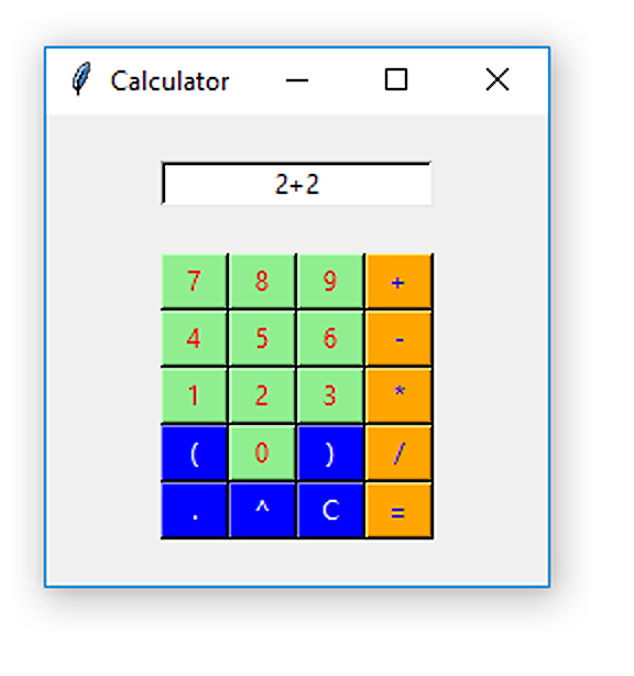
Figure 11.5: A Tcl/Tk calculator GUI generated using the R package tcltk.
The Python library tkinter provides a well supported binding resource for Tcl/Tk. As we know (Ch 9) Python code can be run in R, using the package reticulate. Fig 11.6 shows an analogous calculator the one shown in Fig 11.5, generated in R via the Python script calc.py, which is contained at the book website. It is important to note that while the resulting GUI is generated below in an RStudio R chunk, via reticulate, the code and engines for running the GUI are Python, and thus, do not actually require R.
The function reticulate::source_python() allows one to access Python source code.
 website.](figs11/tcltk_tkinter.png)
Figure 11.6: A Tcl/Tk calculator GUI generated using Python code via the Python binding library tkinter. Code follows a Python demo at the the geeksforgeeks website.
\(\blacksquare\)
11.2.3.2 Grid Manager
Use of tkpack() and tkframe() provides a great deal of flexibility for creating GUI layouts. They are, however, insufficient for handling a number of issues including lining widgets up vertically and horizontally. The grid manager function tkgrid() can be used to lay out widgets in rows and columns using the arguments column and row. Importantly, column = 0 and row = 0 equate to the first column and first row, respectively, in a GUI or container widget. Additional important
tkgrid() arguments include columnspan, rowspan, and sticky. The latter argument is analogous to side in tkpack().
Example 11.6 \(\text{}\)
The callback function below creates a single large blue dot in an R graphics device whose vertical position can be altered with a slider widget.
plot.me <- function(){
  y <- evalq(tclvalue(SliderValue)) # Evaluate the expression
  plot(1, as.numeric(y),xlab = "", ylab = "%", xaxt = "n", ylim = c(0,100),
       cex = 4, col = 4, pch = 19)
}
The operation evalq(foo), (Line 2) above, is equivalent to eval(quote(foo)). The operation quote(foo) simply returns the argument foo as an object of class “call”.
}
The GUI code below uses grid geometry to place widgets in specified GUI rows and columns.
if(names(dev.cur()) == "RStudioGD") dev.new(noRStudioGD = TRUE)

slider.env <<- new.env()
tt <- tktoplevel(); tkwm.title(tt, "Slider demo")
SliderValue <- tclVar("50")
SliderValueLabel <- tklabel(tt, text = as.character(tclvalue(SliderValue)))
tkgrid(tklabel(tt, text = "Slider Value: "),
       SliderValueLabel, tklabel(tt, text = "%"))
tkconfigure(SliderValueLabel, textvariable = SliderValue)

slider <- tkscale(tt, from = 100, to = 0, showvalue = F,
                  variable = SliderValue, resolution = 1,
                  orient = "vertical", command = substitute(plot.me()))

tkgrid(slider, column = 0, row = 1, columnspan = 2)
message = tkmessage(tt, text = "Move the slider to see changes in the plot")
tkgrid(message, column = 3, row = 1)- On Line 6, I insure that the interactive will work in the RStudio system by creating a non-RStudio graphics device if the default device is
"RStudioGD". The code should work inside and outside of RStudio. - On Line 8, I create an environment for the slider widget using
new.env(). - On Line 9, I use use
tktoplevel()to hierarchically define the “top level” widget as the objecttt, and make a title. - On Line 10, I define 50 as the initial value for the slider widget that will be created.
- On Line 11, a Tk label is created based on the slider output. Note the pairing of
tclVar()input andtclvalue()output. In this process, theSliderValueLabellabel object is configured to make its value equal to theSliderValueobject. - On Lines 12-13, the
SliderValueLabelis inserted between two text strings in a grid geometry. - On Lines 16-18, the slider is parameterized using the function
tkscale(). The use ofsubstitute()allows substitution of values for variables bound in theplot.me()function. - On Line 20, the slider is placed into the GUI at column 0 and row 1 (the first column and second row).
- On Lines 21-22, a message is created and placed on the GUI at column 3 and row 1 (the fourth column and second row).
The form of the final GUI is shown in Figure 11.7.
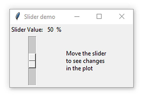
Figure 11.7: A tcltk GUI for manipulating an R plot.
\(\blacksquare\)
Example 11.7 \(\text{}\)
Here is another grid manager example with a radiobutton GUI that allows selection of a bacterial phylum and printing of "Correct", "Incorrect" text in the console, based on the button selection. It also embeds a photo.
tt <- tktoplevel()
tkwm.title(tt, "Bacterial phyla")
tkgrid(tklabel(tt, text = "Which pylum is shown?", padx = 5,
               pady = 5, font = "bold"), column = 1, row = 1)

values <- c("Acidobacteriota", "Armatimonadota",
            "Caldisericota", "Cyanobacteriota",
            "Elusimicrobiota", "Spirochaetota",
            "Thermomicrobia")

var <- tclVar(values[0]) # initially, no phyla selected

tkimage.create("photo", "cyano", file = "figs11/cyano.gif")

callback <- function() ifelse(tclvalue(var) == "Cyanobacteriota",
                              print("Correct"),
                              print("Incorrect"))

lf <- ttkframe(tt)
sapply(values, function(x) {
  radio_button <- ttkradiobutton(tt, variable = var,
                                 text = x, value = x,
                                 command = callback)

 tkgrid(radio_button, pady = 0, padx = 5, sticky = "nw",
        column = 1, rowspan = 1)
 })

tkgrid(tklabel(tt, text = ""), sticky = "n", column = 1,
       row = 9, columnspan = 1)
l <- ttklabel(tt, image = "cyano", relief = "ridge")
tkgrid(l, sticky = "nw", rowspan = 10, column = 2,
row = 0, pady = 25, padx = 10)- On Line 1, the top level widget,
tt, is designated. - On Line 2, a GUI title is created.
- On Lines 3-4, the text “Which phylum is shown?” is placed in the column 1, row 1 position, using the grid manager function
tkgrid(). - On Lines 5-9, a character vector of bacterial phylum names is created for use in the GUI.
- On Line 11 the initial phylum selection is specified. The use of
tclVar(values[0])means that no selection will be initially designated. - On Line 13, the function
tkimage.create()is used to import a photo with .gif formatting (currently the only accepted format). The first argument"photo"indicates that an image will be created from a photo. The second argument creates an object name for the import,"cyano"that will called in later code. - On Lines 15-17, a callback function,
callback()is created to print the text"correct"if Cyanobacteriota is selected, and print"incorrect"if some other selection is made. - On Line 19, an embedded frame is created to hold the radiobuttons.
- On Lines 20-27,
sapply()is used to run a user-defined function that embeds radiobuttons for each level in the character vectorvalues.- On Line 21-23, the function creates an object
radio_buttonusingttkradiobutton(). Note that the top-level path name,ttis given as the first argument, the initial radiobutton designation is given in the second argument, the argumentstextandvaluewill change levels invaueschange. the functioncallback()is called using thettkradiobutton()commandargument to respond to the selected radiobutton. - On Lines 25-26, radiobuttons are stacked, one row at a time, using
tkgrid(), assapply()cycles through levles invalues.
- On Line 21-23, the function creates an object
- On Lines 29-30, an aesthetic empty row is created at the bottom of column one create some additional space.
- On Lines 31-32, the object
lis created from the functionttklabel()to hold the image objectcyno, created on Line 13.
- On Lines 33-34, the image is embedded into the entirety of column two.
The final form of the GUI is shown in Fig 11.8.
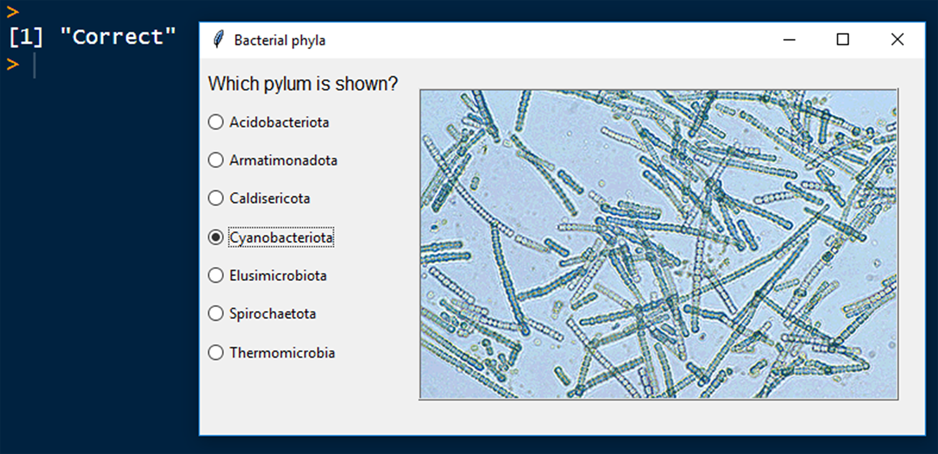
Figure 11.8: A radiobutton tcltk GUI. Photo from CSIRO, CC BY 3.0, https://commons.wikimedia.org/w/index.php?curid=3548094
\(\blacksquare\)
11.2.4 Widget Modifications
Tcl/Tk provides shared modification settings for many of its widgets. These include the standard arguments foreground (the widget foreground color, see choices here), background (the widget background color), image (an image to display in the widget)4, relief (the 3D appearance of the widget), font, and text (a text string to be placed in the widget), among many others. Be aware, however, that standard Tk widget modifiers may not always align with Ttk modifiers.
Example 11.8 \(\text{}\)
Here is an example of a GUI with working (but non-functional) widgets that allows demonstration of relief, background, and foreground color options for different types of widgets.
types = c("flat", "groove", "raised", "ridge",
          "solid", "sunken")
bg = c("beige", "AntiqueWhite1", "aquamarine4", "burlywood3")
fg = c("BlueViolet","aquamarine3", "white", "black")

base = tktoplevel()
tkwm.title(base,"Widget Styles")

cnames <- tkframe(base)
tkpack(tklabel(cnames, text = "Labels", font = "bold"),
       side = "left", padx = 3)
tkpack(tklabel(cnames, text = "Buttons", font = "bold"),
       side = "left", padx = 17)
tkpack(tklabel(cnames, text = "Radiobuttons", font = "bold"),
       side = "left", padx = 0)
tkpack(tklabel(cnames, text = "Sliders", font = "bold"),
       side = "left", padx = 22)
tkpack(cnames, side = "top", fill = "both")

mkframe <- function(type){
  fr <- tkframe(base)
  tkpack(tklabel(fr, text = type, relief = type,
                 fg = fg[1], bg = bg[1]),
         side = "left", padx = 5)
  tkpack(tkbutton(fr, text = type, relief = type,
                 fg = fg[2], bg = bg[2]),
         side = "left", padx = 30)
  tkpack(tkradiobutton(fr, text = type, relief = type,
                 fg = fg[3], bg = bg[3]),
         side = "left", padx = 10)
  tkpack(tkscale(fr, from = 0, to = 10, showvalue = T,
                 variable = 1, resolution = 1,
                 orient = "horizontal",
                 relief = type, fg = fg[4],
                 bg = bg[4]), side = "left", padx = 14)

  tkpack(fr, side = "top", pady = 5)
}

sapply(types, mkframe)
See Fig 11.9.
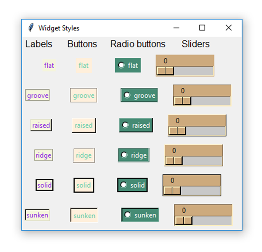
Figure 11.9: Standard widget modifications. Relief styles are varied within each widget type, and background and foreground colors are varied among widget types.
\(\blacksquare\)
11.2.5 Additional tcltk Packages and Toolkits
Several R packages have been developed to streamline and extend the capacities of the tcltk package. These include fgui (Hoffmann and Laird 2009) and PBSmodelling (Jon T. Schnute, Couture-Beil, and Haigh 2023; Jon T. Schnute et al. 2013) which provides wrappers for some Tcl/Tk routines to simplify and facilitate GUI creation. The gWidgets2 package has ambitiously sought to create R simplifying binding frameworks for several GUI toolkits including GTK, qt, and Tcl/Tk5. Currently, however, only the gWidgets2 port for tcltk, called gWidgets2tcltk, is working. The gWidgets2tcltk package is currently used to build interactive self test questions for the pedagogic statistics package asbio (Fig 11.10).
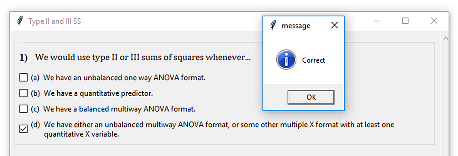
Figure 11.10: A self-test GUI using the gWidgets2tcltk function gcheckboxgroup. For GUI code type: fix(selftest.typeIISS.tck1).
A number of Tcl/Tk extensions for R are available from the SciViews family of packages (Grosjean 2024), including svDialogs (an attempt at creating standard cross-platform dialog boxes), svGUI, and tcltk2. These packages, however, have not been updated (at least on CRAN) for several years.
11.3 JS and JSON Interactive Apps
Many newer interactive R applications are designed and implemented using JavaScript6 (JS) or JavaScript Object Notation7 (JSON). GUIs generated from these approaches are often embedded in HTML8 format, and thus can be viewed from web browsers.
There are several widely used R packages for generating these sorts of apps. The two most popular are plotly and shiny.
plotly creates interactive HTML/web graphics via the plotly.js JS library for interactive charts.
shiny is a package designed by RStudio developers that utilizes other packages, chiefly htmltools and htmlwidgets.9 to provide direct interfaces between HTML embedded GUIs and R.
The next two sections of this Chapter will focus on these packages and approaches.
11.4 plotly
The package plotly (Sievert 2020), uses the R package jsonlite, which provides an R binder for JSON. JSON code is read by the JS library plotly.js to create interactive HTML embedded graphics (Fig 11.11). Charts resulting from this process are interactive under a standardized plotly format, although they don’t represent GUIs in a conventional sense.
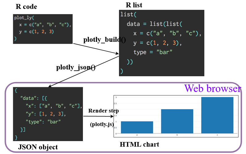
Figure 11.11: A graph from Sievert (2020) that shows the process of creating an HTML-embedded plotly chart from a graph generated in R.
Example 11.9 \(\text{}\)
To provide a simple demonstration I bring in some libraries, including plotly, and the world.emissions data from package asbio.
library(tidyverse); library(plotly)
library(asbio); data(world.emissions)

subset <- world.emissions |>
  filter(country %in% c("United States", "Mexico", "China",
                        "Germany", "Russia", "Canada")) |>
  filter(year > 1950 & year <= 2019)
Plotly graphs are rendered using the function plot_ly().
plot_ly(subset, x = ~year, y = ~co2) |>
  add_lines(color = ~country) |>
  layout(
        yaxis = list(tickfont = list(size = 20),
                     title ='CO\U2082 (million tonnes)',
                     titlefont = list(size = 23)),
        xaxis = list(tickfont = list(size = 20),
                     title='Year',
                     titlefont = list(size = 23)),
        legend = list(font = list(size = 20))
)- On Line 8, I call
plot_ly(). Note the use of the tilde operator to call x and y axis variables, i.e.,x = ~year, y = ~co2. - On Lines 9-18, I call additional plot characteristics using tidyverse pipe operators.
- On Line 9 I use
add_lines()to add a line trace to the plot. - Plot characteristics can be modified in a large number of ways using lists within the function
layout(Lines 10-18).
- On Line 9 I use
The result is shown in Fig 11.12. If you are viewing this document as an HTML, the lines in the plot will be interactive, and the plot will contain a menu that allows summarization of single or multiple data points, panning and zooming.
Figure 11.12: Simple plolty chart with an interactive trace and standard plotly menu.
\(\blacksquare\)
11.4.1 ggplot and plotly
Ggplot2 objects can be converted (imperfectly) to plotly objects using the function plolty::ggplotly().
Unfortunately, a large number ggplot layout characteristics including figure margins and locations of \(x\) and \(y\) axis labels will not translate to ggplotly(). Instead, we must call on potentially exhaustive hierarchically nested list components. This can be a pain, and it may be expedient to build separate list or function objects to facilitate the process.
Example 11.10 \(\text{}\)
To illustrate I extend the previous example. First, I create a nested list object, k, that specifies desired margin and axis characteristics.
k <- list(
  yaxis = list(title = list(font = list(size = 18)),
               tickfont = list(size = 14)),
  xaxis = list(title = list(font = list(size = 18)),
               tickfont = list(size = 15)),
    margin = list(t = 20, r = 20, b = 80, l = 80))
Here I create a simple ggplot boxplot, g. To get the desired characteristics in the mapped plotly graph I call on list components in k within plotly::layout(). Fig 11.13 shows the result.
g <- ggplot(subset, aes(x = country, y = co2)) +
  geom_boxplot(aes(fill = country)) +
  theme_classic() +
  ylab("CO\U2082 (million tonnes)") +
  xlab("Country")

ggplotly(g) %>%
  layout(showlegend = FALSE, xaxis = k$xaxis, yaxis = k$yaxis,
         margin = k$margin)
Figure 11.13: Simple plolty barplot based on a ggplot.
\(\blacksquare\)
Example 11.11 \(\text{}\)
Here is another application using the function GGally::ggcoef() to create a coefficient plot. A coefficient plot displays statistical model parameter estimates and confidence intervals. We can make the plot interactive (in HTML) using ggplotly() (Fig 11.14).
library(GGally)
model <- lm(log(co2) ~ country + year,
            data = subset)

gg <- ggcoef(model,
             exclude_intercept = TRUE,
             errorbar_height = .1,
             color = "blue") +
  theme_bw()

ggplotly(gg) %>%
  layout(yaxis = list(tickfont = list(size = 15),
                       title ='',
                       titlefont = list(size = 18)),
          xaxis = list(tickfont = list(size = 15),
                        title='Parameter estimates',
                        titlefont = list(size = 18)),
           legend = list(font = list(size = 15))
           )
Figure 11.14: Coefficient plot from the function GGally::ggcoef(), rendered using ggplotly().
\(\blacksquare\)
11.5 shiny
Probably the easiest and most flexible way to create interactive HTML apps is through tools in the package shiny. Unlike ploty apps, shiny apps will allow real-time interfacing with R for computations. RStudio has internals to facilitate shiny app creation for embedding on webpages. Examples given here are often based on apps described in Hadley Wickham’s book Mastering Shiny (Wickham 2021).
A shiny app will have three components:
- A user interface (
ui) specification that defines how your app looks. - A server function that defines how your app works. The function will (generally) have three arguments
input,output, andsession. - An app execution call that conjoins the user interface and server functions. This is done with
shinyApp()
Example 11.12 As a first example, here is R code for rendering text in an HTML app (Fig 11.15).
library(shiny)
ui <- fluidPage(
  "Hello, world!"
)
server <- function(input, output, session) {
}
shinyApp(ui, server)
Figure 11.15: A very simple shiny app. Code follows Wickham (2021).
ui:shiny::fluidPage()is a layout function that defines the basic visual structure of the app (Lines 1-4). Among other things the function allows definition of app rows usingshiny::fluidRow(), and columns (within rows) usingshiny::column(). Fluid pages can rescale their components in real-time to fill the available GUI window width.server: For this simple example theserverfunction contains no commands (Lines 5-6). Although, as a matter of convention, theserverarguments:input, output, sessionare still included.shinyApp: The app function pairs theui/serverobjects (Line 7).
\(\blacksquare\)
One can open an R script with a shiny app skeleton in RStudio by going to File\(>\)New File\(>\)Shiny Web Application. This will allow RStudio to recognize the script as app code. This, in turn, allows running the app by either sending its code to the console (e.g., using Ctrl + Enter), or by using the Run App button in the Shiny Web Application toolbar.
Example 11.13 Here is a simple app that lists and provides details about datasets in the package asbio (Fig 11.16).
ui <- fluidPage(
  selectInput("dataset", label = "Dataset",
              choices = data(package = "asbio")$results[,3])
)
server <- function(input, output, session) {
}
shinyApp(ui, server)ui:fluidPage()includesshiny::selectInput(), an input control function that provides the user with a select box widget. An appropriate label"Dataset"is defined. Selection boxchoicesare the third column indata(package = "asbio")$results, which contains the names of the dataframe object names in asbio.server: Once again, theserverfunction contains no commands (Lines 5-6).shinyApp: The app function again pairs theui/serverobjects (Line 7).

Figure 11.16: A shiny app to allow scrolling through asbio datasets.
The app in Fig 11.16 has limited usefulness because it provides only the asbio dataframe object names. Indeed, we could get more information by simply running data(package = "asbio"). Here we insert additional features into the user interface and server to increase functionality (Fig 11.17).
adata <- data(package = "asbio")$results[,3]
data(list = adata[1:length(adata)]) # loads all asbio datasets

ui <- fluidPage(
  selectInput("dataset", label = "Dataset", choices = adata),
  verbatimTextOutput("summary"),
  tableOutput("table")
)

server <- function(input, output, session){
    output$summary <- renderPrint({
    dataset <- get(input$dataset)
    summary(dataset)
  })

  output$table <- renderTable({
      dataset <- get(input$dataset)
    dataset
  })
}

shinyApp(ui, server)
The code
data(list = adata[1:length(adata)])loads all the asbio datasets into the global environment (Line 2).ui:fluidPage()now specifies three features, which will occur from top to bottom app, as they are listed (Lines 4-8).- The functions
shiny::verbatimTextOutput()(Line 6) andshiny::tableOutput()(Line 7) are controls that define how and where output (depending on the order they are specified influidPage()) are displayed. Specifically,verbatimTextOutput()displays code, andtableOutput()displays tables.
- The functions
server: Theserverfunction has been modified to allow interaction with the user interface (Lines 10-20). It allows generations of two objects:output$summary(Line 11) andoutput$table(Line 12), based oninput$datasetfrom theui.output$summary(lines 10-14) is a rendered expression fromshiny::renderPrint(). In particular, this will be output fromsummary()(Line 13) for columns ininput$datasetwhich is made available in the objectdataseton Line 12. The output operation is coupled withverbatimTextOutput("summary")in theui.
output$table(Lines 16-19) is a rendered expression fromshiny::renderTable(). It will show the raw data in a scrollable table for the dataframe specified in theui. This output operation is coupled withtableOutput("table")in theui.
shinyApp: As before, we generate the app using:shinyApp(ui, server)(Line 22).
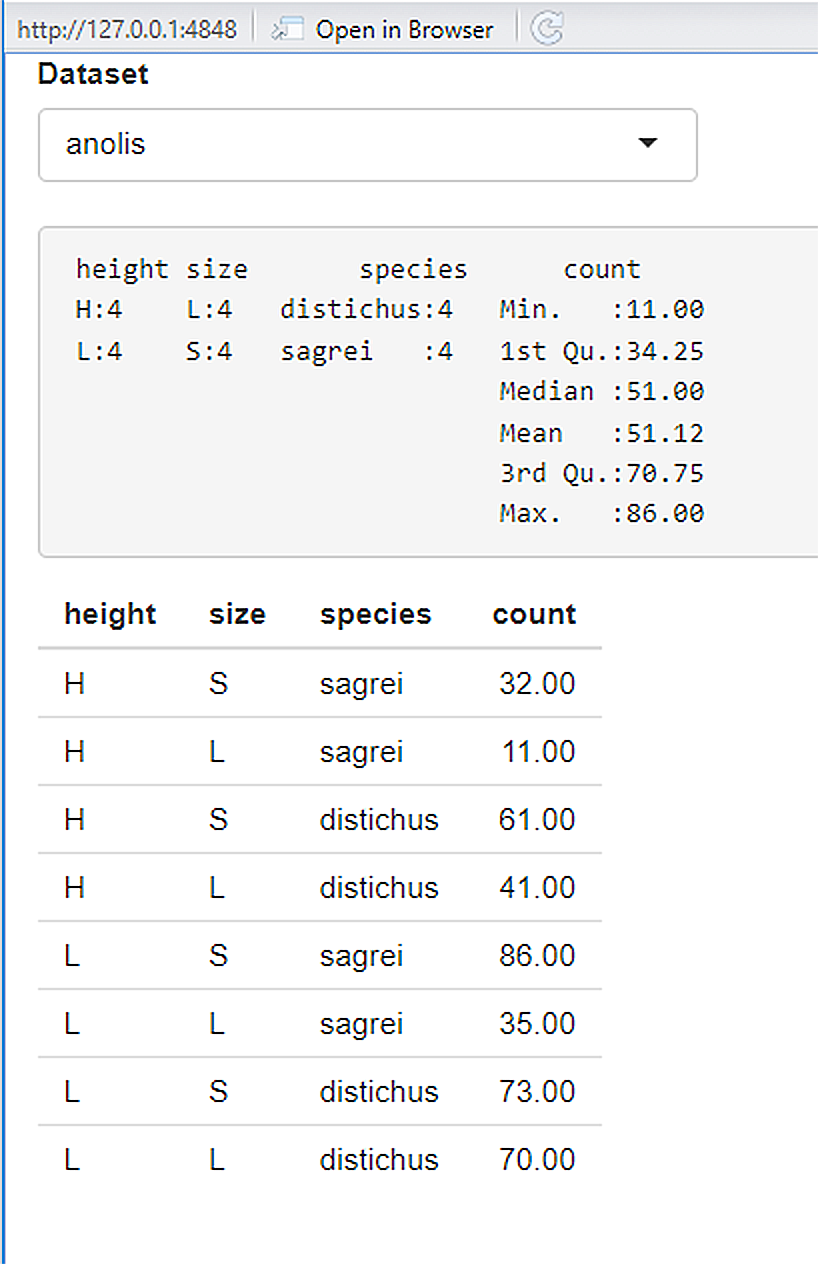
Figure 11.17: A modified shiny app to provide summaries of scrollable asbio datasets.
\(\blacksquare\)
11.5.1 ui Details
Input widget functions are specified in the ui. A ui input function, e.g., selectInput() with first argument "foo", or with inputId = "foo" can be called by server operations using the script input$foo. Most input functions have a 2nd argument called label that creates a user-readable label for the control widget on the app. A The 3rd input argument is typically value which creates a starting value for the widget control. Fig 11.18 shows many of the standard shiny ui input functions (without output). Important ui import functions are also listed Table 11.1.
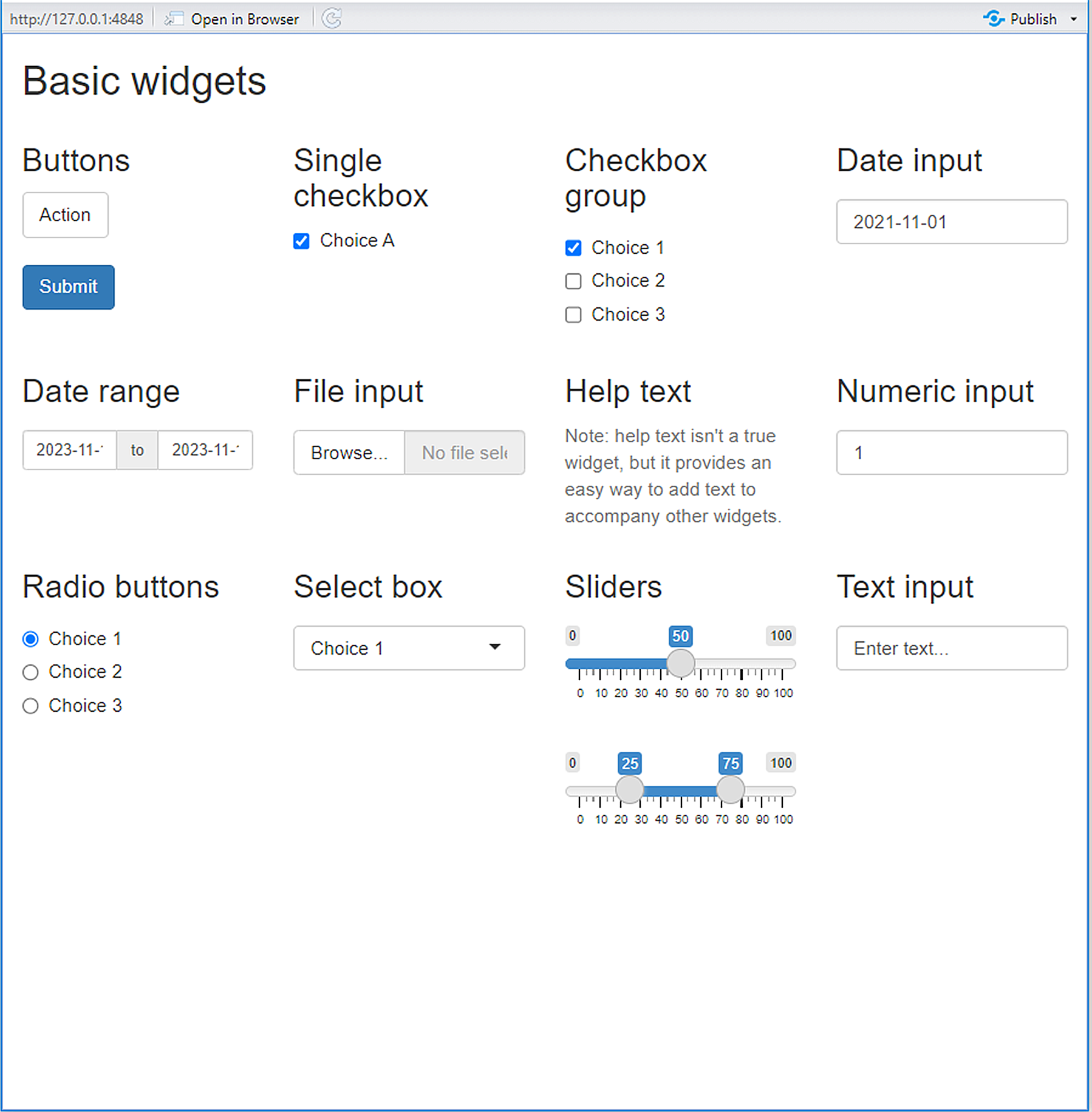
Figure 11.18: A variety of shiny input widgets and operations that can be specified in the ui. By row, the figure depicts widgets generated by the functions: actionButton(), submitButton(), checkboxInput, checkboxGroupInput(), dateInput(), dateRangeInput(), fileInput(), helpText(), numericInput(), radioButtons(), selectInput(), sliderInput(), and textInput(). Also see Table 11.1.
| Function | Purpose |
|---|---|
actionButton(), actionLink() |
Creates an action button or link. |
submitButton() |
Create a submit button. |
checkboxInput() |
Create a checkbox to specify logical values. |
dateInput() |
Create a selectable calendar. |
dateRangeInput() |
Create a pair of selectable calendars. |
fileInput() |
Create a file upload control to upload one or more files. |
helpText() |
Create help text which can be added to input to provide additional information. |
numericInput() |
Create an input control for entry of numeric values |
radioButtons() |
Create a set of radio buttons to select item from a list. |
selectInput() |
Create a selectable list, from which single or multiple items can be selected. |
sliderInput() |
Constructs a slider widget to elect a number, date, or date-time. |
passwordInput |
Create an control for entry for passwords. |
textInput() |
Create an input control for unstructured text. |
11.5.1.1 Output
Output functions in the ui create placeholders that can filled by the server function. As with inputs, outputs require a unique ID. For instance, in Fig 11.19, which provides a simple summary of the asbio::world.emissions dataset, output$code and output$text generated in the server are placed in the fluid page using textOutput("text") and verbatimTextOutput("code").
library(asbio)
data(world.emissions)

US <- world.emissions |>
  filter(country == "United States")

ui <- fluidPage(
  textOutput("text"),
  verbatimTextOutput("code")
)
server <- function(input, output, session) {
  output$text <- renderText({
    "Summary of the US CO\u2082 data \n"
  })
  output$code <- renderPrint({
    summary(US$co2)
  })
}

shinyApp(ui, server)
Figure 11.19: A simple app providing a single descriptive statistics summary.
Table 11.2 lists some potential ui output functions that can be used in shiny apps.
| Function | Purpose |
|---|---|
downloadButton(), downloadLink() |
Create a download button or link. To be paired with downloadHandler() in server. |
htmlOutput(), uiOutput() |
Create an HTML output element. |
imageOutput(), plotOutput() |
Create a plot or image output element. To be paired with renderPlot() and renderImage(), respectively, in server. |
outputOptions() |
Set options for an output object. |
modalDialog(), modalButton() |
Create a modal dialog interface. |
showNotification(), removeNotification() |
Show or remove a notification. |
textOutput(), verbatimTextOutput() |
Create a text output element. To be paired with renderText() and renderPrint(), respectively, in server. |
urlModal() |
Generate a modal dialog that displays a URL. |
11.5.2 server Details
As noted earlier, the server function requires three arguments: input, output, and session. The input argument allows assembly of items from the ui front-end to create a list-like object. The output argument in server provides output for ui inputs, often via rendering and handling functions (Table 11.3).
| Function | Purpose |
|---|---|
downloadHandler() |
Create a download button or link. To be paired with downloadButton() and downloadLink() in ui. |
renderPlot(), renderImage() |
Create a plot or image output element. To be paired with imageOutput() and plotOutput(), respectively, in ui. |
renderText() , renderPrint() |
Create a text output element. To be paired with textOutput() and verbatimTextOutput(), respectively, in ui. |
Fig 11.20 shows an app with sliders inputs, generated using the function sliderInput() in the ui, and text (product) output which is provided to the ui from the server, via renderText().
ui <- fluidPage(
  sliderInput("x", label = "If x is", min = 1, max = 50, value = 30),
  sliderInput("y", label = "And y is", min = 1, max = 50, value = 30),
  "then x times y is",
  textOutput("product")
)

server <- function(input, output, session) {
  output$product <- renderText({
    input$x * input$y
  })
}

shinyApp(ui, server)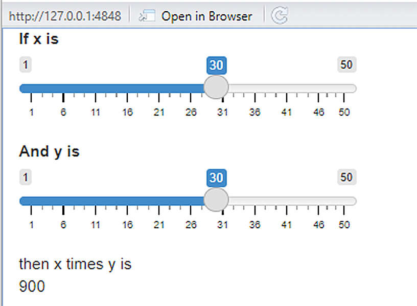
Figure 11.20: A simple slider app.
11.5.3 Running shiny Apps in R Markdown
Unlike plotly graphics, shiny apps are not automatically interactive in an R markdown rendered document. However, it is easy to a make shiny app interactive in this setting (provided that R is open to run the app). One simply adds runtime:shiny to the R Markdown YAML header. Thus, the YAML header in R markdown should have the format of Fig 11.21. Note that this approach will now be possible under Bookdown.
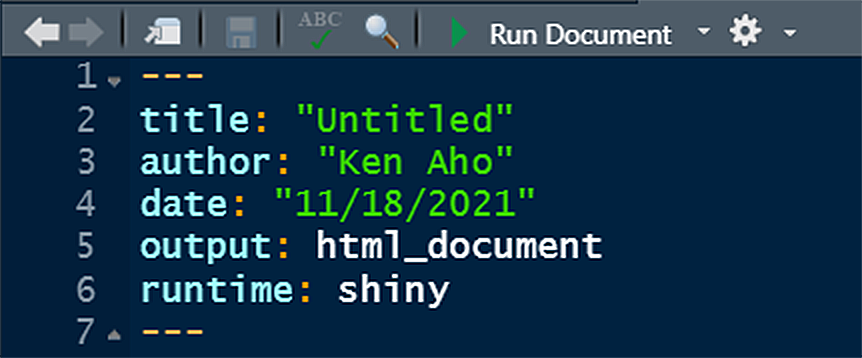
Figure 11.21: YAML header to allow inclusion of shiny apps in an R Markdown generated HTML.
Some adjustments to R and Markdown code may be needed (e.g., figure margins in renderPlot() may need to be changed) to make apps fit nicely on a page. A shiny app will only work remotely (outside of an R session) if a server implementing R is used to implement the app’s code. This process will be detailed at the end of the chapter.
11.5.4 Reactive Programming
We can increase efficiency in Shiny apps using reactive programming wherein outputs automatically update as inputs change. Under reactive programming we specify interactive dependencies so that when an input changes, all related outputs are automatically updated. The code below results in the app shown in Fig 11.22. Note that the output updates ``reactively’’ as I type individual characters of my name.
ui <- fluidPage(
  textInput("name", "What's your name?"),
  textOutput("greeting")
)

server <- function(input, output, session) {
  output$greeting <- renderText({
   paste0("Hello ", input$name, "!")
  })
}
shinyApp(ui, server)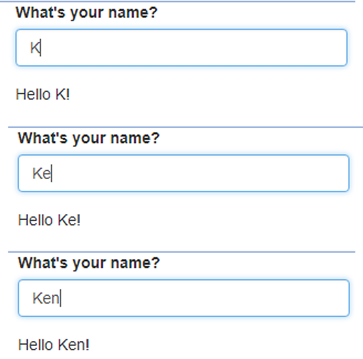
Figure 11.22: Reactive behavior of a simple shiny app.
Reactive programming usually occurs in more complex settings than the previous example and requires the function reactive.
Example 11.14 \(\text{}\)
As an extended example, imagine we wish to rapidly examine green house emissions data for the fifty countries in the asbio::world.emissions dataset with the highest current populations. As a first step, we do some data tidying and create a stats summary callback function we will use later.
library(tidyverse)
not.redundant <- world.emissions |> filter(continent != "Redundant")

pop.max <- not.redundant |>
  group_by(country) |>
  summarise(max.pop = max(population)) |>
  arrange(desc(max.pop))

# names of 50 largest countries
country_names <- setNames(nm = pop.max$country[1:50])

# 50 largest countries data
top50 <- not.redundant |>
  filter(country %in% pop.max$country[1:50])

# summary stats
summarize <- function(x, rn = c("CO2", "CH4", "NOx", "total GHG")){
    mean <- apply(x, 2, function(x) mean(x, na.rm = T))
    max <- apply(x, 2, function(x) max(x, na.rm = T))
    sum <- apply(x, 2, function(x) sum(x, na.rm = T))
    n <- apply(x, 2, function(x) length(which(!is.na(x))))
    df <- data.frame(mean = mean, max = max, cumulative = sum, n = n)
    row.names(df) <- rn
    df
}ui: We define a relatively complexuithat will provide sufficient inputs and outputs for theserverfunction.
ui <- fluidPage(
  titlePanel(h1("Greenhouse gasses", align = "center")), #h1 = HTML heading
  fluidRow(
    column(6,
      selectInput("country", choices = country_names, label = "Country")
    )
  ),
  fluidRow(
    column(4, tableOutput("diag")), # table
  ),
  br(), # line break
  br(),
  fluidRow(
    column(12, plotOutput("plot")) # plot
  )
)- Note that we use the
fluidRow()layout function. Shiny app rows, created withfluidRow(), contain twelve columns. These can be divided up in various ways usingshiny::column()(Fig 11.23). - The functions
htmltools::br()andhtmltools::h1()are HTML tags from the package htmltools, which is imported by shiny. Theh1()function creates a first level heading. Thus, it is equivalent to the HTML operator<h1>. Thebr()functions equates to an HTML line break tag, i.e.,<br>. A list of HTML equivalent tags is provided in?htmltools::builder. - The function
plotOutput()allows input of interactive R graphs, including ggplots (see below).
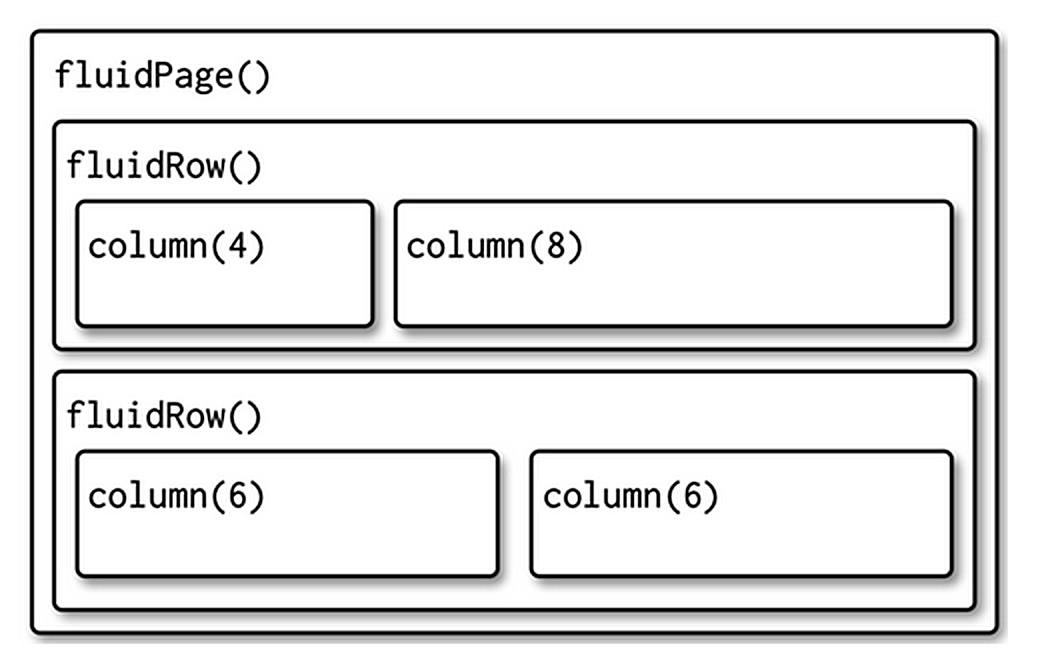
Figure 11.23: Behavior of shiny app rows and columns, in the ui. Figure taken from Wickham (2021).
server:: Theserverfunction contains several new features, including use of the functionreactive().
server <- function(input, output, session) {
  selected <- reactive(top50 %>% filter(country == input$country))

  output$diag <- renderTable(
  summarize(select(selected(), co2, methane, nitrous_oxide, total_ghg)),
  colnames = TRUE, rownames = TRUE
  )

  output$plot <- renderPlot({
  selected() %>%
       ggplot(aes(year, co2)) +
       geom_line() +
       labs(x = "Year",
            y = expression(paste(CO[2], " emissions (", 10^6, " tonnes)")))
  })
}- The code:
provides a data subset for a particular country that only needs to be calculated once, and then re-used. This also allows spontaneous (as possible) interaction with the ui with respect to this choice. The reactive object selected is called several times, as a function, in the server function.
- The object output$plot <- renderPlot() will be a ggplot generated from selected() which will be called by plotOutput("plot") in the ui.
shinyApp: As before, we generate the app using:
The final form of the app is shown in Fig 11.24.
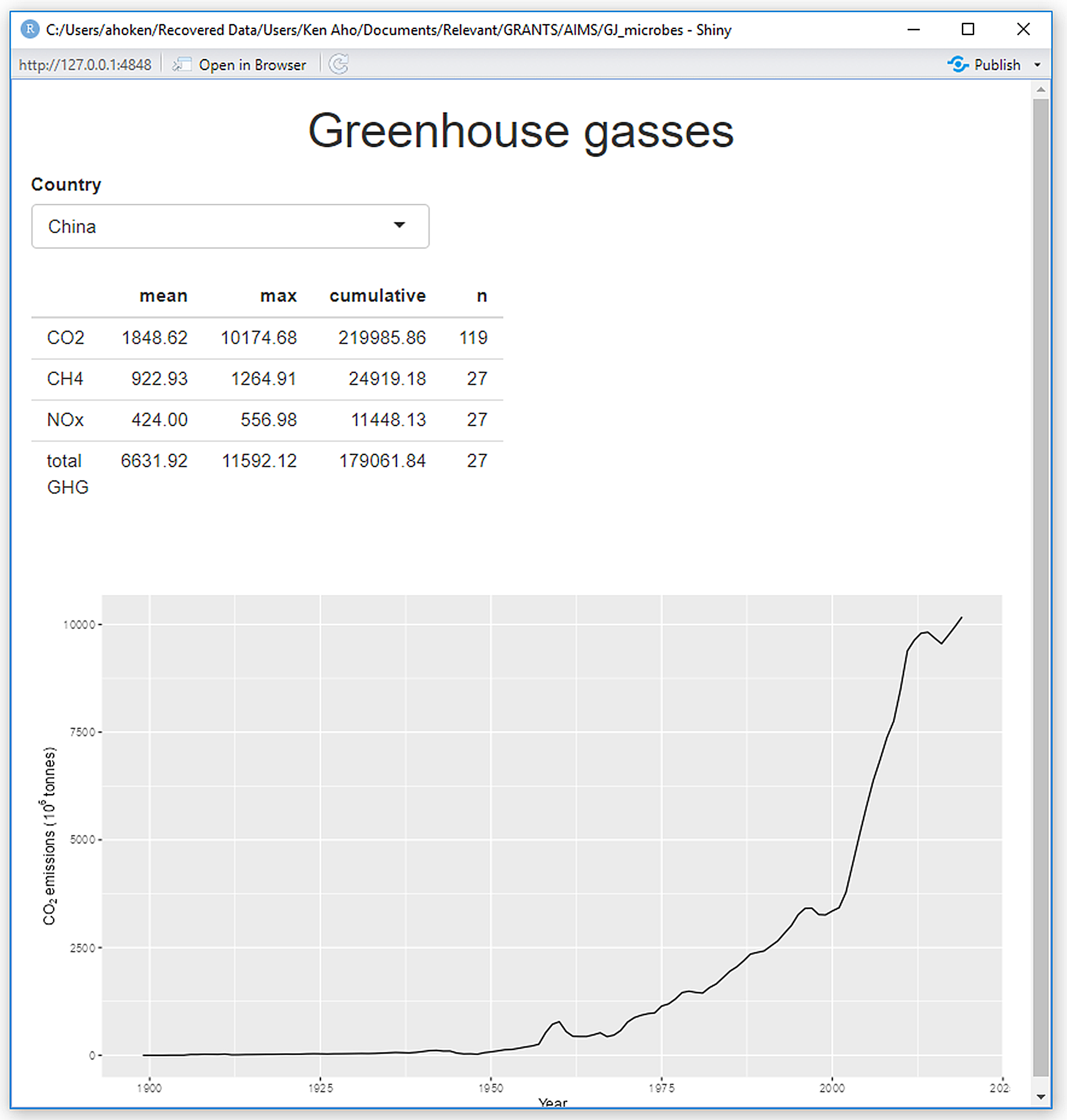
Figure 11.24: A shiny app to graphically depict changing CO\(_2\) levels over time for a user-selected country.
\(\blacksquare\)
Example 11.15 \(\text{}\)
Wickham (2021) used \(t\)-test computations to demonstrate reactive programming as shown (with some modifications) below. We first delineate two callback functions we wish to use in the app.
freqpoly <- function(x1, x2, binwidth = 0.1, xlim = c(-3, 3)) {
  require(ggplot2)
  df <- data.frame(
    x = c(x1, x2),
    group = c(rep("x1", length(x1)), rep("x2", length(x2)))
  )
  ggplot(df, aes(x, colour = group)) +
    geom_freqpoly(binwidth = binwidth, linewidth = 1) +
    coord_cartesian(xlim = xlim)
}

t_test <- function(x1, x2) {
  test <- t.test(x1, x2)
  sprintf(
    "p-value: %0.3f \nCI for µ1 - µ2: [%0.2f, %0.2f]",
     test$p.value, test$conf.int[1], test$conf.int[2]
  )
}
The function t.test() runs \(t\)-tests for true normal population means. In particular, assuming \(X_1 \sim N(\mu_1, \sigma^2_1)\), \(X_2 \sim N(\mu_2, \sigma^2_2)\) we generally consider the hypotheses:
\[\begin{align*} \text{H}_0: \mu_1 &= \mu_2 \\ \text{H}_\text{A}: \mu_1 &\neq \mu_2 \end{align*}\]
By default, t.test() does not assume homoscedasticty (that is, it allows \(\sigma^2_1 \neq \sigma^2_2\)). Thus, it uses the Satterthwaite method to estimate degrees of freedom for the null \(t\)-distribution of the test statistic (Aho 2014). The GUI we will create will run \(t\)-tests on randomly generated data from two user-specified normal distributions x1 and x2.
The function sprintf() in t_test() uses C code to return a formatted combination of text and variable outcomes. The code below combines text and inputs for double precision values (indicated with f) for \(p\)-values, and bounds for a 95% confidence interval for a true mean difference. The code %0.3f indicates rounding to three significant digits. As before, the code \n creates a text line break.
ui: we use the functionnumericInput()to specify characteristics of the normal distributions under consideration. ThesliderInput()function is used to specify x-limits in app-rendered ggplot frequency plot.
ui <- fluidPage(
  fluidRow(
    column(4,
      "Distribution 1",
      numericInput("n1", label = "n", value = 200, min = 1),
      numericInput("mean1", label = "µ", value = 0, step = 0.1),
      numericInput("sd1", label = "\u03c3", value = 0.5, min = 0.1, step = 0.1)
    ),
    column(4,
      "Distribution 2",
      numericInput("n2", label = "n", value = 200, min = 1),
      numericInput("mean2", label = "µ", value = 0, step = 0.1),
      numericInput("sd2", label = "\u03c3", value = 0.5, min = 0.1, step = 0.1)
    ),
    column(4,
      "Frequency polygon",
      numericInput("binwidth", label = "Bin width", value = 0.1, step = 0.1),
      sliderInput("range", label = "range", value = c(-3, 3), min = -5, max = 5)
    )
  ),
  fluidRow(
    column(12, plotOutput("hist"))
  ),
  fluidRow(
    column(1),
    column(5, verbatimTextOutput("ttest")),
    column(2),
    column(3, actionButton("simulate", "Simulate!")),
    column(1)
  )
)server: In the server we use reactive programming to generate random samples from a normal distribution. Specifically, for the objectx1we obtain a random sample of sizeinput$n1from a normal distribution with a mean ofinput$mean1and a standard deviation ofinput$sd1. These parameter values are specified in theui.
server <- function(input, output, session) {
  x1 <- reactive({input$simulate
        rnorm(input$n1, input$mean1, input$sd1)})
  x2 <- reactive({input$simulate
        rnorm(input$n2, input$mean2, input$sd2)})

  output$hist <- renderPlot({
    freqpoly(x1(), x2(), binwidth = input$binwidth, xlim = input$range)
  }, res = 96)

  output$ttest <- renderText({
    t_test(x1(), x2())
  })
}
- shinyApp: As before, we generate the app using:
The final form of the app is shown in Fig 11.25.
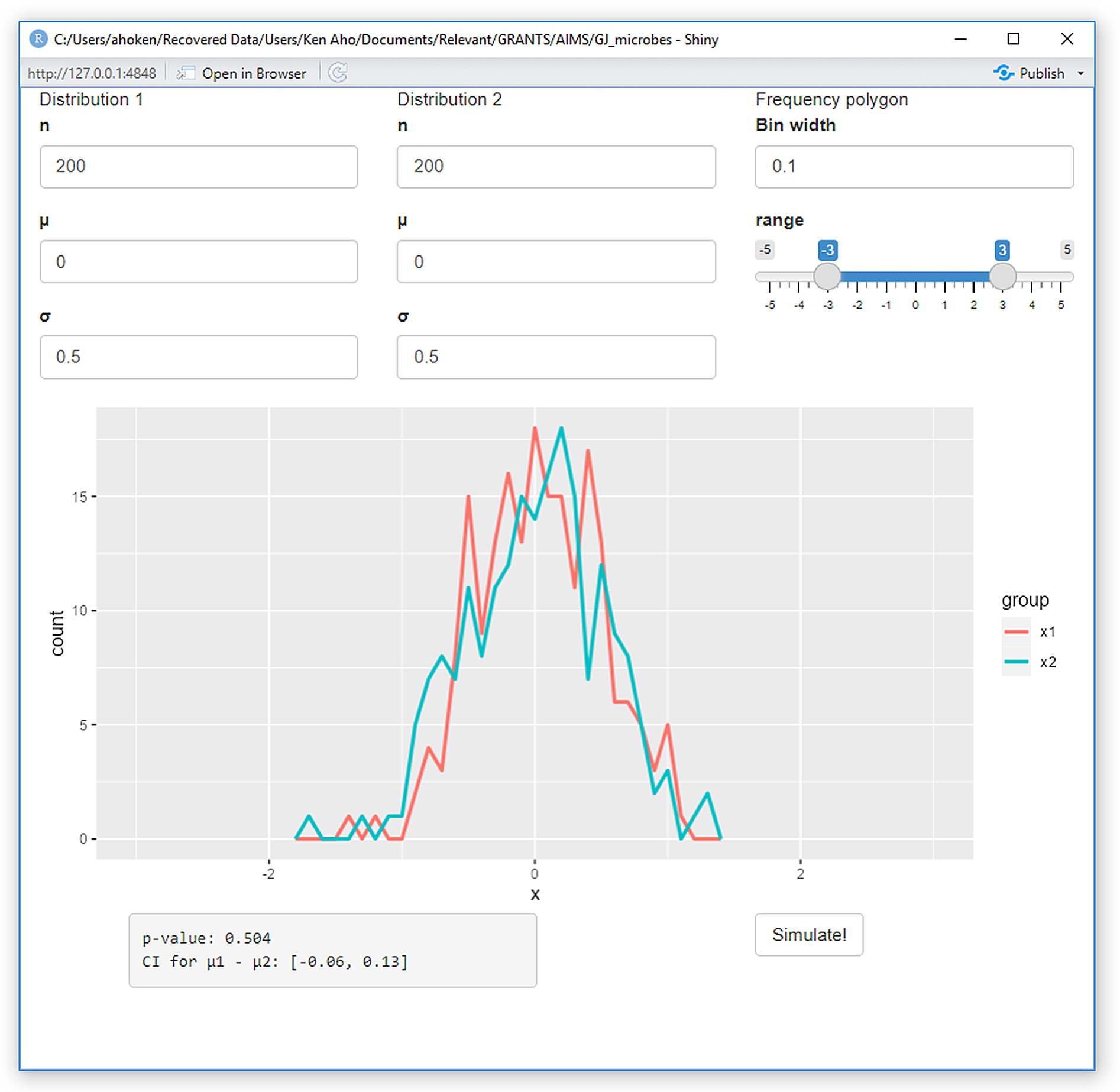
Figure 11.25: A shiny app to demonstrate the mechanism of \(t\)-tests.
\(\blacksquare\)
11.5.5 Additional Layout Control
We have already learned about techniques like fluidRow() to control single page layouts in fluidPage(). Another popular HTML layout uses side panels. These can be implemented in the shiny ui using the functions sidebarLayout() and sidebarPanel(). Sidebar formatting is summarized in Fig 11.26.
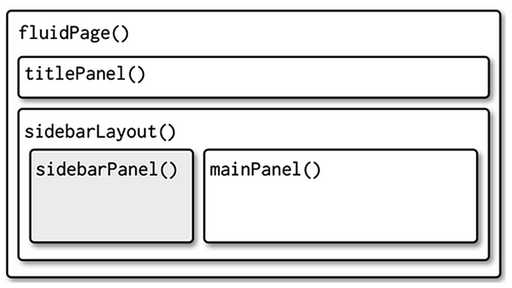
Figure 11.26: Sidebar formatting for shiny. Figure taken from Wickham (2021).
Example 11.16 \(\text{}\)
Here is an example for displaying a normal distribution using sliders in sidebars.
ui: The user interface specifies a sidebar layout, usingsidebarLayout(), that contains a sidebar panel designated withsidebarPanel, and a main panel, designated withmainPanel().
ui <- fluidPage(
   titlePanel(h1("Normal Distribution", align = "center")),
   sidebarLayout(
      sidebarPanel(
         sliderInput("mu", "\u03BC", step = 0.2, min = -3,
                     max = 3, value = 0),
         sliderInput("sigma", "\u03C3", min = 0.5, max = 3,
                     value = 1), width = 4
      ),
    mainPanel(plotOutput("plot"))
))server: The only output from theserveris a base R plot of the normal PDF.
server <- function(input, output, session) ({
   xmin <- -4; xmax <- 4; ymin <- 0; ymax <- 0.8
   xx <- seq(xmin, xmax, length = 100)

   output$plot <- renderPlot({
       yy <- dnorm(xx, input$mu, input$sigma)
       plot(xx, yy, type = "l", xlim = c(xmin, xmax), ylim = c(ymin, ymax),
            xlab = expression(italic(x)),
            ylab = expression(paste(italic(f), "(", italic(x), ")", sep = "")),
            cex.axis = 1.2, cex.lab = 1.2, lwd = 1.4)
     })
})
}
- shinyApp: As before, we use shinyApp() to generate the app.
The final form of the app is shown in Fig 11.27.
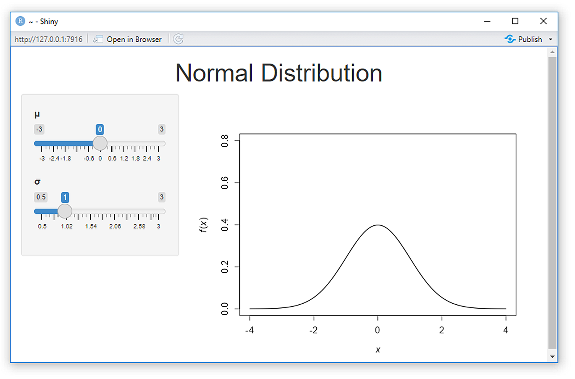
Figure 11.27: A shiny app for demonstrating the normal distribution.
Interestingly, the app appears less reactive than an analogous plot GUI generated with tcltk. Compare the app from Fig 11.27 to asbio::see.norm.tck().
\(\blacksquare\)
11.5.5.1 Multi-page Apps
Complex apps may be impossible to fit onto a single page. In shiny, the simplest way to break a app page into multiple pages is to use tabsetPanel() and tabPanel().
Wickham (2021) that does not provide widget output because of its empty server (Fig 11.28). In the ui a tabset panel is generated using tabsetPanel(). This entity has three panels, each is generated using tabPanel(). Only the first panel "Import data" currently contains content.
ui <- fluidPage(
  tabsetPanel(
    tabPanel("Import data",
      fileInput("file", "Data", buttonLabel = "Upload..."),
      textInput("delim", "Delimiter", ""),
      numericInput("skip", "Rows to skip", 0, min = 0),
      numericInput("rows", "Rows to preview", 10, min = 1)
    ),
    tabPanel("Set parameters"),
    tabPanel("Visualise results")
  )
)

server <- function(input, output, session) {
}
shinyApp(ui, server)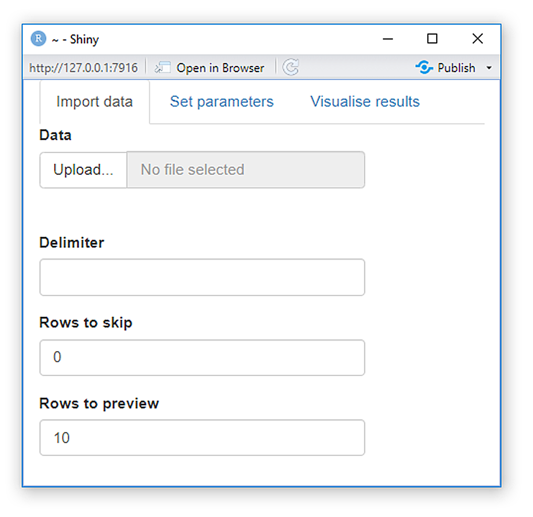
Figure 11.28: A shiny multipanel example.
A tabset can be an input when its id argument is used.
This allows an app to behave differently depending on which tab is currently visible (Fig 11.29).
ui <- fluidPage(
  sidebarLayout(
    sidebarPanel(
      textOutput("panel")
    ),
    mainPanel(
      tabsetPanel(
        id = "tabset",
        tabPanel("panel 1"),
        tabPanel("panel 2"),
        tabPanel("panel 3")
      )
    )
  )
)
server <- function(input, output, session) {
  output$panel <- renderText({
    paste("Current panel: ", input$tabset)
  })
}
shinyApp(ui, server)
Figure 11.29: Tabs for a multi-page app.
Because tabs are displayed horizontally, there is a limit to their number. The functions navlistPanel(), navbarPage(), and navbarMenu() provide vertical layouts that allow more tabs with longer titles (Fig 11.30).
ui <- fluidPage(
  navlistPanel(
    id = "tabset",
    "Heading 1",
    tabPanel("panel 1", "Panel one contents"),
    "Heading 2",
    tabPanel("panel 2", "Panel two contents"),
    tabPanel("panel 3", "Panel three contents")
  )
)

server <- function(input, output, session) {
}
shinyApp(ui, server)
Figure 11.30: A multi-page app with vertical tabs.
11.5.5.2 Layout Themes
Customization of the general shiny layout can be obtained by utilizing or modifying Bootstrap10 themes and classes. These can include layouts specific to mobile apps (see package RInterface) and Google’s material design frame (see package shinymaterial).
Here we use the "darkly" bootswatch (Fig 11.31). Other choices include "sandstone", "flatly", and "united".
ui <- fluidPage(
  theme = bslib::bs_theme(bootswatch = "darkly"),
  sidebarLayout(
    sidebarPanel(
      textInput("txt", "Text input:", "text here"),
      sliderInput("slider", "Slider input:", 1, 100, 30)
    ),
    mainPanel(
      h1(paste0("Theme: darkly")),
      h2("Header 2"),
      p("Some text")
    )
  )
)

server <- function(input, output, session) {
}
shinyApp(ui, server)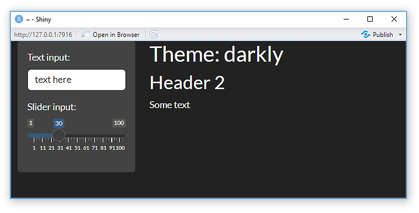
Figure 11.31: A shiny app using the darkly bootswatch from Bootstrap.
Further control of shiny apps can be achieved by programming directly in HTML, CSS, and Java11. In fact, HTML code in uis is revealed by running ui functions directly in the R console (Fig 11.32).

Figure 11.32: Representation of shiny code as HTML code.
11.5.6 plotOutput Interactives
One of the perks of plotOutput() is that it can be an input that responds to mouse pointer events. Such controls are also possible with tcltk GUIs. A shiny plot can respond to four different mouse events: click, dblclick (double click), hover (i.e., the mouse stays in the same place), and brush (a rectangular selection tool).
Example 11.17 \(\text{}\)
Consider the following simple example:
US <- world.emissions %>% filter(country == "United States")

ui <- fluidPage(
  plotOutput("plot", click = "plot_click"),
  verbatimTextOutput("info")
)

server <- function(input, output) {
  output$plot <- renderPlot({
    par(mar = c(5,5,2,2))
    plot(US$year, US$co2, xlab = "Year",
         ylab = expression(paste(CO[2], " (",10^6, " tonnes)")), type = "l")
  }, res = 96)

  output$info <- renderPrint({
    req(input$plot_click)
    x <- round(input$plot_click$x, 2)
    y <- round(input$plot_click$y, 2)
    cat("[year = ", x, ", CO2 = ", y, " million tonnes]", sep = "")
  })
}
shinyApp(ui, server)
}
Note the use of req(), to ensure the app doesn’t do anything before the first click. The resulting app is shown in Fig 11.33.
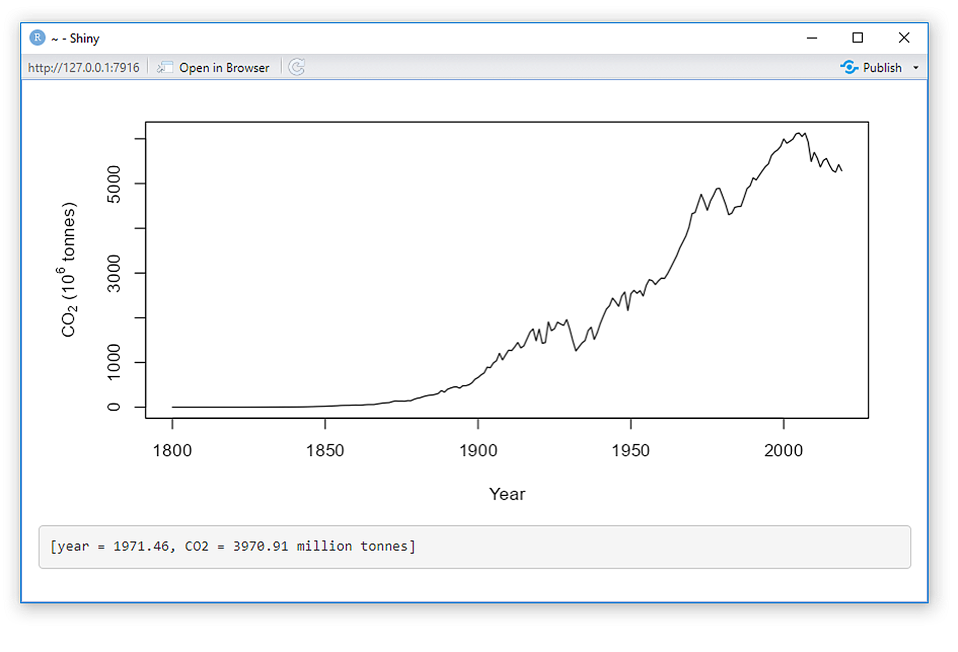
Figure 11.33: A mouse interactive shiny app.
Here we use nearPoints() to return a dataframe for a point near a mouse click.
US.ghg <- data.frame(US[,c(3,4,10,11,12,14,15)])

ui <- fluidPage(
  plotOutput("plot", click = "plot_click"),
  tableOutput("data")
)
server <- function(input, output, session) {
  output$plot <- renderPlot({
    par(mar = c(5,5,2,2))
    plot(US.ghg$year, US.ghg$co2, xlab = "Year",
         ylab = expression(paste(CO[2], " (",10^6, " tonnes)")),
         type = "l")
  }, res = 96)

  output$data <- renderTable({
    nearPoints(US.ghg, input$plot_click,
               xvar = "year", yvar = "co2")
  })
}
shinyApp(ui, server)
The resulting app is shown in Fig 11.34.
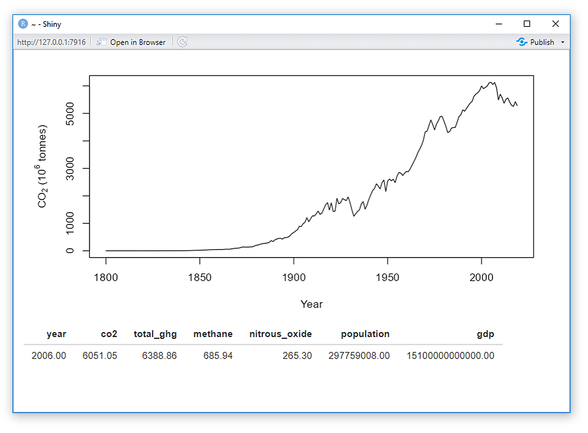
Figure 11.34: Another mouse interactive shiny app.
\(\blacksquare\)
11.5.7 Putting Your App Online
A shiny app will only work remotely (outside of an R session) if a server implementing R is used to call the app’s code. RStudio helps with this by housing a shiny server site shinyapps.io (Fig 11.35). The site is currently free of charge for a relatively small number of personal applications.
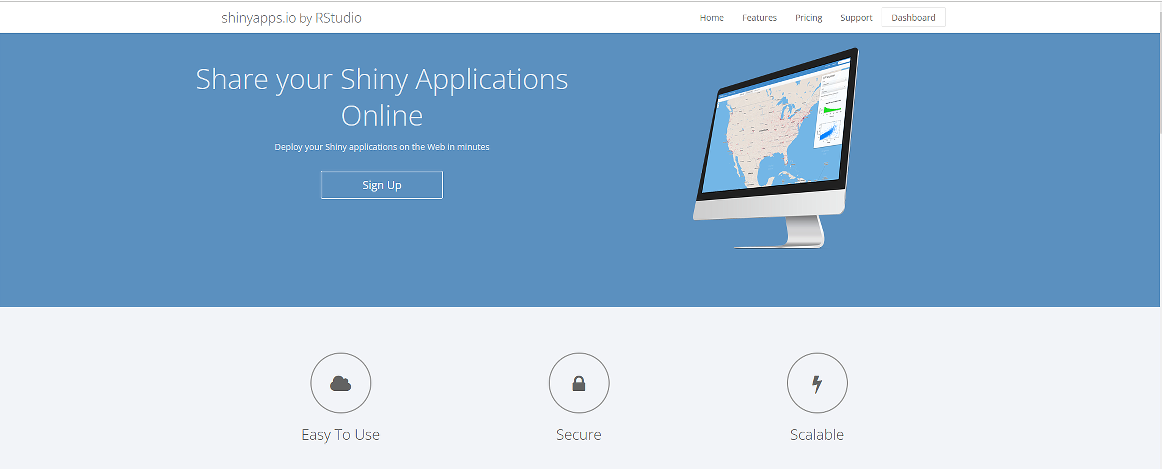
Figure 11.35: The shiny apps website (https://www.shinyapps.io/).
My personal shinyapps.io account is shown in Fig 11.36.

Figure 11.36: My personal shiny apps website, with three apps.
The account houses links for some apps summarizing the green house gas data, and the Hardy Weinberg equilibrium.
11.6 Comparison of GUI-generating Approaches
Three R GUI building approaches were described in this chapter. The package tcltk uses the Tcl/Tk GUI building tools alongside the native windowing capacities of Windows, Unix-like and Mac operating systems. The plotly and shiny libraries render GUIs under an HTML framework. A final comparative summary of the three approaches is given in Table 11.4.
| Mechanics | Strengths | Weaknesses | |
|---|---|---|---|
| tcltk | Package provides binding for Tcl/Tk GUI building tools. | 1) Direct interfacing with R 2) Excellent GUI reactivity 3) Wide range of widgets | 1) Limited to R environment, 2) GUIs may have poor aesthetics, 3) Awkward coding frameworks, 4) Poor support online or otherwise. |
| plotly | Package provides language interfacing from R to JSON to HTML. | 1) After generation, does not require R, 2) Some built-in ggplot compatibility. | 1) GUI capabilities limited to plot interactives. |
| shiny | Language interfacing from R to JSON to HTML. Maintains connection to R environment \end{tabular} | 1) Good support online and otherwise. 2) High level of RStudio compatibility. 3) Potentially aesthetic GUIs. 4) Straightforward coding 5) Wide range of widgets | 1) Requires direct connection to an R session, or server connection to an R environment, 2) Potentially poor reactivity. |
Exercises
Make a tcltk GUI that solves and reports the solutions to differential equations.
Make a
plotlygraph of anygglot2graph usingggplotly.Make a
shinyapp to greet someone. Hint: place the two code chunks below in theuiand theserverfunction, respectively.
Along with the code, include a snapshot of the app in action.
- Your friend has designed an app that solves the exponential growth function for a population with an initial population size of 10, and an intrinsic growth rate of 2, for times, \(t\), from 1 to 50: \[f(t) = 10 \times \exp(2 \times t).\]
ui <- fluidPage(
  sliderInput("t", label = "If t is", min = 1, max = 50, value = 30),
  "then the population size is",
  textOutput("exp.growth")
)
server <- function(input, output, session) {
  output$exp.growth <- renderText({10 * exp(2 * t)})
}
shinyApp(ui, server)Fix the code and provide a snapshot of the app in action.
References
Tcl, an acronym for “tool command language,” is an interpreted programming language that is often embedded into C applications. Tk is a Tcl package for GUI building. Tk, when implemented in Tcl, is termed Tcl/Tk.↩︎
The code:
tcl("label", tt, text = "Hello world", bg = "red")is equivalent totklabel(tt, text = "Hello world", bg = "red"), wherettis the top-level GUI object. Both prompt the Tcl/tk code:label tp -text "Hello world" -bg red, wheretpis the path name of the Tcl/Tk label object.↩︎Code for Fig 11.5 can be obtained using
source(url("http://www2.cose.isu.edu/~ahoken/book/calctcltk.R")).↩︎This requires creation with
tkimage.create()(see Example 11.7).↩︎GTK (formerly GIMP ToolKit and GTK+) and qt (pronounced ‘cute’) are free, open-source, cross-platform, toolkits for creating GUIs.↩︎
Java is an OOP language designed to have few dependencies. Once compiled, Java code can run on all platforms that support Java. Additional details for Java web design are given here. JavaScript, while linguistically similar to Java, has many many important differences. For instance, JavaScript is an interpreted language, whereas Java code is generally compiled.↩︎
JavaScript Object Notation (JSON) was derived from JavaScript largely to facilitate server-to-browser session communication.↩︎
As noted in Section 2.9.2, HTML (Hypertext Markup Language) is the standard language for structuring web pages and web content. Basic HTML programming details are available from a number of sources, including this Mozilla developer site.↩︎
The packages htmltools and htmlwidgets were created by RStudio developers for R bindings to JS libraries and HTML code.↩︎
Bootstrap is a collection of HTML conventions, Cascading Style Sheets (CSS) styles (CSS is a language used to style HTML documents, including colors and fonts), and java script snippets bundled into a convenient form.↩︎
for more information, check this R-studio help link and this link to a book by David Granjon↩︎