Chapter 6 Base Graphics
"Mankind invented a system to cope with the fact that we are so intrinsically lousy at manipulating numbers. It’s called the graph."
- Charlie Munger, businessman and philanthropist
6.1 Introduction
An important feature of R is its capacity to create publication-quality graphics with tremendous user flexibility. Generally speaking, R graphics are non-interactive and changes to plots require the creation of entirely new static plots. This may feel like a major departure for those used to point-and-click graphics, characteristic of software like Excel\(^{\circledR}\) and SigmaPlot\(^{\circledR}\).
There are two general graphics approaches in R: base graphics and grid graphics (Murrell 2019). Base graphics are applied using the R distribution package graphics, whereas the grid graphics system relies on low level facilities in the R distributed grid package, which are generally implemented via high level functions in other packages. The base and grid graphics systems generally do not interact well, although both rely on the distributed grDevices package which provides the fundamental infrastructure for R graphics, including graphical devices. Both base and grid systems follow the painters model in which later output obscures earlier overlapping output.
The base graphics system is the focus of this chapter. The grid system, and its most popular adherent, the package ggplot2, is described in Chapter 7.
6.2 Simple Base Graphics Examples
The base graphics system allows creation of a wide variety of plots for single variables and multiple variables (see Figs 6.1 and 6.2, respectively). Approaches for making many of these example plots are elaborated later in this chapter.
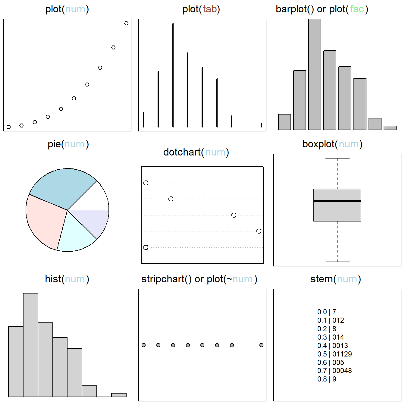
Figure 6.1: Base graphics approaches for single variables. Figure follows Murrell (2019). Classes of plotted objects are distinguished by name and color in main headings: num = numeric, tab = table, fac = factor. By row, from left to right, graphics are: 1) a scatterplot created by applying the function plot() to a vector of class numeric, 2) the plot() function applied to a one-dimensional object of class table, resulting in a distributional plot, 3) a barplot, useful for comparing categorical outcomes, 4) a pie chart, 5) a dotchart, which provides a dot variant of a bar plot), 6) a boxplot, i.e., the interquartile range (hinges) and whiskers delimiting outliers, 7) a histogram (the most common graphical distributional summary), 8) a stripchart, i.e., a one dimensional scatter plot that provides a horizontal view of distributional outcomes, and 9) a stem chart.
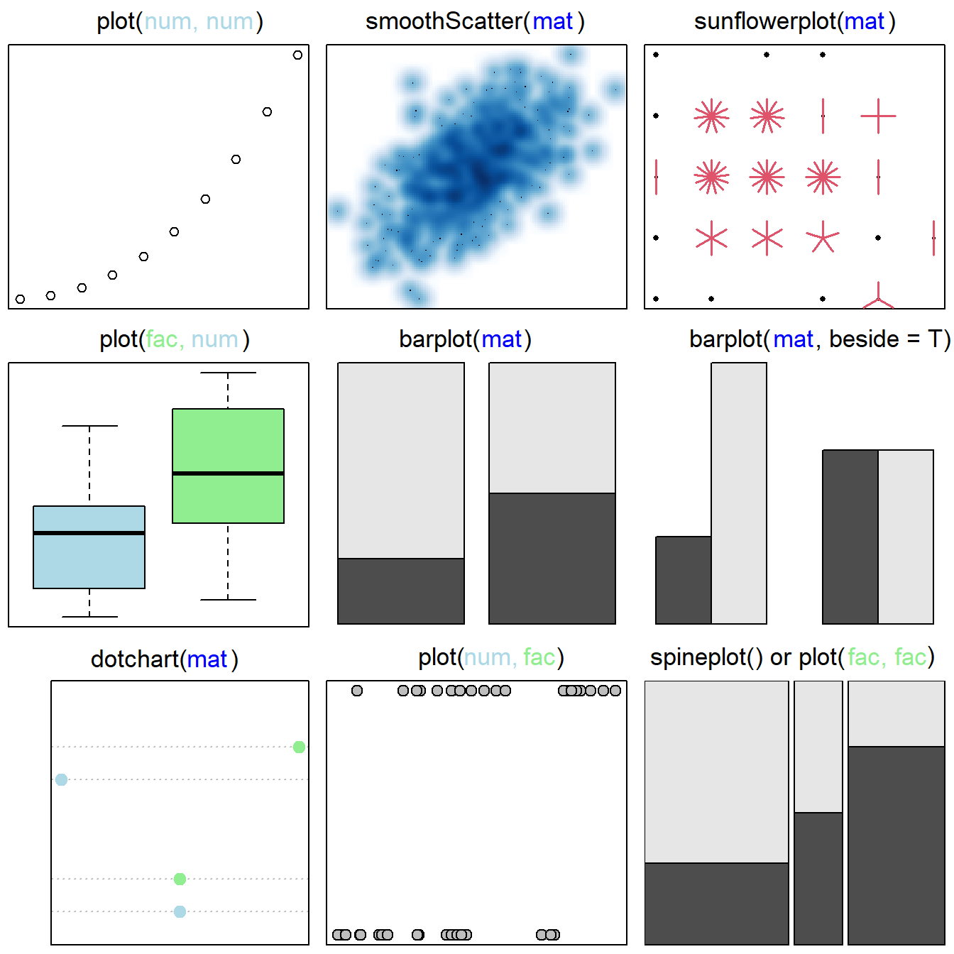
Figure 6.2: Base graphics approaches for considering multiple variables. Figure follows Murrell (2019). Classes of plotted objects are distinguished by name and color in main headings: num = numeric, tab = table, fac = factor. By row, from left to right, graphics are: 1) a scatterplot based on two quantitative variables, 2) a scatterplot with smoothed densities, 3) a sunflower plot, which uses special symbols to indicate overplotting of points, 4) a boxplot based on a factor (with two levels) and a numeric variable, 5) and 6) stacked and beside barplots of matrices, 7) a dotchart, 8) a stripchart, based on two numeric variables, and 9) a spineplot, a special cases of a mosaic plot (obtained using mosaicplot()), representing a generalization of a stacked (or highlighted) bar plot.
6.2.1 plot()
The workhorse of base graphics is the function plot(). From Figs 6.1 and 6.2 it is evident that plot() can be used in a number of different ways, depending on the characteristics of data being plotted. For example, if data are two numeric vectors, then a conventional scatterplot is created. However, if the first two arguments in plot() call a numerical vector and a factor vector (in that order), then a boxplot is created, and if the first two arguments in plot() call a factor vector and a numeric vector (in that order), then a stripchart is created. Further, plotting methods for particular classes of objects can be designed that can be implemented by calling plot(). For instance, the dendrogram in Fig 6.3 was created using a plotting method called plot.agnes(), designed for objects of class agnes1. However, the function can be run using a generic call to plot(). See Ch 8 for additional details on plotting methods for R classes.
library(cluster)
aa.ga <- agnes(animals, method = "average")
plot(aa.ga, sub = "", main = "", which.plots = 2, xlab = "")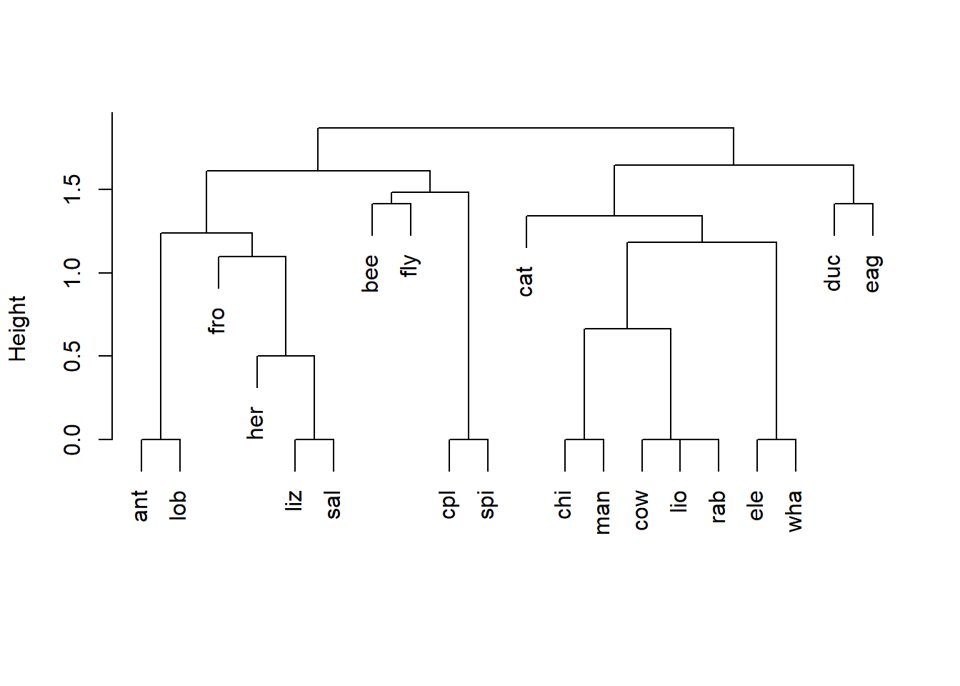
Figure 6.3: Dendrogram of an average linkage classification of animals based on six variables: warm vs. cold blooded, ability to fly, vertebrate or invertebrate, whether or not the animal is endangered, whether or not the animal lives in groups, and whether or not the animal has hair. The plotting function used, plot.agnes(), is called using the generic name plot().
By default, the function plot() creates a projection at user defined Cartesian coordinates. Under this usage plot() has only
two required arguments.
xdefines the x-coordinate values.ydefines the y-coordinate values.
If coordinates for only one dimension, x are supplied, then x is plotted on the vertical axis against the series \(1:n\), where \(n\) is the number of points in x. A coordinate system can also be supplied to the argument x in the form of a formula, list, matrix, or dataframe.
Important optional arguments include the following:
pchspecifies the symbol type(s), i.e., the plotting character(s) to be used.coldefines the color(s) to be used with the symbols.cexdefines the size (character expansion) of the plot symbols and text.xlabandylaballow the user to specify the x and y-axis labels.typeallows the user to define the type of graph to be drawn. Possible types are"p"for scatterplot points (the default),"l"for a line plot,"b"for both,"c"for the line component of"b","o"for overplotted,"h"for ‘histogram’ like vertical lines (see middle plot in top row of Fig 6.1),"s"for stair steps, andn"for no plotting.
Example 6.1 \(\text{}\)
We can see some symbol and color alternatives by calling them in plot() (Fig 6.4).
plot(1:20, 1:20, pch = 1:20, col = 1:20,
     ylab ="Symbol number",
     xlab = "Color number",
     cex = 1.6, cex.lab = 1.1, cex.axis = 1.1)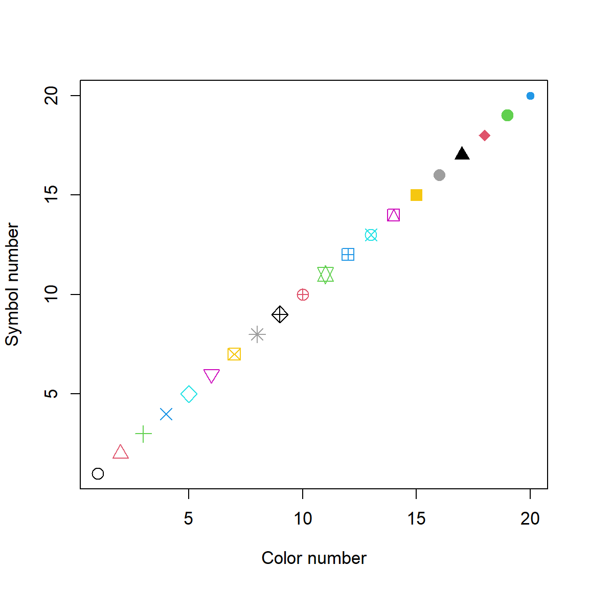
Figure 6.4: Some symbol and color plotting possibilities in plot().
In line one from the code above, the x and y coordinates are both sequences of numbers from 1 to 20 obtained from the command 1:20. I varied symbol colors and plotting characters (col and pch, respectively) using 1:20 as well. Thus, the combination col = 1 and pch = 1 results in a black open circle, whereas the combination col = 20, pch = 20 results in a blue filled circle. Note that we need to enclose the axis names in quotations for R to recognize
them as text. Symbol numbers 21-26 allow background color specification using the argument bg. Many other symbol types are also possible.
\(\blacksquare\)
6.3 Graphical Devices
Graphics in R are created within graphics devices, encoded in the package grDevices. These vary with respect to storage modes, display modes, available typefaces, and other characteristics. In a basic R download, six graphics devices will be available:
windows()is available for Windows releases of R. Provides on-screen rendering of graphics (outside of RStudio)2, and creates Windows metafile graphics files.pdf()renders graphics into .pdf files.postscript()renders graphics into PostScript, .ps, graphics files.xfig()renders graphics files using the Xfig graphics file format.bitmap()renders graphics into bitmap graphics files It requires the open source software ghostscript.piktex()Writes TeX/PicTeX graphics commands to a file and is of historical interest only.
A number of other graphics devices also exist, although they may return a warning if R was not compiled to use them upon installation.
cairo_pdf(),cairo_ps()andsvg()are PDF, PostScript SVG (Scalar Vector Graphics) devices based on the open source Cairo graphics.bmp(),jpeg(),png(), andtiff()render graphics as .bmp, .jpg, .png, and .tif bitmap files, respectively.X11()is the graphics device for the X11 windowing system, and is commonly used in Unix-alike operating systems, including MacOS.quartz()is only functional on MacOS and supports plotting to the screen (default) and to various graphics file formats. The device requires the open source software XQuartz for rendering some R graphical user interfaces (see Ch 11).
Multiple devices (currently up to 63) may exist simultaneously in an R work session, although there will only be one active device. To find the current (active) graphics device can type dev.cur(). I get:
png
  2
R tells me there are two devices open. The current device is a Windows device. The second device is the so-called “null device.” The null device is always open but only serves as a placeholder. Any attempt to use it will open a new device in R. Occasionally, on purpose or by accident, all graphics devices (except the null device) may become turned off. A new active graphics device can be created at any time by typing:
One can close the current (active) device using:
The active device can be changed using the function dev.set(). For instance, if there were three or more accessible devices, and one wished to define device three as the active device, one could type:
It is possible to scroll through graphics devices using keyboard shortcuts. Specifically, let \(n\) be the current device number, then the combination Ctrl + Alt + F11 (Windows or Linux) or Cmd + Alt + F11 (Mac) shows device \(n-1\), whereas Ctrl + Alt + F12 (Windows or Linux) or Cmd + Alt + F12 (Mac) shows device \(n+1\).
6.4 par()
Parameters for a graphics device (which may contain several plots) can be accessed and modified using the function par(). Below are important arguments for par(). Some of these can also be specified as arguments in plot(), with different results.
bggives the background color for the graphical device. When used inplot()it gives the background color of plotting symbols.btyis the box-type to be drawn around the plots. Ifbtyis one of"o"(the default),"l","7","c", "u", or"]"the resulting box resembles the corresponding upper case letter. The value"n"suppresses the box.fggives the foreground color.fontis an integer that specifies the font typeface.1corresponds to regular text (the default),2to bold face,3to italic and4to bold italic.lasis the style of axis labels:0always parallel to the axis (default),1always horizontal,2always perpendicular to the axis,3always vertical.marwill have the formc(bottom, left, top, right)and gives the number of lines of margin to be specified on the four sides of the plot. The default isc(5, 4, 4, 2) + 0.1.mfrowwill have the formc(number of rows, number of columns)and the number and position of plots in a graphical layout. Multiple graphs can also be placed into a graphical device with additional control over plot designation to multiple elements in a row and column configuration, using the functionlayout().omaspecifies the outer margins of a graphical device, given multiple plots, using a vector using a matrix of the form:c(bottom, left, top, right).usrwill have the formc(x1, x2, y1, y2)giving the extremes of the user coordinates of the plotting region.
When setting graphical parameters, it is good practice to revert back to the original parameter values. Assume that I want to background of the graphics device to be black. To set this I would type:
old.par <- par(no.readonly = TRUE) # save default, for resetting...
par(bg = "black") # change background parameter
To return to the default settings for background I would type:
Defaults will also be reset by closing the current graphics device, or by opening a new device. For instance, using dev.new().
Other fundamental properties of the default graphics device, such as device height, width and pointsize, can be adjusted using the dev.new() function. For instance, to create a graphical device 9 inches wide, and 4 inches high, I would type:
Example 6.2 \(\text{}\)
Fig 6.5 shows an example of applying background and foreground colors using the bg and fg arguments in par(), respectively. Note also the specification of a bold font using the par() argument font = 3, and expansion of all graphics parameters to slightly larger than their original size, using cex = 1.1.
old.par <- par(no.readonly = TRUE)
par(bg = "black", fg = "white", font = 3, cex = 1.1)
plot(1:10, 1:10, xlab = "x", ylab = "y",
     col.lab = "white")
par(old.par)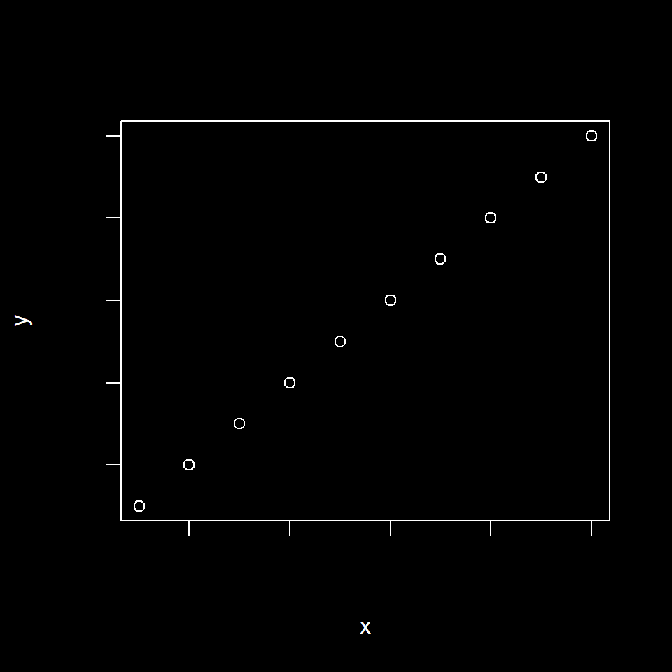
Figure 6.5: Use of par() to change background and foreground graphical parameters.
\(\blacksquare\)
Example 6.3 \(\text{}\)
Fig 6.6 shows how one can place multiple graphs into a single graphical device using the mfrow argument in par(), and control figure margins using the par() argument mar (line two). It also shows some basic plot types resulting from the type argument in plot() (lines 4-7).
old.par <- par(no.readonly = TRUE)
par(mfrow = c(2,2), cex = 1.1, mar = c(4,4,1,1))
x <- 1:10; y <- sort(rnorm(10))
plot(x, y)
plot(x, y, type = "l")
plot(x, y, type = "o")
plot(x, y, type = "h")
par(old.par)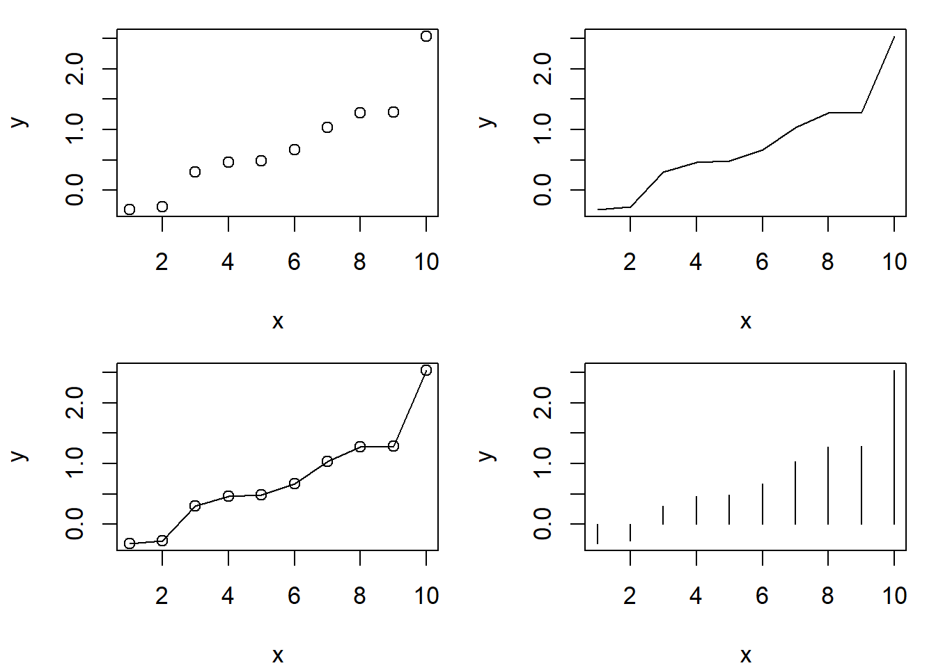
Figure 6.6: Use of par() to place multiple graphs into a single graphical device. The figure also demonstrates basic plot types, specified using the plot() argument type. Clockwise from the top-left these are: 1) a point plot (scatterplot), 2) a line plot, 3) a histogram-like (high density line) plot, and 4) a plot with a both points and lines.
\(\blacksquare\)
6.5 Exporting Graphics
To export R graphics, one can generally copy snapshots to a clipboard using pull down menus on graphical device. These can then be pasted into programs (e.g., word processors) as bitmaps (a spatially mapped array of bits) or metafiles, a generic term for a file format that can store multiple types of (generally graphical) data.
To create the best possible graphs, however, one should save device output using graphical device functions.
For instance, to save a graphics device image as a pdf under the file name example.pdf in the working directory I would type:
I would then make the plot, for instance
The plot will not be shown because the png() graphical device is engaged. As a final step I close the device.
The graphics file will now be contained in the working directory. If the file argument is unspecified, pdf() will save a file called Rplot.pdf.
By default, the bitmap graphics formats: BMP, JPEG, PNG, and TIFF, have a width and height of 480 pixels, and a “large” point size (1/72 inch) in R. This results in a rather coarse 72 ppi (72 points per inch) image resolution.
However, changing the res (resolution) argument in a graphical device function without changing the pointsize, or height and width arguments will generally result in unusable figures.
Because \(500 \approx 72 \cdot 6\), one can generate a TIFF with greater than \(400\) ppi TIFF called fig1.tiff by typing:
With respect to graphical formats, documentation in the grDevices package states:
“The PNG format is lossless3 and is best for line diagrams and blocks of color. The JPEG format is lossy4, but may be useful for image plots, for example. The BMP format is standard on Windows, and supported by most viewers elsewhere. TIFF is a meta-format: the default format written by the default format
tiff(compression = none)is lossless and stores RGB values uncompressed. Such files are widely accepted, which is their main virtue over PNG.”
The svg(), and graphical devices apply cairographics and will recognize a large number of symbols and fonts not available for document and image generation in the default setting of the Windows PostScript and PDF devices.
6.6 text(), points(), and lines()
The functions text(), points() and lines() can be used to overlay text, points and lines in a plot, respectively. As with plot() the first two arguments of these functions are the x and y coordinates for the plotted entities. Other arguments concern characteristics of the plotted items. For instance, to plot the text "example" with in an existing plot, at plot coordinates x = 0, y = 0, with a large character expansion, I could type:
plot(-1:1, -1:1, type = "n", axes = F, xlab = "", ylab = "") # empty plot
text(x = 0, y = 0, "example", cex = 9)
The result is shown in Fig 6.7.
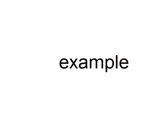
Figure 6.7: Empty plot (even axes are suppressed) with text overlain.
The function paste() can be used to concatenate elements from text strings in plots or output. For instance, try:
[1] "a d" "b e" "c f"Which can be placed in a plot (Fig 6.8) using text().
plot(-1:1, -1:1, type = "n", axes = F, xlab = "", ylab = "")
text(x = 0, y = 0, paste(c, collapse = ' '), cex = 2)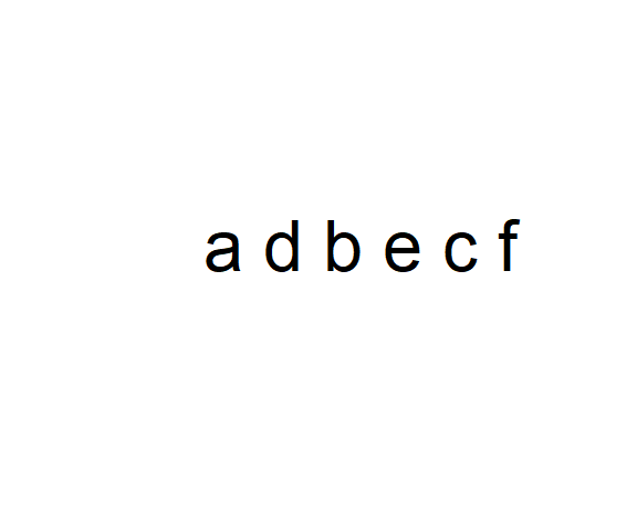
Figure 6.8: An empty plot with text overlain. Note the use paste(c, collapse = ' ') to collapse the string vector c into a single entity.
To plot a dashed line between the points \((0, 0)\) and \((3, 2)\), I would type:
or
The result is shown in Fig 6.9.
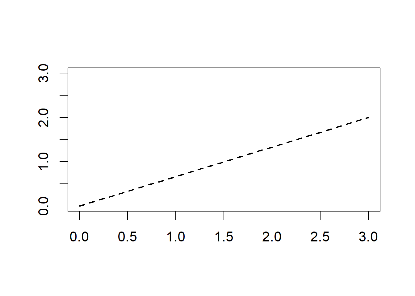
Figure 6.9: Plot with dashed line overlain.
To place a large, blue, triangle with red outline at the point (1, 1), of an existing plot I would type:
The resulting plot is shown in Fig 6.10.
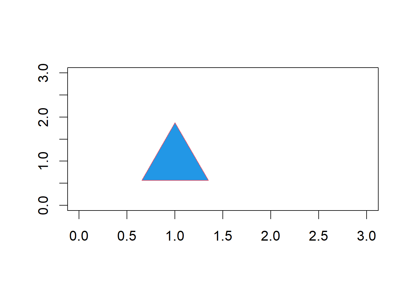
Figure 6.10: Plot with point overlain.
6.6.1 Plotting Mathematical Text
R has useful functions for the plotting of mathematical expressions. These include the Greek letters, mathematical operators, italicization, and sub- and super-scripts. mathematical text is generally called as an expression in the text argument in the functions text() or mtext(). For example, the formula for the sample variance is overlain in Fig 6.11.
plot(-1:1, -1:1, type = "n", axes = F, xlab = "", ylab = "")
varexp <- expression(over(sum(paste("(",italic(x[i] - bar(x)),")"^2),
                              italic(i)==1, italic(n)),(italic(n) - 1)))

text(x = 0, y = 0, varexp, cex = 3)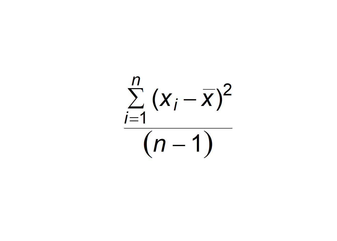
Figure 6.11: Empty plot with formula for the sample variance overlain. Type ?plotmath for more information.
6.6.2 mtext()
To place text in the margin of a plot we can use the function mtext(). As its first argument the mtext() function requires a character string to be written into the plot. The 2nd argument, side defines the plot margin to be written on: 1 = bottom, 2 =left, 3 = top, 4 = right.
For instance, to place the text "Axis 2" on the right hand axis of an existing plot, I would type:
6.7 Geometric Shapes
Geometric shapes can be drawn using a number of functions including rect() (which draws rectangles) and polygon() (which draws other polygons) based on user-supplied vertices. For instance, to place a purple rectangle with vertices at \((1,1)\), \((1,2)\), \((2,2)\), and \((2,1)\), in an existing plot, I would type:
See Fig 6.12.
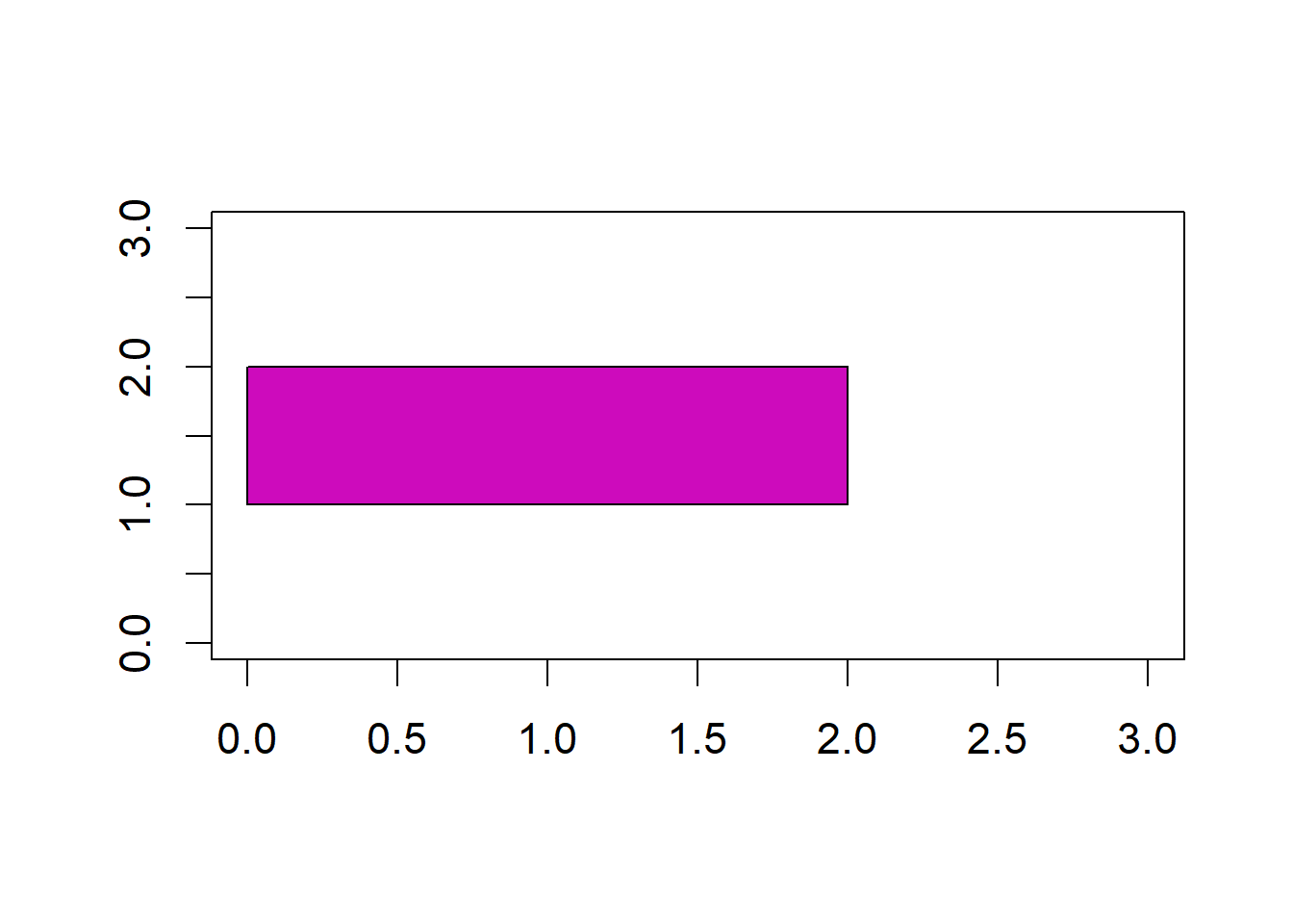
Figure 6.12: Plot with rectangle overlain.
6.8 axis()
The function axis() can be used to create new axes on a plot or to customize axis characteristics. Its first argument (side) specifies the side of the plot that the new axis will occupy 1 = bottom, 2 =left, 3 = top, 4 = right.
For instance, to create a right hand axis I would type:
Other important axis() arguments include a vector of axis labels (argument labels), and the locations of labels (argument at).
Example 6.4 \(\text{}\)
Here I create customized axes with rotated, \(x\)-axis labels, using axis() and text() (Fig 6.13).
plot(1:3, type = "n", axes = F, xlab = "", ylab = "")
axis(side = 2, at = 1:3, col = "red")
axis(side = 1, at = 1:3, labels = FALSE, col = "blue")
text(1:3, rep(.65, 3), c("Label 1", "Label 2", "Label 3"),
     srt = 50, xpd = TRUE)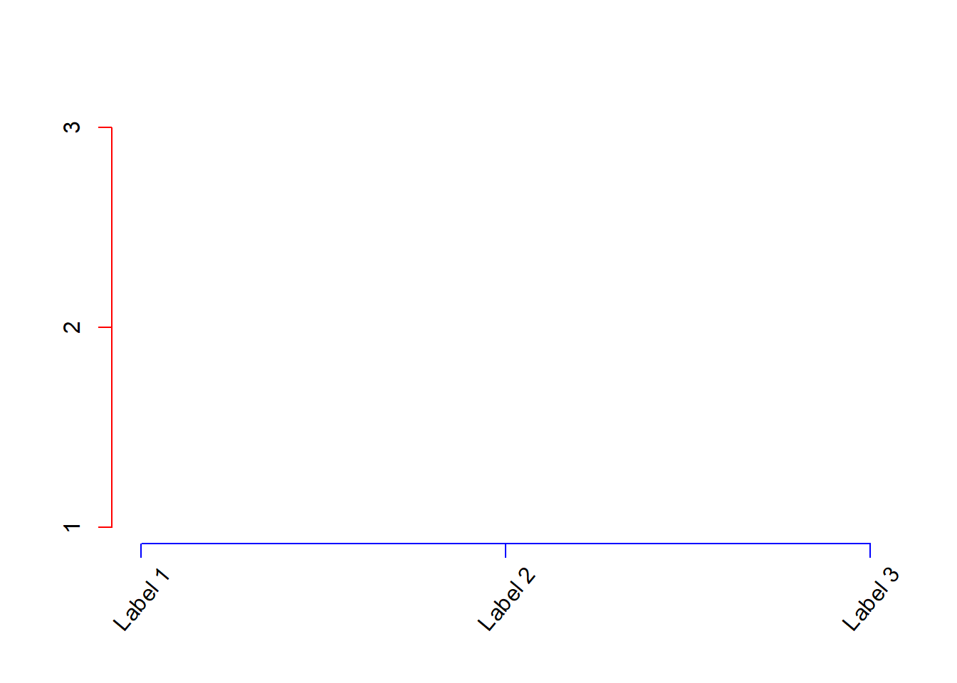
Figure 6.13: Modifying axes with axis().
The argument srt = 50 (Line 5) rotates the text 50 degrees (srt cannot be specified in mtext() or axis(), hence the use of text() here). The specification xpd = TRUE in text() (Line 5) allows text printing to extend to the plot axis margins.
\(\blacksquare\)
6.9 Font Typefaces
Font typefaces can be changed using a number of graphical functions, including par(), via the argument family. The general typeface families: "serif", "mono", and "sans", and the Hershey family of fonts (type ?Hershey for more information) are transferable across all graphics devices employed in R. To change the font in a graphical device from the default sans serif (similar to Arial) to serif (similar to Times New Roman) one
could type:
To use a Courier-type monospace font one would use.
Many other typeface families are possible, although they may not be transportable to all graphical devices and graphical storage formats.
Example 6.5 \(\text{}\)
In the code below I bring in a large number of conventional font families using a function from the Foundational and Applied Statistics for R website. These typefaces (and many others) will typically be available on Windows platform machines, although not all will be supported by non-Windows graphics devices. The result can be seen in Figure 6.14 which displays text from ninety-nine Windows typefaces.
source(url("http://www2.cose.isu.edu/~ahoken/book/win_fonts.R"))
png("fonts.png", res = 72 * 6, height = 480 * 6, width = 480 * 6)
  x <- rep(c(2.8, 6.4, 9.6), each = 33)
  y <- rep(seq(10, 0.25, by = -.2965), 3)
  font.type <- paste(rep("f", length(fonts)), 1:length(fonts), sep = "")
  par(mar = c(0.1,0.1,0.1,0.1), cex = 1.05)
  plot(0:10, type = "n", xaxt= "n", yaxt = "n", xlab = "", ylab = "",
       bty = "n")

  for(i in 1:length(fonts)){
    text(x[i],y[i], labels=fonts[i] , family = font.type[i])
  }
dev.off()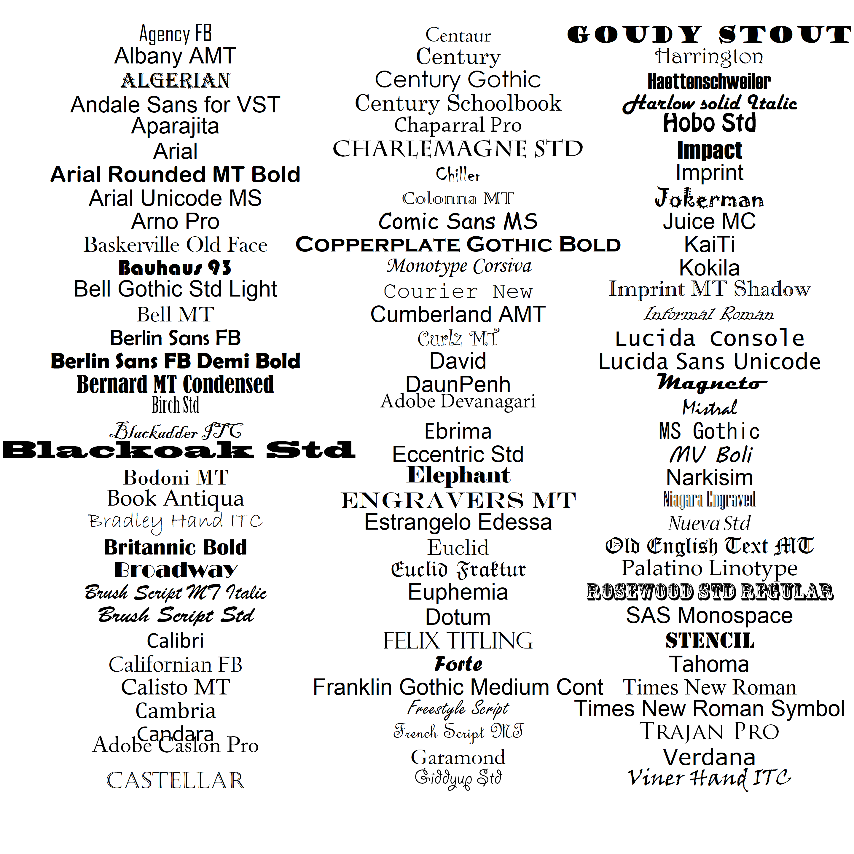
Figure 6.14: Examples of font families that can be used in R graphics.
Note that on line 2 in the code above, I use the function png() to generate a high resolution .png graphical file. Thus, running the entirety of the preceding code chunk will create the image file fonts.tiff in your working directory. To save myself from typing an inordinate amount of code, I use a for loop (see Ch 8) to place the fonts one at a time in the graphics device (lines 9-11). Output from closing the graphical device is shown on line 14-15.
Importantly, the typefaces imported from the first line of code in the chunk above will now be available for graphics functions using the Windows graphical device. To see the first six available Windows fonts one can type:
$serif
[1] "TT Times New Roman"

$sans
[1] "TT Arial"

$mono
[1] "TT Courier New"

$f1
[1] "Agency FB"

$f2
[1] "Albany AMT"

$f3
[1] "ALGERIAN"
Similarly, one can see the available fonts for PostScript and PDF graphics devices using:
[1] "serif"      "sans"       "mono"       "AvantGarde" "Bookman"
[6] "Courier"
\(\blacksquare\)
6.10 Colors
An enormous number of color choices for R graphics are possible and these can be specified in at least six different ways.
- First, we can specify colors with integers as I did in Figure 6.4. Additional varieties can be obtained by drawing color elements from the function
colors()usingcolors()[number](Fig 6.15).
e <- expand.grid(1:20, 1:32)
plot(e[,1], e[,2], bg = colors()[1:640], pch = 22, cex = 2.5, xaxt = "n",
     yaxt = "n", xlab = "", ylab = "")
text(e[,1], e[,2], 1:640, cex = .4)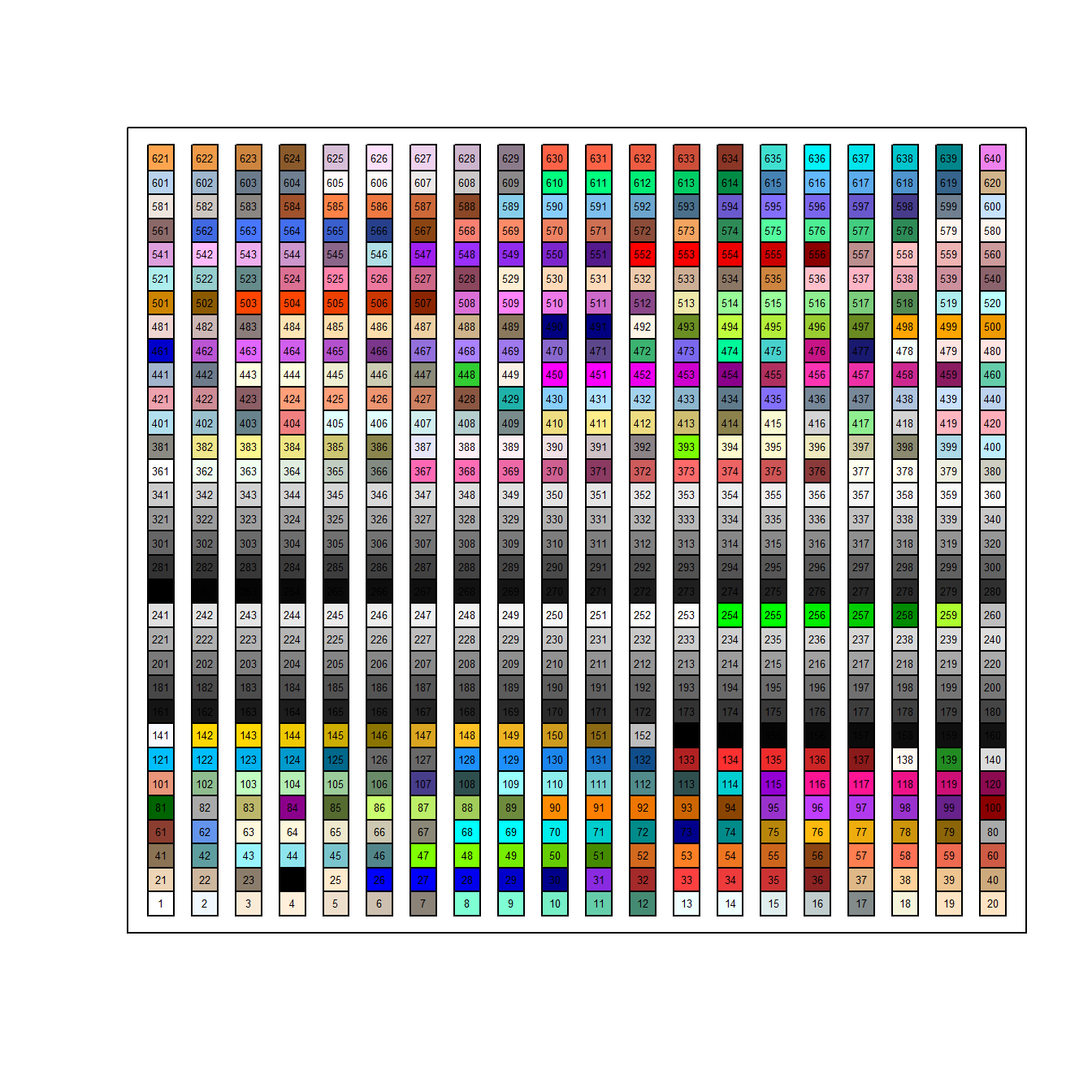
Figure 6.15: Color choices from colors()
The function expand.grid() creates a dataframe from all combinations of user-supplied supplied vectors. Note that these combinations are used as coordinates in plot().
Second, we can specify colors using actual color names, e.g.,
"white","red","yellow". For a visual display of essentially all the available named colors in R type:example(colors).Third, we can define colors by requesting red green and blue (RGB) color intensities, along with transparency, using the function
rgb()(Fig 6.16). Usable light intensities can be made to vary individually from 0 to 255 (i.e., within an 8 bit format). Thus, there are \(255^4 = 4,228,250,625\) possiblergb()color combinations. By default,redgreen,blue, andalpha(transparency) arguments inrgb()are defined to be in (0, 1).
plot(1:10, cex = 15, pch = 19, xlab = "", ylab = "",
     col = rgb(red = rep(0.2,10), green = rep(0.5,10),
               blue = rep(0.8,10),
               alpha = seq(0.05,1, length = 10)), axes = F)
box()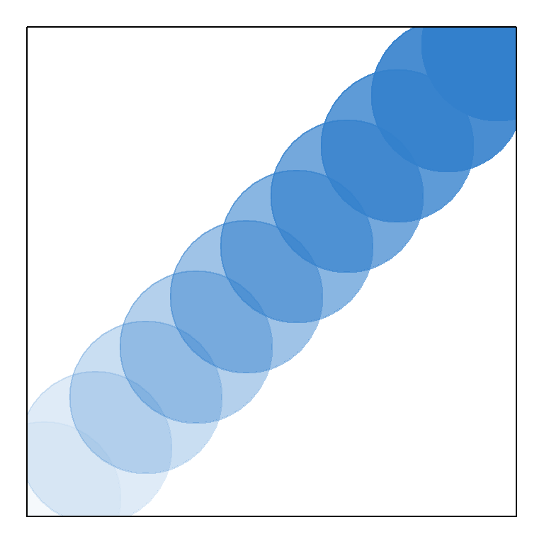
Figure 6.16: Demonstration of rgb(), emphasizing changes in transparency.
Note the use of box() on line 5, which places a box around the plot.
Fourth, similar to
rgb(), we can specify colors using the functionhcl()which controls hues, chroma, and luminescence and transparency (see Fig 6.17).Fifth, we can define colors using hexadecimal codes5, e.g., blue =
"#0000FF".Sixth, we can specify colors using palettes. Figure 6.17 shows six pie plots. Each pie plot uses a different pre-defined color palette. Each pie slice from each pie represents a distinct segment of a distinct palette.
layout(matrix(seq(1,6),3,2))
par(mar=c(1,1,1,1))
pie(rep(1,12), col = rainbow(12), main = "Rainbow colors")
pie(rep(1,12), col = heat.colors(12), main = "Heat colors")
pie(rep(1,12), col = topo.colors(12), main = "Topographic colors")
pie(rep(1,12), col = gray(seq(0,1,1/12)), main = "Gray colors")
pie(rep(1,12), col = hcl(h=seq(180,0, length=12)),
    main = "Cols from hcl hue")
pie(rep(1,12), col = hcl(h=seq(360,180,length=12)),
    main = "Cols from chroma")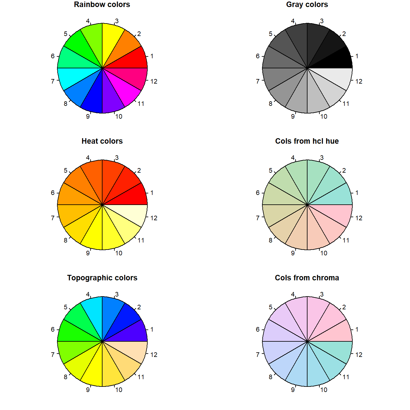
Figure 6.17: Examples of color palettes in R. Numbers do not correspond to actual color type designations.
Note that the functions rainbow(), heat.colors(), topo.colors() (Lines 3-6) only require an integer specification requesting the number of colors within a particular palette. For instance
[1] "#FF0000" "#CCFF00" "#00FF66" "#0066FF" "#CC00FF"Note that the colors in rainbow() are given in a hexidecimal format.
The function palette() can be used to check and define a number of useful palettes. Colors in the current palette can be obtained by typing:
[1] "black"   "#DF536B" "#61D04F" "#2297E6" "#28E2E5" "#CD0BBC" "#F5C710"
[8] "gray62"
A list of predefined palettes in palette() can be obtained by typing:
 [1] "R3"              "R4"              "ggplot2"
 [4] "Okabe-Ito"       "Accent"          "Dark 2"
 [7] "Paired"          "Pastel 1"        "Pastel 2"
[10] "Set 1"           "Set 2"           "Set 3"
[13] "Tableau 10"      "Classic Tableau" "Polychrome 36"
[16] "Alphabet"
To define the current palette to be the one used by the ggplot2 package (Ch 7), I could type: palette("ggplot2").
A large number of useful pre-defined palettes (including color-blind-safe palettes) can be obtained using the package RColorBrewer (Fig 6.18).
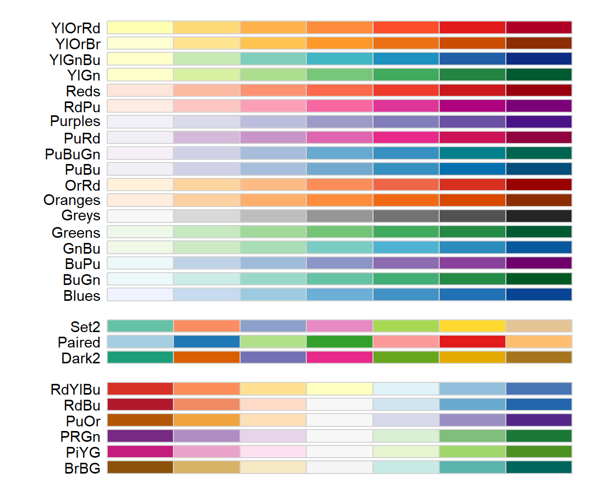
Figure 6.18: RColorBrewer color-blind-safe, seven category palettes. Top palettes are so-called ‘sequential’ palettes, middle palettes are ‘qualitative’, and bottom palettes are ‘divergent’.
Here are the hexadecimal names for the “Set2” palette chunks in Figure 6.18.
[1] "#66C2A5" "#FC8D62" "#8DA0CB" "#E78AC3" "#A6D854" "#FFD92F" "#E5C494"Customized palettes can be generated using the colorRamp() function which returns functions that “interpolate a set of given colors to create new color palettes.” Important colorRampPaltette() arguments include:
two required arguments.
colorsdefines colors to interpolate.biasa positive number that controls distinctions among interpolated colors. Larger values indicated greater differences.spaceone of"RGB"or"Lab", indicating whether RGB or CIELAB6 color spaces are to be used in interpolations.
Here I generate and plot a 15 color palette interpolated from the colors red and blue (Fig 6.19).
crp <- colorRampPalette(colors = c("red", "blue"))(15)
plot(1:15, pch = 19, cex = 5, col = crp, axes = F, xlab = "", ylab = "")
box()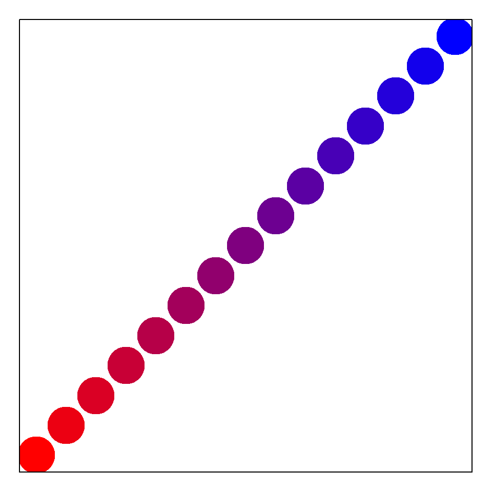
Figure 6.19: Color palette generated by the function colorRampPalette().
The function box() (Line 3) places a box around the figure whose axes and axis labels I have intentionally omitted.
There are a number of packages for the generation of customized palettes. My current favorite is colorspace and its interactive function hclwizard(), which generates the shiny GUI (Ch 11) shown in Fig 6.20.
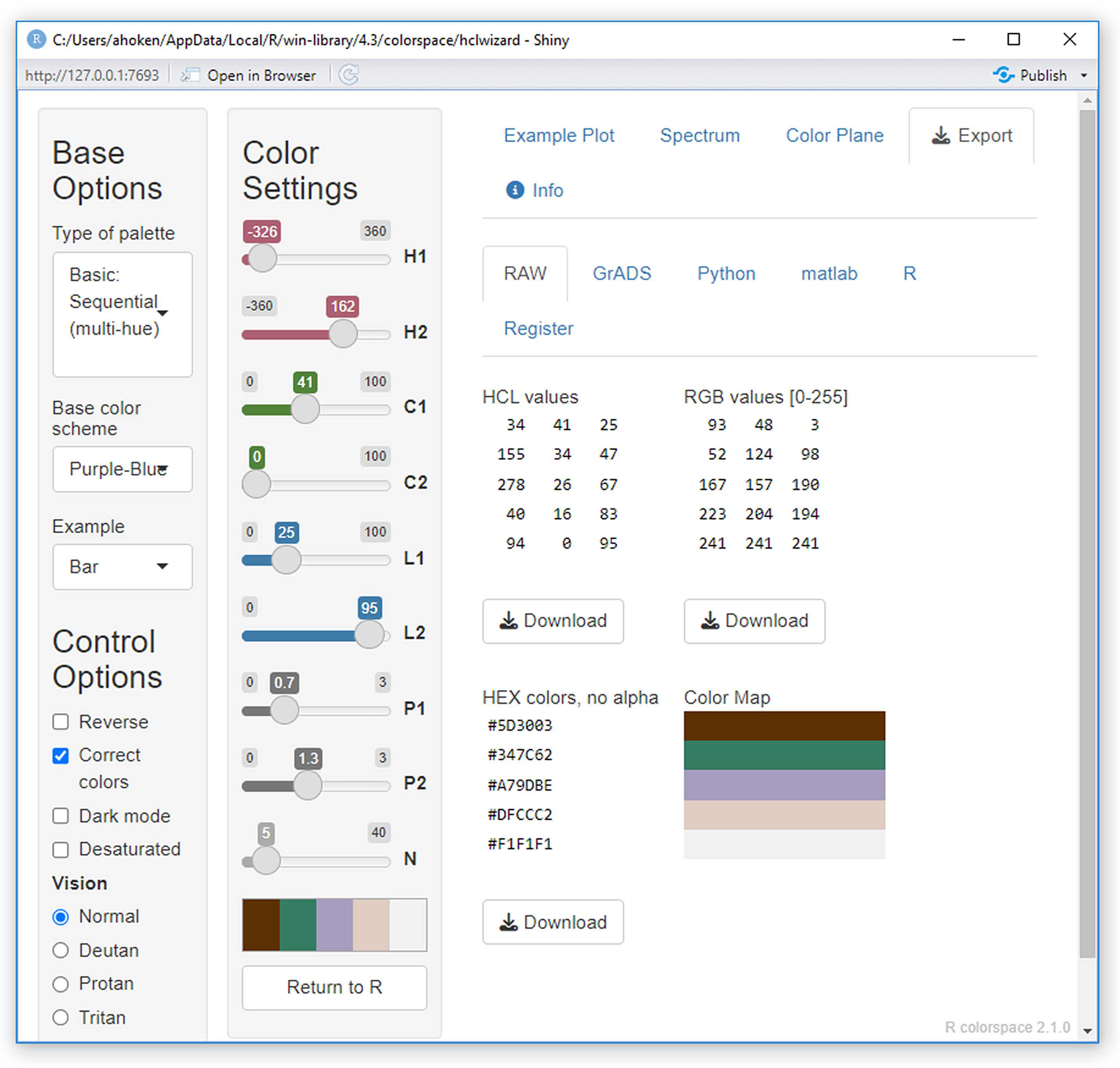
Figure 6.20: A GUI for constructed customized palettes generating by the function colorspace::hclwizard().
6.11 Scatterplots
Scatterplots project points at the intersection of paired observations describing two quantitative variables. Thus, scatterplots are often presented in conjunction with simple regression analyses (Aho 2014).
Example 6.6 \(\text{}\)
As an example of scatterplot usage we will use the Loblolly dataset in the package datasets. Figure 6.21 allows visualization of the relationship of loblolly pine tree age and tree height.
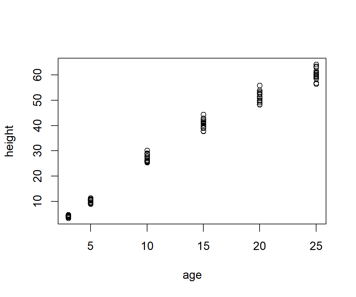
Figure 6.21: Scatterplot of height and age from the Loblolly pine tree dataset.
Now let’s fit a simple linear regression for loblolly pine height as a function of age. A regression line will show the best possible linear fit for a response variable as a function of an quantitative explanatory variable (Aho 2014). The R function for a linear model is lm(). It encompasses and allows a huge number of statistical procedures, including regression (see Chs. 9-11 in (Aho 2014)). We have:
Note that in the first argument of lm() we define height to be a function of age using the tilde operator. Objects of class lm have their ownsummary function. This can be called by simply typing:
Call:
lm(formula = height ~ age, data = Loblolly)

Residuals:
    Min      1Q  Median      3Q     Max
-7.0207 -2.1672 -0.4391  2.0539  6.8545

Coefficients:
            Estimate Std. Error t value Pr(>|t|)
(Intercept) -1.31240    0.62183  -2.111   0.0379 *
age          2.59052    0.04094  63.272   <2e-16 ***
---
Signif. codes:  0 '***' 0.001 '**' 0.01 '*' 0.05 '.' 0.1 ' ' 1

Residual standard error: 2.947 on 82 degrees of freedom
Multiple R-squared:  0.9799,    Adjusted R-squared:  0.9797
F-statistic:  4003 on 1 and 82 DF,  p-value: < 2.2e-16
The output shows us the Y-intercept, -1.31240, and slope, 2.59052, of the fitted regression line, and results from null hypothesis tests, along with a lot of other information.
The abline() function allows the plotting of a line over an existing plot. The first two arguments for abline() are the Y-intercept and slope (Fig 6.22).
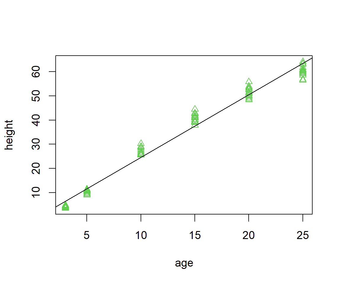
Figure 6.22: Scatterplot with fit overlain.
Note that we could have gotten the same result using abline(ha.lm).
Finally, we can overlay a 95% confidence interval for the true regression fitted value (see Aho (2014), Ch 9) using the function predict.lm() (Fig 6.23)
ci <- predict(ha.lm, interval = "confidence")

o <- order(Loblolly$age)
ageo <- Loblolly$age[o]
cio <- ci[o,]

with(Loblolly, plot(age, height, pch=19, col=1))
abline(-1.312396, 2.590523)
points(ageo, cio[,2], type = "l", col = "gray") # lower CI bound
points(ageo, cio[,3], type = "l", col = "gray") # upper CI bound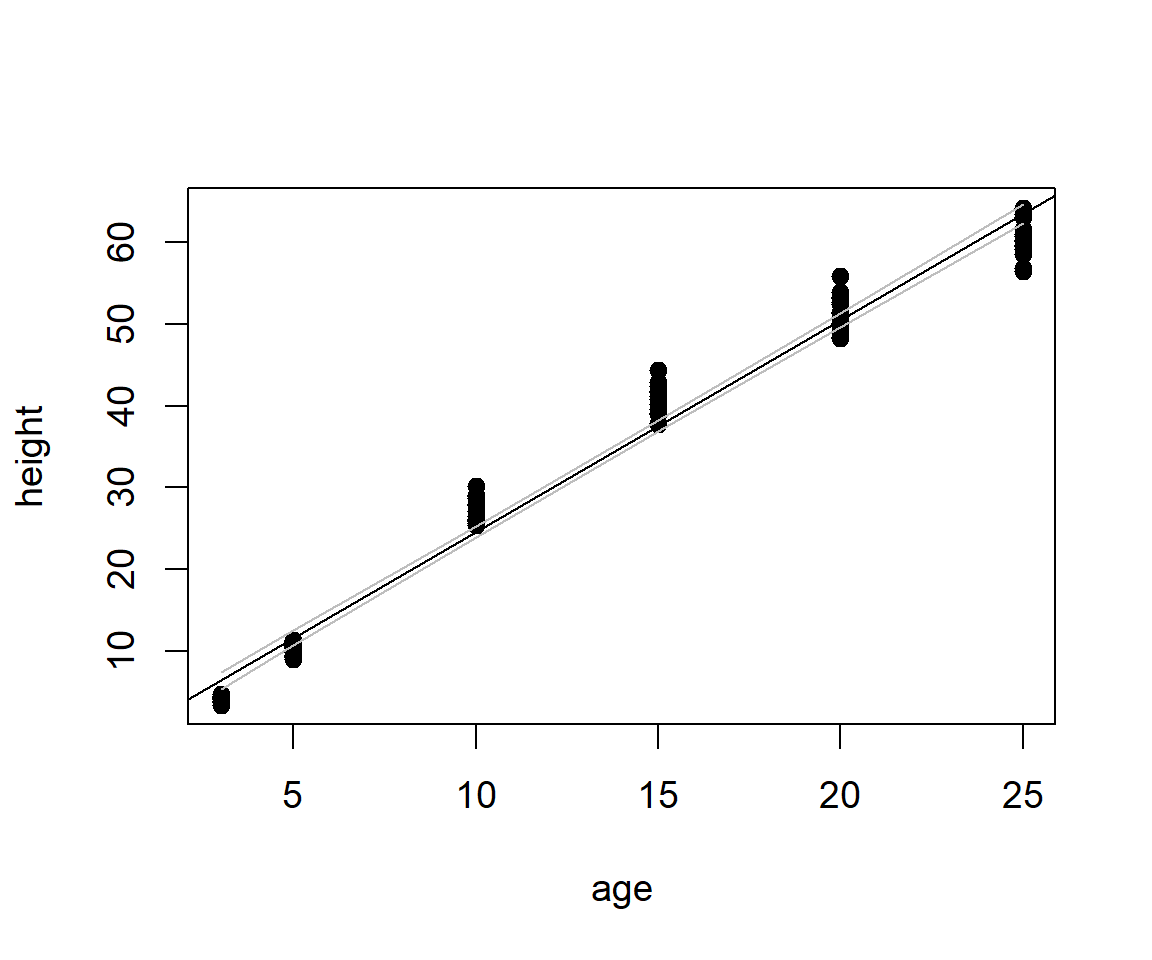
Figure 6.23: Scatterplot with confidence interval for the true mean of \(y\) given \(x\), overlain.
The object ci, created on Line 1, is a dataframe containing fits, and corresponding lower and upper confidence interval bounds. The ordering of \(x\)-axis values is established on Line 3 to allow creation of lines that look like functions of \(x\). This ordering is applied to Cartesian coordinates on Lines 4-5.
\(\blacksquare\)
6.12 Transformations
Importantly, plot() allows straightforward application of log transformations to axes. For instance, to apply a \(\log_e\) transformation to the \(x\)-axis or \(y\)-axis I could use log = "x" or log = "y", respectively (Fig 6.24).
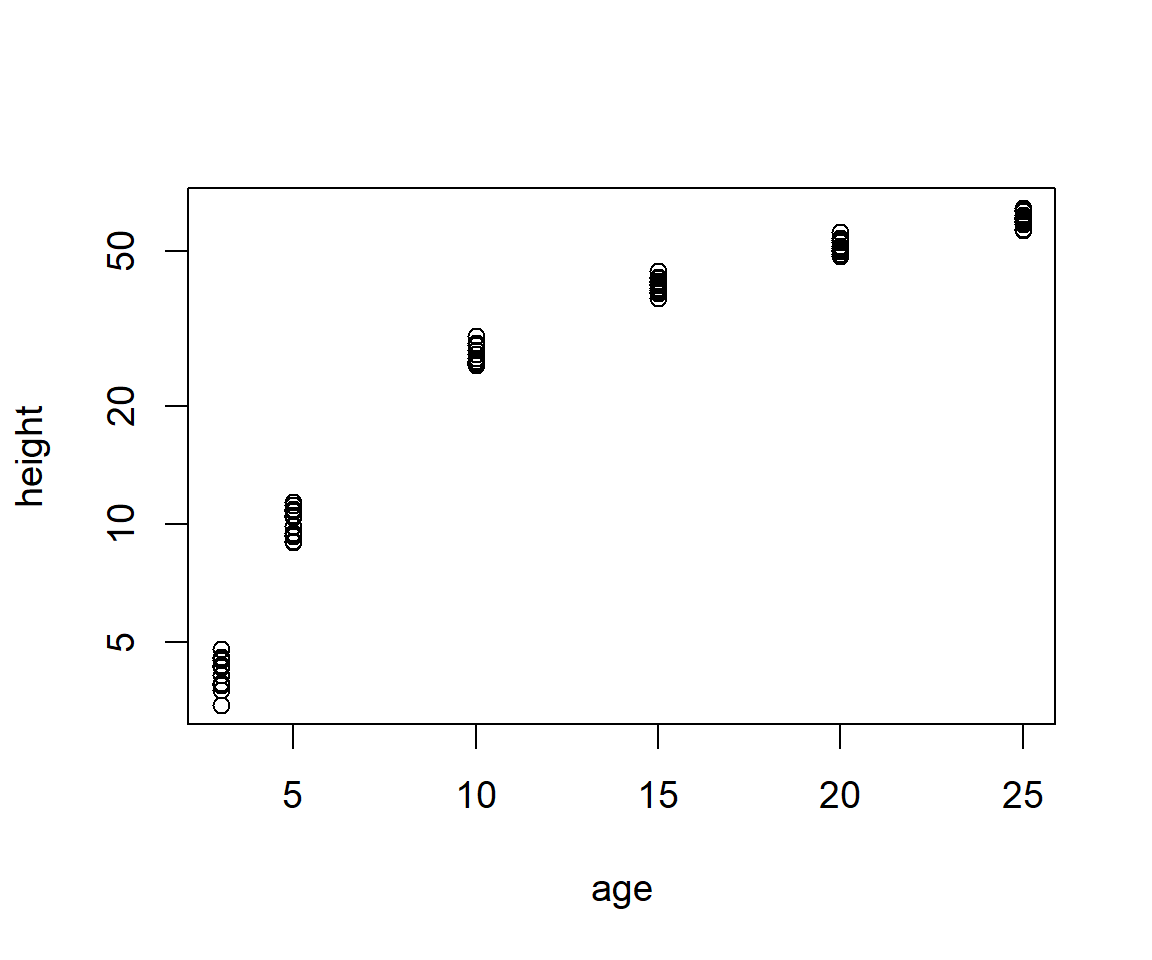
Figure 6.24: Graphical \(\log_e\) transformation of the height axis from a scatterplot of the Loblolly pine tree dataset.
6.13 Multiple Plots
As shown earlier, multiple graphs can be placed in a graphics device using the mfrow or mfcol argument in par(). In this section I will try to incorporate a number of the functions discussed so far, including plot(), par(), mathematical formulae with text(), points(), shapes rending with rect(), colors() axis(), and mtext().
Example 6.7 \(\text{}\)
The dataframe C.isotope in package asbio describes variations in \(\delta ^{14}\)C over time in La Jolla California. The term \(\delta ^{14}C\) describes the ratio of carbon 14 to carbon 12 (\(^{14}\)C is unstable, while \(^{12}\)C is a stable isotope of carbon) compared to a standard ratio. We will create a figure with four subplots, with the following characteristics:
- It will have dimensions 8” x 7”.
- The outer margins (in number of lines) will be bottom = 0.1, left = 0.1, top = 0, right = 0.
- The inner margins (for each plot) will be bottom = 4, left = 4.4, top = 2, right = 2. The plot margins will be light gray. We can specify gray gradations with the function.
- The first plot will show \(\delta ^{14}\)C as a function of date. The plotting area will be dark gray, i.e.,
colors()[181]. Points will be white circles with a black border. - The second plot will be a line plot of atmospheric carbon as a function of date. It will have a light green plotting area:
colors()[363]. - The third plot will be a scatterplot of \(\delta ^{14}\)C as a function of atmospheric C. Points will be yellow circles with a black border. The plotting area will be light red:
colors()[580]. - The fourth plot will show the sample variance for atmospheric carbon in the time series. It will have a custom (albeit meaningless) axis, created with
axis(), with the labels:a,b,c, andd. It will also have a horizontal axis label inserted withmtext().
The result is shown in Fig 6.25.
library(asbio)
data(C.isotope)
dev.new(height = 8, width = 7)
op <- par(mfrow = c(2, 2), oma = c(0.1, 0.1, 0, 0), mar = c(4, 4.4, 2, 2),
          bg = gray(.97))
#-------------------------------- plot 1 -------------------------------#
with(C.isotope, plot(Decimal.date, D14C, xlab = "Date", ylab =
                       expression(paste(delta^14,"C (per mille)")),
                     type = "n"))

rect(par("usr")[1], par("usr")[3], par("usr")[2], par("usr")[4],
     col = colors()[181])

with(C.isotope, points(Decimal.date, D14C, pch = 21, bg = "white"))

#-------------------------------- plot 2 -------------------------------#
with(C.isotope, plot(Decimal.date, CO2, xlab = "Date", ylab =
                       expression(paste(CO[2]," (ppm)")),
                     type = "n"))

rect(par("usr")[1], par("usr")[3], par("usr")[2], par("usr")[4],
     col = colors()[363])

with(C.isotope, points(Decimal.date, CO2, type = "l"))

#-------------------------------- plot 3 -------------------------------#
with(C.isotope, plot(CO2, D14C, xlab = expression(paste(CO[2], " (ppm)")),
                     ylab = expression(paste(delta^14,"C (per mille)")),
                     type = "n"))

rect(par("usr")[1], par("usr")[3], par("usr")[2], par("usr")[4],
     col = colors()[580])

with(C.isotope, points(CO2, D14C, pch = 21, bg = "yellow"))

#-------------------------------- plot 4 -------------------------------#
plot(1:10, 1:10, xlab = "", ylab = "", xaxt = "n", yaxt = "n",
     type = "n")

rect(par("usr")[1], par("usr")[3], par("usr")[2], par("usr")[4],
     col = "white")
text(5.5, 5.5, expression(paste(over(
  sum(paste("(",italic(x[i] - bar(x)),")"^2),
      italic(i)==1, italic(n)),(italic(n) - 1))," = 78.4")),
  cex = 1.5)
axis(side = 1, at = c(2, 4, 6, 8), labels = c("a", "b", "c", "d"))
mtext(side = 1,
      expression(paste("Variance of ", CO[2], " concentration")),
      line = 3)
par(op)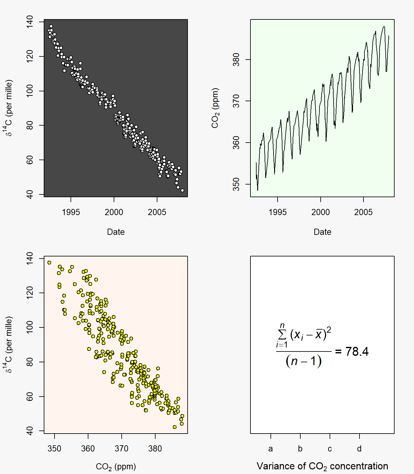
Figure 6.25: Figure resulting from summative example code.
\(\blacksquare\)
6.14 Histograms
Histograms are vital for considering the distributional characteristics of quantitative data. They consist of rectangles whose height is proportional or equivalent to the frequency of particular numeric intervals (bins) describing that variable.
Example 6.8 \(\text{}\)
The brycesite dataset from package labdsv consists of environmental variables recorded at, or calculated for, each of 160 plots in Bryce Canyon National Park in Southern Utah.
The histogram in Fig 6.26 shows the distribution of the aspect (in degrees) of sites in the dataset.
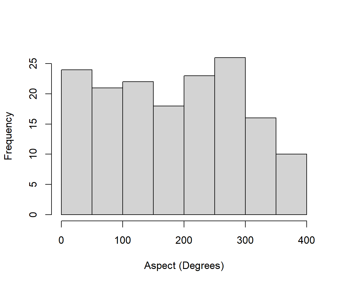
Figure 6.26: Histogram of raw aspect measures from the brycesite dataset.
The distribution appears remarkably uniform.
Consideration of raw aspect values in analyses is problematic because the measurements are circular. As a result the values 1 and 360 are numerically 359 units apart, although they in fact only differ by one degree. One solution is to use the transformation \([1 - \cos(\text{aspect}^{\text{o}} - 45)]/2\). This index will have highest values on southwest slopes (at 225 degrees), and lowest values on northeast facing slopes (at 45 degrees). This acknowledges the fact that highest temperatures in the Northern Hemisphere occur on Southwest facing slopes because they receive ambient warming during the morning, coupled with late afternoon direct radiation. We have:
Fig 6.27 shows the distribution of the transformed aspects which now appears bimodal.
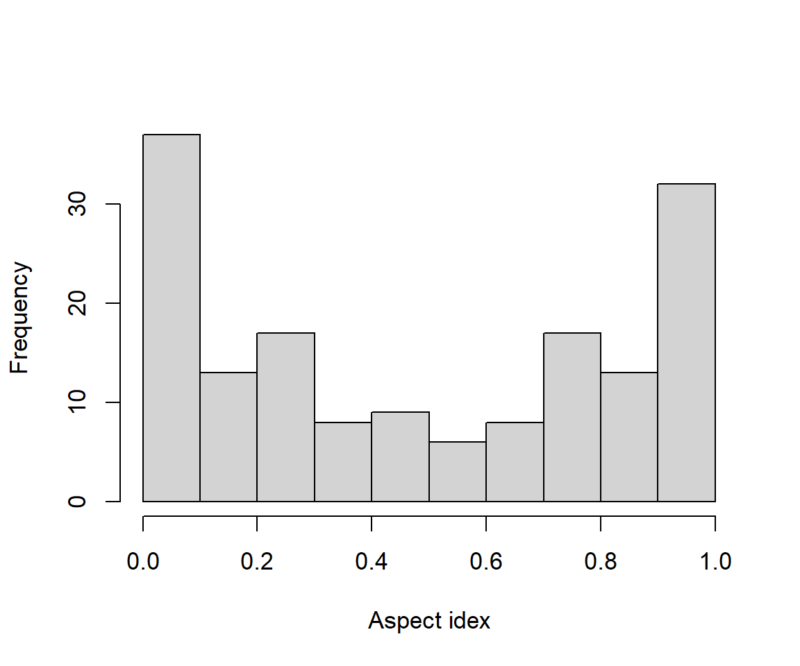
Figure 6.27: Histogram of transformed aspect measures from the brycesite dataset.
\(\blacksquare\)
6.15 Controlling Graphical Features using Vectors
It is often useful to add information to graphical elements using a variable.
Example 6.9 \(\text{}\)
The brycesite contains information on incident radiation received by sites, measured in Langleys. A Langley (Ly) is a measure of energy per unit area, per unit time. To be precise, one Ly = 1 calorie m\(^{-2}\) min\(^{-1}\). In SI units 1Ly = 41840.00 J m\(^{-2}\). Fig 6.28 is a scatterplot of Langleys as a function of aspect index values. In addition five topographic positions from are distinguished using both point color and shape. For clarity I also create a legend. Note that ridge top sites have mostly northeastern aspect, and hence have lower radiation inputs.
with(brycesite, plot(asp.val, annrad, xlab = "Aspect value",
                     ylab = "Annual radiation (Langleys)",
                     col = as.numeric(pos), pch = as.numeric(pos)))

legend("bottomright", legend = levels(brycesite$pos), pch = 1:5, col = 1:5)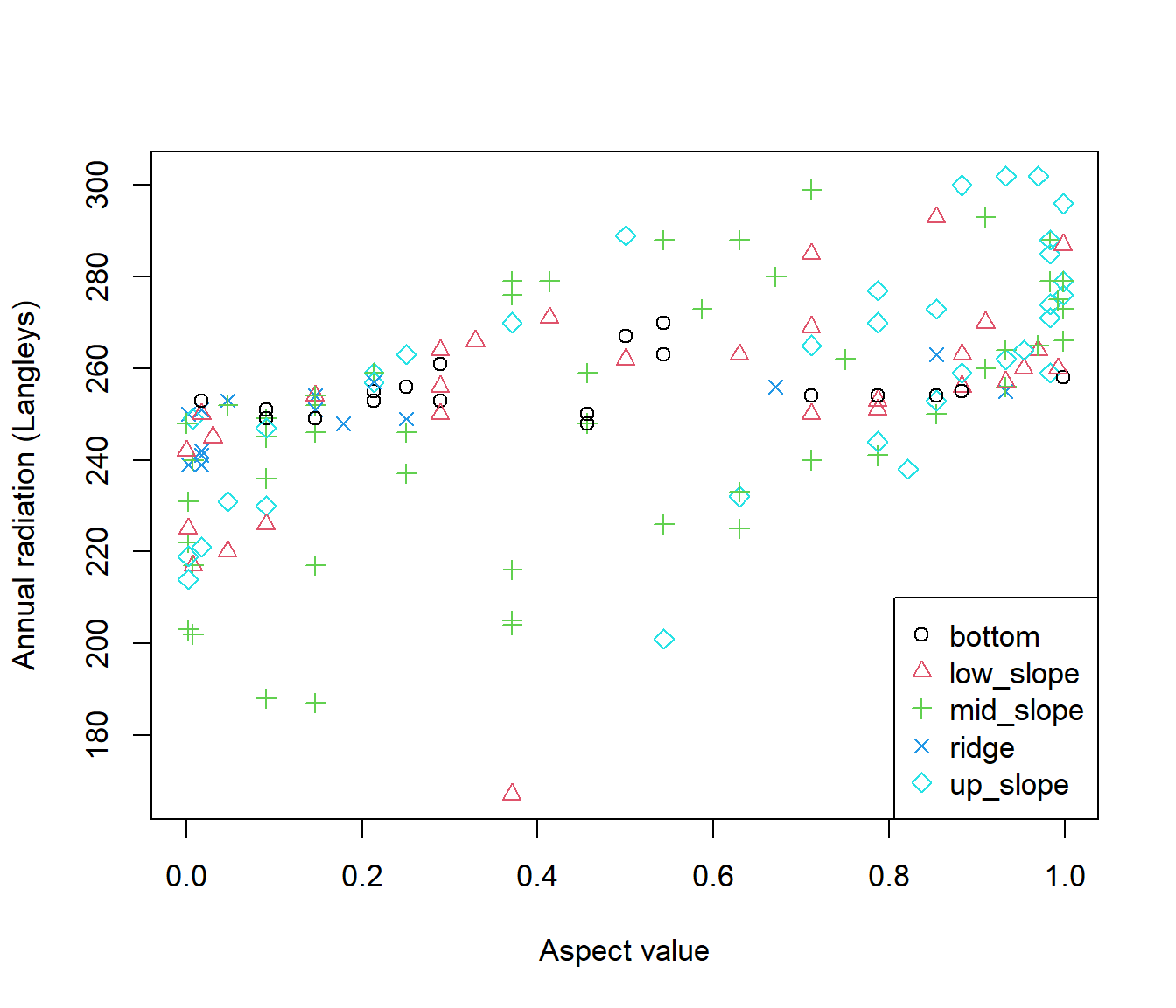
Figure 6.28: Scatterplot of aspect index value versus annual radiation with topographic positions indicated from the brycesite dataset.
Note that to assign colors and plotting characters appropriately, I coerce the categorical topographic position vector, brycesite$pos, to be numeric with as.numeric() (Line 3). The result is:
  [1] 4 3 3 4 5 3 3 5 3 3 2 2 3 4 3 3 3 1 2 2 2 5 4 4 3 5 4 3 5 3 5 3 2 5 5
 [36] 4 1 1 2 4 4 3 3 3 3 4 3 5 3 3 3 2 5 3 5 3 3 5 5 4 3 3 5 2 3 3 5 2 2 5
 [71] 2 2 3 3 3 2 2 3 3 2 4 3 4 2 5 3 3 2 2 3 5 5 3 5 5 3 3 3 3 5 5 3 3 3 3
[106] 5 1 2 4 1 2 1 2 3 5 1 5 3 3 3 3 1 3 2 2 5 2 1 2 2 1 2 1 1 1 1 1 1 2 1
[141] 1 4 5 5 5 4 5 2 2 4 1 5 5 5 3 2 2 1 5 4
Ones correspond to the first alphanumeric level in pos, bottom, whereas fives correspond to the last alphanumeric level, up_slope. The color and symbols assignments are made within the plot on Line three. Base graphics legends can be created using the function legend() (Line 5). The first argument(s) will be a specific x, y position in the plot for the legend, or one of: "bottomright", "bottom", "bottomleft", "left", "topleft", "top", "topright", "right", or "center". The legend argument names the categories to be depicted. The function levels() used in the legend argument lists the categories in a vector of class factor, alphanumerically.
\(\blacksquare\)
6.16 Secondary Axes
For many graphical summaries it may be necessary to add additional axes. For base graphics this will involve laying one plot on top of another, by specifying par(new = TRUE), and defining axes = FALSE, and depending on whether we want extra vertical or horizontal axes, xlab = FALSE or ylab = FALSE, and ylab = "" or xlab = "" in the arguments of the second plot.
Example 6.10 \(\text{}\)
In this example I make a scatterplot that considers both brycesite annual radiation and annual growing season radiation as a function of aspect value (Fig 6.29).
op <- par(mar = c(5,4.5,1,4.5), cex = 1.2)
with(brycesite, plot(asp.val, annrad, xlab = "Aspect value",
                     ylab = "Annual radiation (Langleys)"))
par(new = TRUE)
with(brycesite, plot(asp.val, grorad, pch = 19, axes = FALSE, xlab = "",
                     ylab = ""))
axis(4)
mtext(side = 4,"Growing season radiation (Langleys)", line = 3, cex = 1.2)
legend("bottomright", pch=c(1, 19), legend = c("Annual radiation",
                                            "Growing season radiation"))
par(op)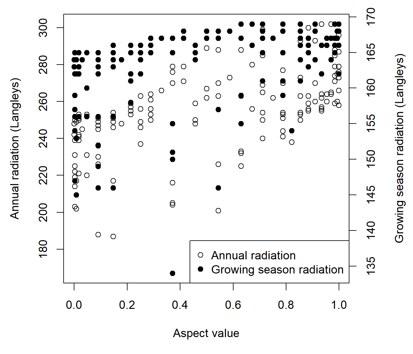
Figure 6.29: Scatterplot of annual radiation and growing season radiation as function of the aspect value index for the brycesite dataset.
Note the extra room given to the right hand margin (Line 1) to contain a labeling for a secondary vertical axis. The code par(new = TRUE) (Line 4) tells R not to clean the graphical device before drawing a new plot. The code axis(4) (Line 7) creates labeling for the right hand axis. The argument axes = FALSE in the second plot, suppresses default plot plotting of axis units on the left and bottom axes.
\(\blacksquare\)
6.17 Barplots
Barplots are frequently used to compare single number summaries (e.g., sum, median, mean, etc.) of categorical levels.
Example 6.11 \(\text{}\)
Of great concern to both citizens and scientists are rising global levels of atmospheric greenhouse gasses. Atmospheric CO\(_2\) concentrations have increased more than 40% since the start of the industrial revolution while the more potent greenhouse gasses CH\(_4\) and NO\(_2\) have increased approximately 150% and 23%, respectively (Brinkmann 2009). We will take a detailed look at recent global patterns of CO\(_2\) emissions and human population numbers in this example, while creating different sorts of barplots, and applying some of the data management techniques introduced in Chapter 4. Tidyverse data management approaches will be used for creating ggplot2 graphics in Chapter 4. We will use the world.emissions dataframe from asbio as our data source.
library(asbio)
data(world.emissions)

nred <- world.emissions[world.emissions$continent != "Redundant",]
co2 <- with(nred, tapply(co2, country, function(x){mean(x, na.rm = T)}))
n <- with(nred, tapply(co2, country, function(x){length(x)}))

co2n <- data.frame(cbind(co2, n))
co2n.sub <- co2n[which(row.names(co2) %in% c("Canada", "China", "Finland",
"Japan", "Kenya", "United States")),]

labels <- paste(rownames(co2n.sub), " (", co2n.sub$n, ")", sep = "")
In the code above, CO\(_2\) annual means and sample sizes for each country are computed on Lines 4-5. A subset dataset of six countries is created on Lines 7-8. Country names for this subset and the number of years of data collection are combined in an object called labels on Line 10. Here is the barplot code.
cols <- c("#5D3003","#347C62","#A79DBE","#DFCCC2","#994E58", "#F1F1F1")
barplot(co2n.sub$co2, las = 2, ylab = "", yaxt = "n", names = labels,
        log = "y", col = cols)
axis(2)
mtext(side = 2,
      expression(paste(CO[2], " Emissions (metric tons x ", 10^6, ")")),
      line = 2.5)
The color palette on Line 1 in the code above was generated using colorspace::hclwizard(). Note that rotated x-axis labels (las = 2) and log-scale y-axis are are specified on the call to barplot() on Lines 2-3. A customized y-axis is constructed on Lines 4-7. This is done largely to force the axis tick labels to be have a default vertical format. They would be vertical otherwise because of the use of las = 2 in barplot(). Figure 6.30 shows the shows the final result.
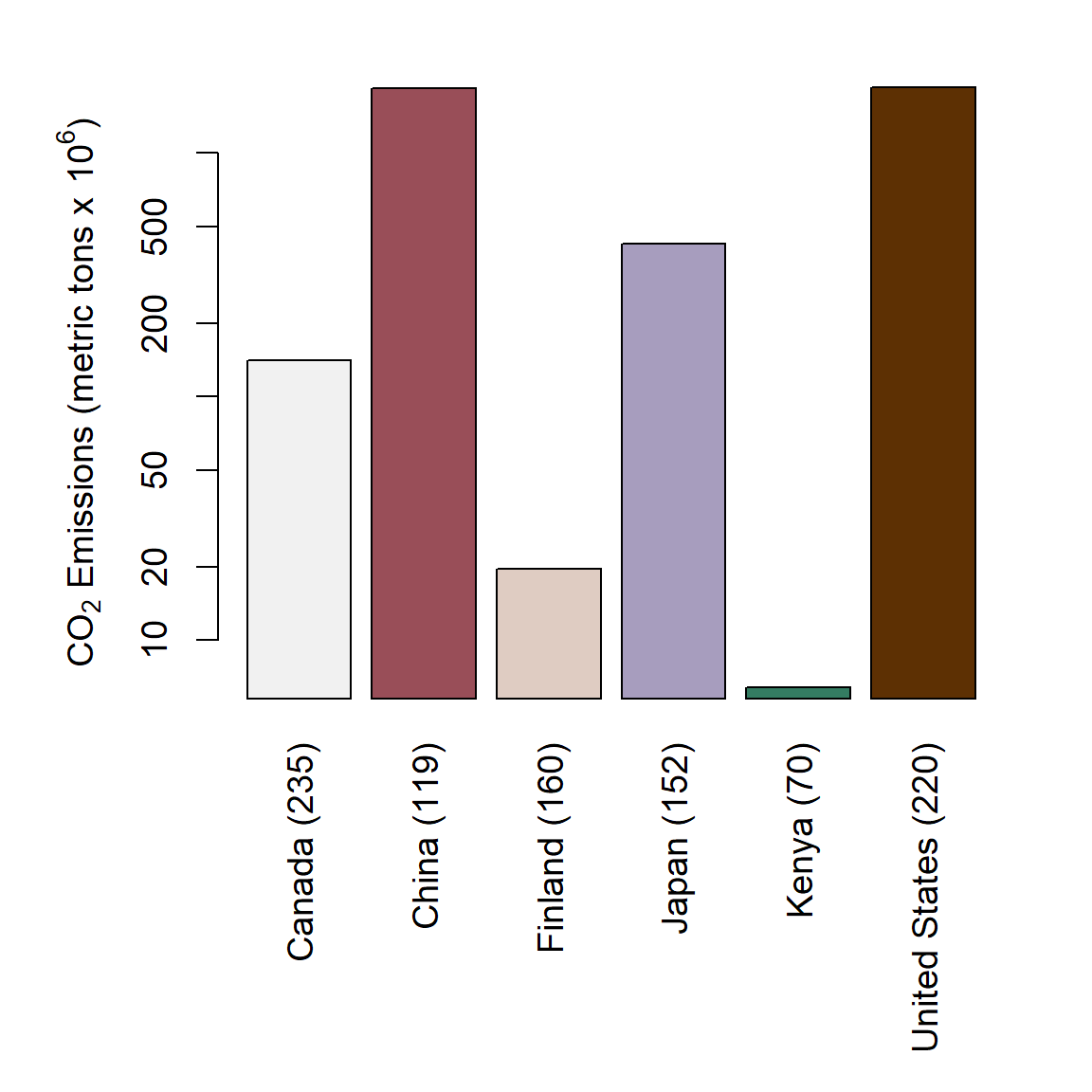
Figure 6.30: Barplot of mean annual CO\(_2\) emmission levels for six countries. Number of years used in computing means indicated in parentheses.
To depict trends since the year 2000, we can use a stacked barplot (Fig 6.31), or a side by side barplot (Fig 6.32) by applying barplot() to a matrix with columns representing categories.
In the code below we subset the data by country (Lines 1-4) and year (Line 6), and create a dataframe containing CO\(_2\) and country data (line 8), which is converted to a wide format matrix using unstack() (Line 9).
csub <- world.emissions[
  which(world.emissions$country %in%
          c("Canada", "China", "Finland",
            "Japan", "Kenya", "United States")),]

ysub <- csub[which(csub$year >= 2000),]

dat <- data.frame(co2 = ysub$co2, country = ysub$country)
dat1 <- as.matrix(unstack(dat))
In the code below, hexadecimal colors generated by colorspace::hclwizard() are brought in (Line 1) and modified, i.e., unlisted, coerced to be a character vector and reversed (Line 2), preceding creation of the barplot (Lines 4-8).
cols <- read.table("colormap_hex.txt") # file from hclwizard()
cols <- rev(as.character(unlist(cols)))

barplot(dat1, log = "y", col = cols, yaxt = "n", las = 2, names = labels)
axis(2)
mtext(side = 2,
      expression(paste(CO[2], " Emissions (metric tons x ", 10^6, ")")),
      line = 2.5, cex = 1.2)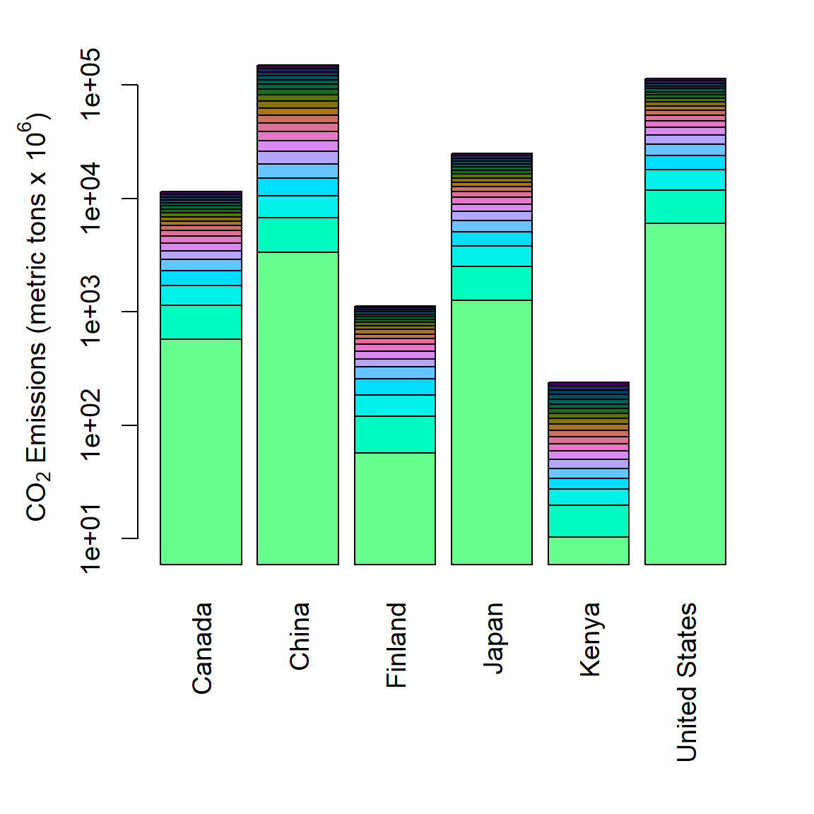
Figure 6.31: Stacked barplot of mean annual CO\(_2\) emmission levels for six countries from 2000-2019.
Side by side barplots are generated by specifying beside = TRUE in barplot() (Line 2 in code below).
barplot(dat1, log = "y", beside = TRUE, col = cols, yaxt = "n", las = 2)

axis(2)
mtext(side = 2,
      expression(paste(CO[2], " Emissions (metric tons x ", 10^6, ")")),
      line = 2.5, cex = 1.2)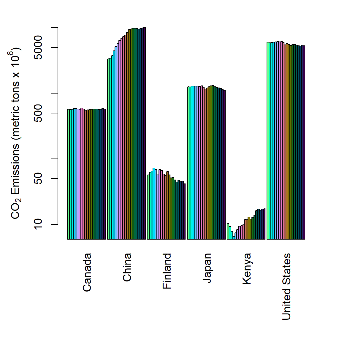
Figure 6.32: Side by side barplot of mean annual CO\(_2\) emmission levels for six countries from 2000-2019.
\(\blacksquare\)
6.18 Boxplots
Boxplots or box and whisker plots and their variants are an excellent way to quickly summarize and compare the distributions of levels in a categorical variable with respect to a quantitative variable. The function boxplot() does this by graphically providing a five number summary for factor levels (Fig 6.33). Specifically, the upper and lower hinges of boxes from boxplot show the 1st and 3rd quartiles (thus the box contains the central 50% of the data). The black stripe in the middle of each box shows the median. The whiskers extend to the most extreme data point which is no more than coef times the length of the box away from a hinge, where coef is defined in the arguments for boxplot() (by default coef = 1.5). Circle symbols outside of whiskers can be considered outliers (cf., Tukey et al. 1977).
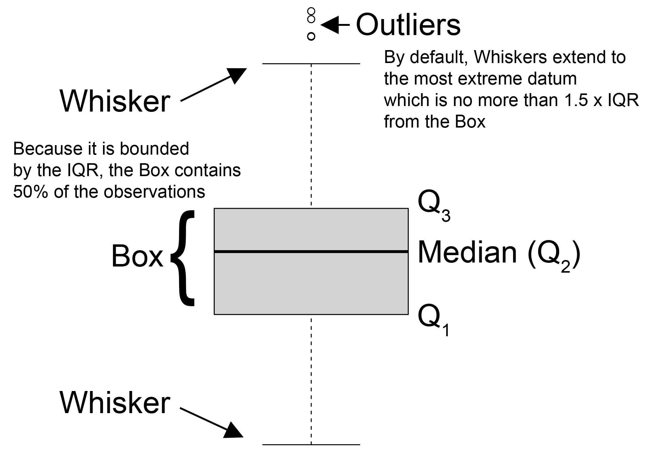
Figure 6.33: A summary of boxplot characteristics.
Example 6.12 \(\text{}\)
Here we reconsider the world.emissions data using boxplots. Recall our approach from the previous exercise:
csub <- world.emissions[
  which(world.emissions$country %in% c("Canada", "China", "Finland",
                                     "Japan", "Kenya", "United States")),]
ysub <- csub[which(csub$year >= 2000),]

dat <- data.frame(co2 = ysub$co2, country = ysub$country)
We can use plot(q ~ c) (Fig 6.2) or boxplot(q ~ c) to make boxplots, where q is a vector of quantitative data and c is a corresponding vector of categorical data.
cols1 <- rev(c("#5D3003","#347C62","#A79DBE",
               "#DFCCC2","#994E58", "#F1F1F1"))
with(dat,
     boxplot(co2 ~ country, col = cols1, las = 2, xlab = "",
             ylab =
               expression(
                 paste(CO[2], " Emissions (metric tons x ", 10^6, ")"))))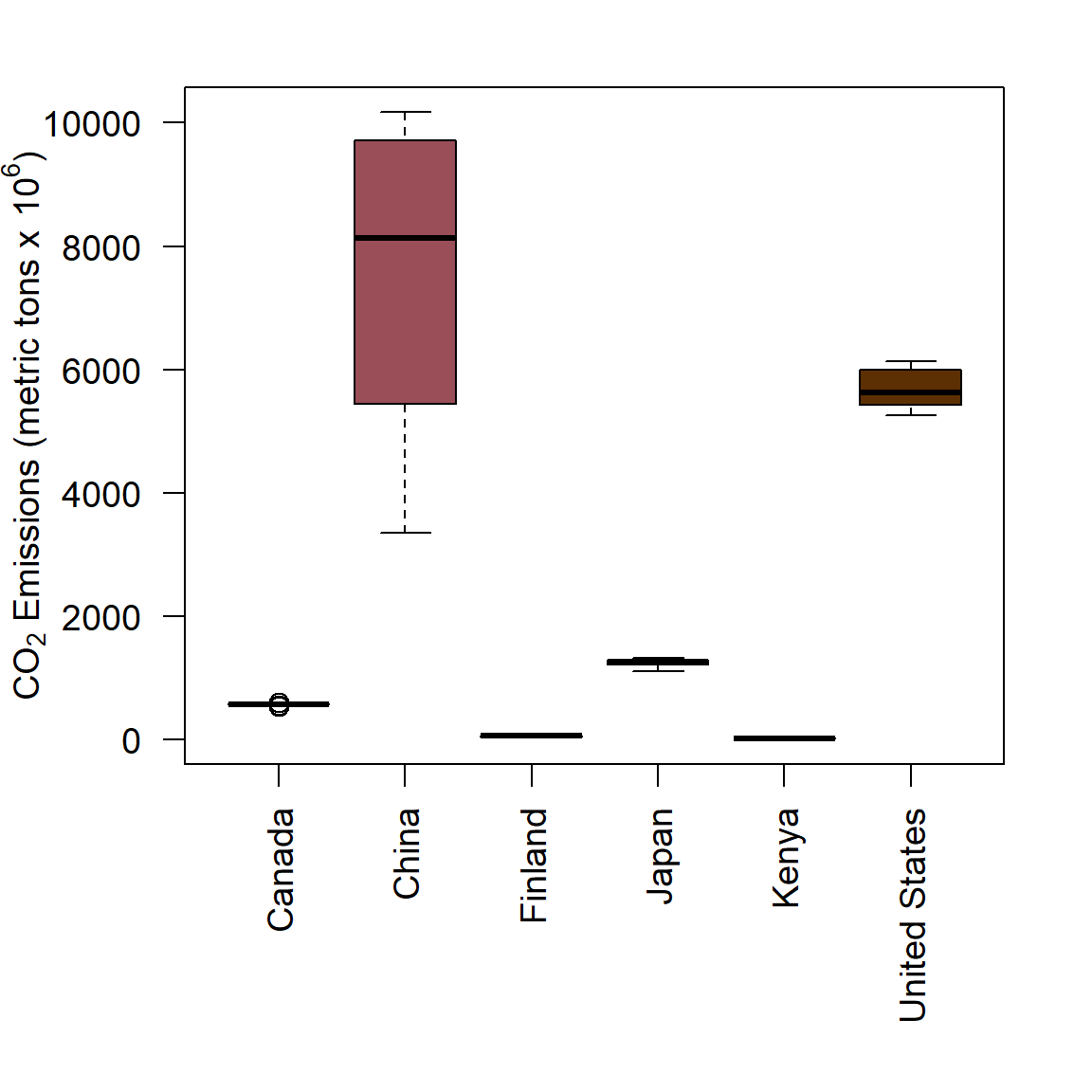
Figure 6.34: Boxplots of annual CO\(_2\) emmission levels for six countries from 2000-2019.
\(\blacksquare\)
6.18.1 Violin Plots
Another graphical tool for comparing probability distributions is a violin plot. It contains contains similar components to a boxplots, including designation of boxes and whiskers, along with a rotated kernel density plot on each side. Thus, it allows additional consideration of the skew, kurtosis and potential multimodality of distributions. The function vioplot from the package vioplot allows base graphics generation of violin plots.
Example 6.13 \(\text{}\)
As an example we will compare violin plots based on random sampling of a bimodal, uniform and normal distribution (see ?vioplot). Note the kernel density generator fits a oblique sphere, although the uniform PDF is a rectangle (Fig 6.35).
library(vioplot)

mu <- 2
sig <- 0.6
bimodal <- c(rnorm(1000,-mu, sig), rnorm(1000, mu, sig))
uniform <- runif(2000, -4, 4)
normal <- rnorm(2000, 0, 3)
vioplot(bimodal, uniform, normal, col = cols1[1:3],
        names = "Bimodal", "Uniform", "Normal")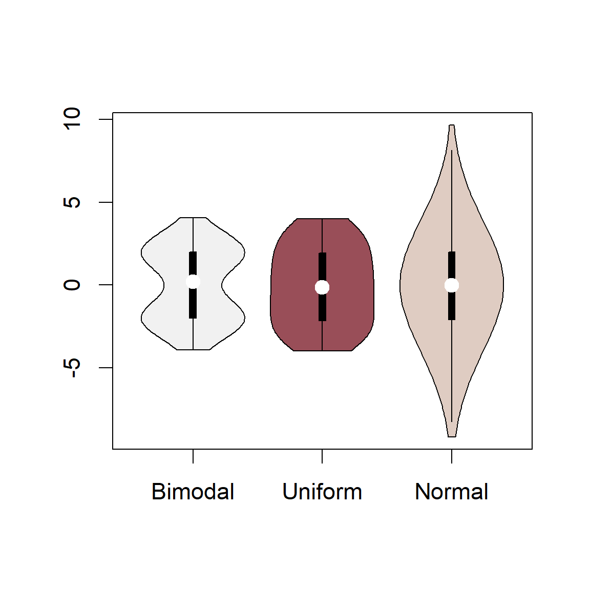
Figure 6.35: Violin plots based on random sampling from a bimodal, uniform, and normal distribution.
\(\blacksquare\)
6.19 Interval Plots
Interval plots display location measures (e.g. means, medians, etc.), typically as bars, along with error bars representing measures of data dispersion (e.g., standard errors, standard deviations, confidence intervals, interquartile ranges, etc.). Thus, barplots and boxplots can be considered special types of interval plots.
Example 6.14 \(\text{}\)
As an example, we will create an interval plot by hand using a classic dataset from R.A. Fisher that records the yield of different varieties of potatoes. The data are in the dataframe asbio::potato. Here are the means and the standard errors of the mean.
         Ajax Arran comrade British queen  Duke of York       Epicure
     3.340000      2.262222      3.136667      1.777778      2.160000
   Great Scot
3.403333 Ajax Arran comrade British queen Duke of York Epicure
0.30594117 0.07090247 0.18118438 0.14831252 0.14677080
Great Scot
0.14092945 We will plot the means using a barplot and save the horizontal locations of bars as a object bloc.
We will then overlay error bars using the function segments() or arrows().
The result is shown in Fig 6.36.
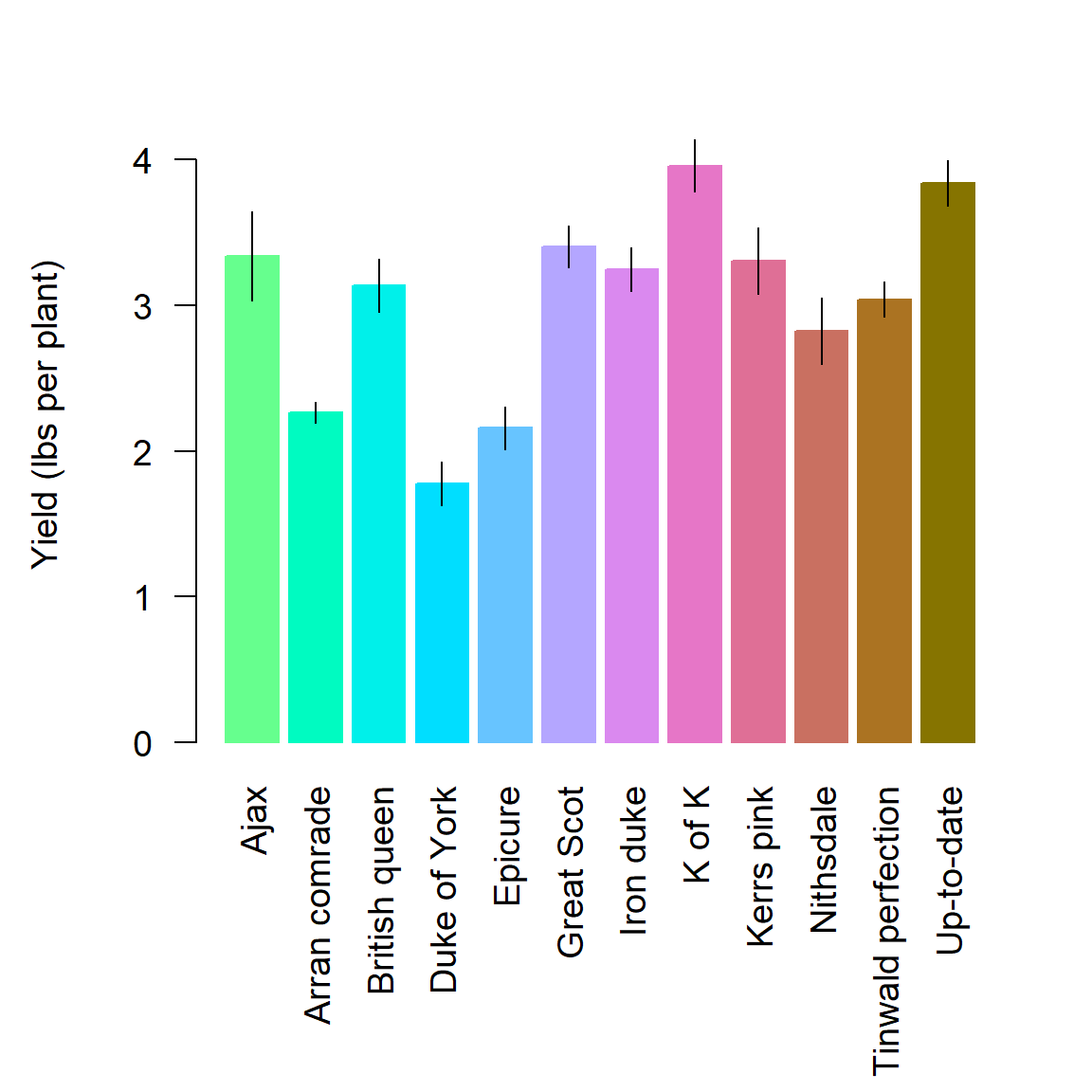
Figure 6.36: Interval plot of the Fisher potato dataset. Bar heights are means, error bars represent \(\bar{x} \pm \hat{\sigma}_{\bar{x}}\).
\(\blacksquare\)
The function asbio::bplot allows straightforward creation of interval plots from specified explanatory and response variables. A large number of location and dispersion measures can be specified in the function arguments. To recreate Fig 6.36 one could simply type:
6.19.1 Pairwise Comparisons
An important component of many biological analyses are multiple pairwise comparisons of means (or other location measures). These tests will often require control of Family-Wise type I Error Rate (FWER), that is, the probability of incorrectly rejecting at least one true null hypothesis in a family of related tests. The most powerful method for controlling FWER in a post hoc family of pairwise tests, following an omnibus ANalysis Of VAriance (ANOVA), is Tukey’s honest significant difference (see Aho (2014)).
Example 6.15 \(\text{}\)
Zelazo, Zelazo, and Kolb (1972) performed a series of experiments to determine whether certain exercises could allow infants to learn to walk at a younger age. The experimental treatments were: Active Exercise (AE), Passive Exercise (PE), Test-Only (TO), and Control (C). The data are in the dataframe asbio::baby.walk. For more information type ?baby.walk.
Rejection of the omnibus ANOVA null hypothesis of no mean treatment differences, allowed pairwise comparison of treatment means using Tukey’s procedure. We will use the function asbio::pairw.anova() to run this analysis.
95% Tukey-Kramer confidence intervals

              Diff    Lower    Upper  Decision Adj. p-value
muAE-muC    -2.225 -4.35648 -0.09352 Reject H0     0.038997
muAE-muPE   -0.525 -2.65648  1.60648    FTR H0     0.897224
muC-muPE       1.7 -0.52625  3.92625    FTR H0     0.172932
muAE-muTO -1.58333 -3.61562  0.44895    FTR H0     0.160457
muC-muTO   0.64167 -1.48981  2.77314    FTR H0     0.829542
muPE-muTO -1.05833 -3.18981  1.07314    FTR H0     0.513366
Interval plots can be used to summarize these comparisons. The plot method for objects of class pairw calls bplot() for this purpose. In particular, we have:
Bars are means.  Errors are SEs.

The population means of factor levels with the same letter are not
significantly different at alpha = 0.05 using the Tukey HSD method.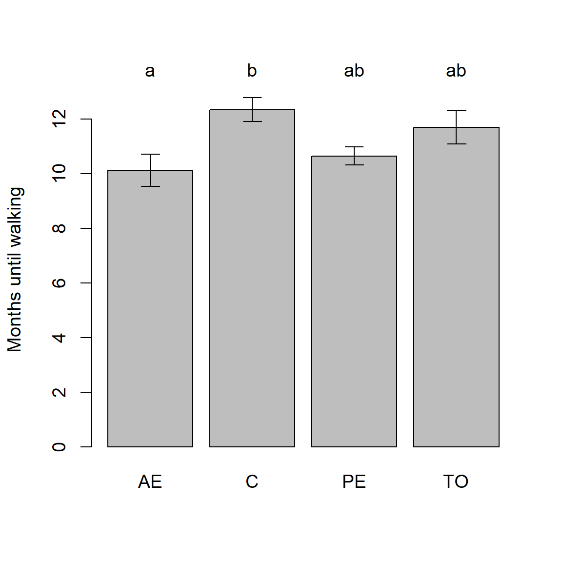
Figure 6.37: An interval plot summarizing the results of pairwise comparisons for the baby.walk example.
As stated in the plot.pairw() function output (Fig 6.37), letters above bars summarize the result of pairwise comparisons. In particular, factor levels means with the same letter are not significantly different using the conventional FWER \(\alpha = 0.05\).
\(\blacksquare\)
We will look at more sophisticated graphical methods for pairwise comparisons in Ch 7.
6.20 matplot()
The function matplot() allows one to plot the columns of one matrix against the columns of another. There is no clear ggplot2 alternative to matplot() because tidyverse functions require data to be a long table format, whereas matplot() works best with data in a wide table format.
Example 6.16 \(\text{}\)
To demonstrate matplot() we will use the dat1 dataset, used to create Fig 6.31, which contains annual CO\(_2\) levels from 2000-2019 for six countries.
par(mar = c(3,4.5,5,2), cex = 1.1)
matplot(x = 2000:2019, y = dat1, col = cols1, type = "l", lwd = 1.5,
        log = "y",
        ylab = expression(
          paste(CO[2], " Emissions (metric tons x ", 10^6, ")")))

legend(x = 2001, y = 80000, xpd = TRUE,
       lty = 1:5, ncol = 2, lwd = 1.5, bty = "n",
       col = cols, legend =
         c("Canada", "China", "Finland",
           "Japan", "Kenya", "United States"))
In the code above, note that I allocate additional room in the top of the graph for a legend (Line 1). Note that the response variable is a matrix of CO\(_2\) values whose columns delimit countries (Line 2). The xpd argument in legend() allows plotting to be clipped to the device region which will generally exceed the plot region (Line 6). The result is shown in Fig 6.38.
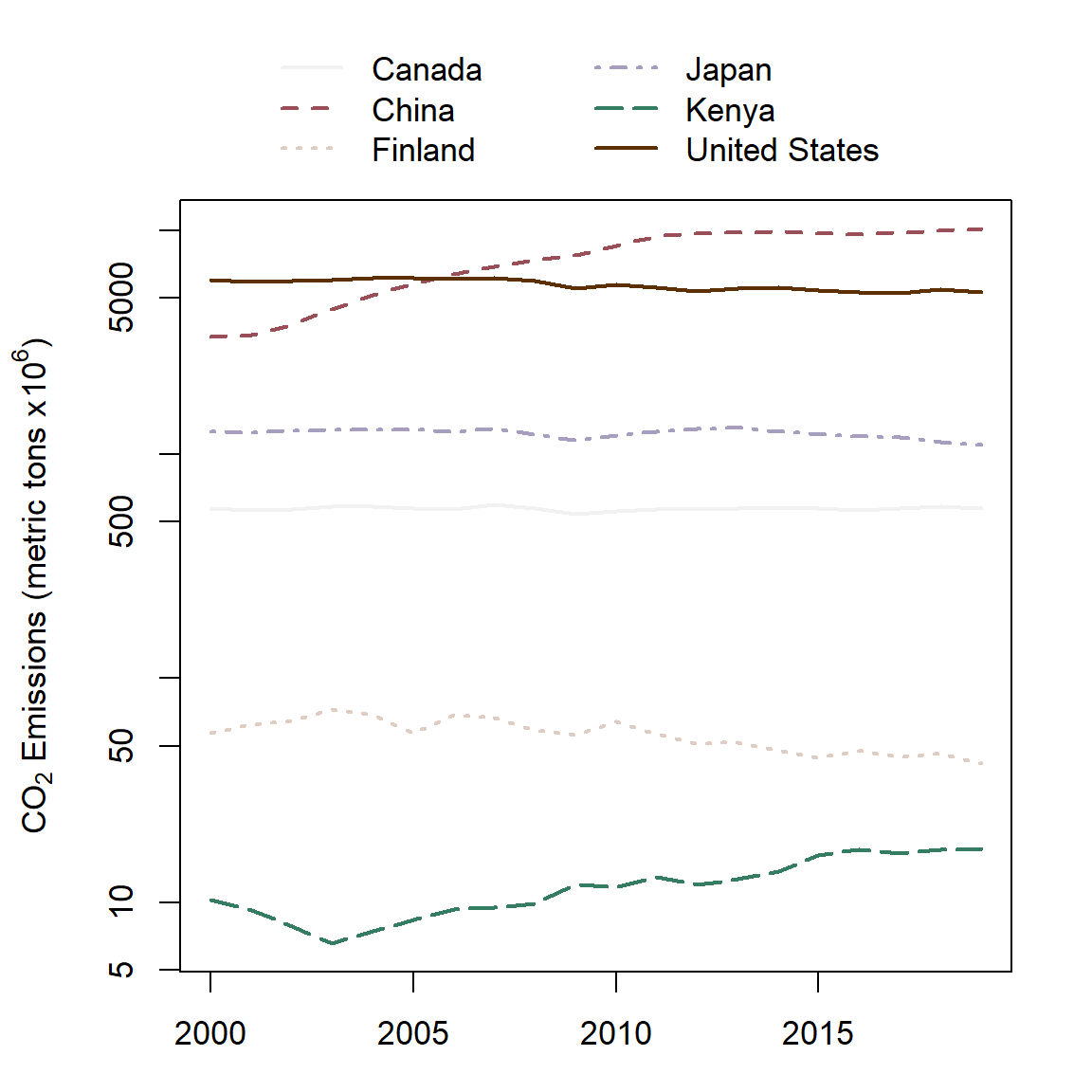
Figure 6.38: A matrix line plot.
\(\blacksquare\)
6.21 Interactivity
As noted earlier, R graphics are generally non-interactive. Some graphical interactivity is allowed via the function locator(), which returns graphical coordinates where a mouse click occurred in plot, and identify(), which can be used to add labels and symbols to mouse click locations. For instance, try:
For Windows, X Window, and Cairo graphics devices, more sophisticated methods exist for interactivity. In these settings, the function setGraphicsEventHandlers() can be used to call functions when events such as mouse clicks or keystrokes occur. For instance, open an appropriate graphics device and try:
Still other interactive options are possible using animations and hand rotatable graphics. These approaches, which are often transferable to Markdown HTMLs, are considered briefly in the next two sections of this chapter. Animations using the package ggplot2 are considered in Ch 7. GUI driven graphics interactivity is also possible, and is described in Ch 11.
6.22 Three Dimensional Graphics
It is often necessary to consider more than two variables in biological graphics. This can be done in a number of different ways, including the use of additional axes (e.g., Fig 6.29) (including 3D plots), additional colors, multiple line or symbol types (Fig 6.28), or even multiple symbol sizes.
Example 6.17 \(\text{}\)
To consider three dimensional plotting we will use two datasets from the package vegan which describe taiga/tundra ecosystems at particular Scandinavian sites. Vegetation data are contained in the dataset varespec while soil chemistry data for the same sites are contained in the dataset varechem.
In Fig 6.39 we examine the distribution of the heath plant Vaccinium vitis-idaea (a common species in boreal forest understories) with respect to both pH and soil percent nitrogen. This is done by making symbol sizes change with the abundance of V. vitis-idaea.
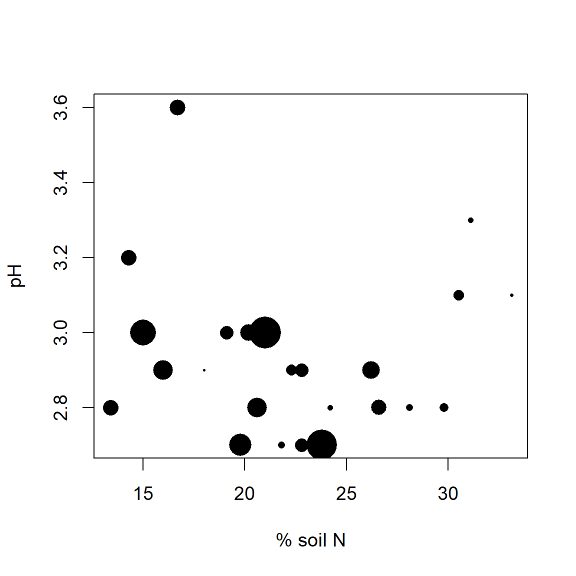
Figure 6.39: Cover of Vaccinium vitis-idaea with respect to pH and % soil nitrogen. Larger symbols indicate higher percent plant cover.
Vaccinium vitis-idaea appears to prefer intermediate to low levels of soil N, and acidic soils. The somewhat negative association between soil N and pH is probably due to soil leaching, because H\(^+\) (and Al\(^{3+}\)) cations are more strongly adsorbed by soil colloids than bases in poorly drained soils.
A 3D plot of the same associations can be created using the scatterplot3d() function from the package scatterplot3d .
library(scatterplot3d)
Fig <- function(angle = 55){
s3d <- scatterplot3d(cbind(varechem$N, varechem$pH, varespec$Vaccviti),
type = "h", highlight.3d = TRUE, angle = angle, scale = .7, pch = 16,
xlab = "N", ylab = "pH", zlab =
  expression(paste(italic(Vaccinium), " ", italic(vitis-idaea),
                   " % cover")))

lm1 <-lm(varespec$Vaccviti ~ varechem$N + varechem$pH)
s3d$plane3d(lm1)
}
Fig()
In the code above, I define the figure to be a function (named Fig) to allow the angle of rotation in the 3D scatterplot to be easily changed using the angle argument in Fig (Line 2). Functions will be addressed in detail in Ch 8. By stipulating highlight.3d = TRUE (Line 4), objects that are closer to the viewer with respect to the x plane are given warmer colors. A regression “plane” is also overlaid on the graph (Lines 9-10). The fitted plane is produced from a multiple regression model created by the function lm().
The result is shown in Fig 6.40.
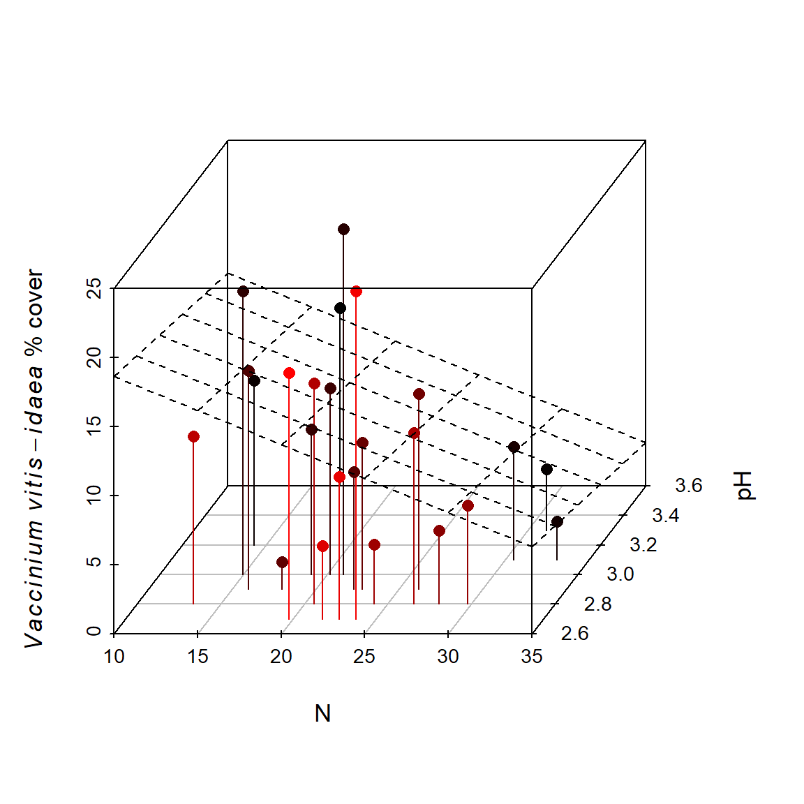
Figure 6.40: Cover of Vaccinium vitis-idaea with respect to pH and % soil nitrogen, depicted in a 3D scatterplot.
\(\blacksquare\)
6.23 Animation
Animations can be created in R to illustrate a wide range of processes (Xie 2013; Xie et al. 2018). Functions with animation are generally based on loops (Section 8.4) with some method of slowing the loop; usually the function Sys.sleep().
Example 6.18 \(\text{}\)
Here we add animation to the 3D scatterplot shown in Fig 6.40. This will be facilitated by the fact that the plot is a function with an argument whose alteration results in modification of the graph.
fig.rot <- function(){
lapply(seq(1, 360), function(i){
  Fig(i)
  Sys.sleep(.1)
  })
}

fig.rot()
# save frames into one GIF:
library(animation)
saveGIF(fig.rot(), interval = 1, movie.name = "vaccinium.gif")
Recall that lapply() returns a list of the same length as its first argument X, whose elements result from applying a function, given in the second argument, to corresponding elements of X. In the code above, an argument-less function is created containing a loop run by lapply() (Lines 2 - 5). As the loop index i changes from i = 1 to i = 360 (Line 2) this changes the angle argument in the function fig(), used in creating Fig 6.40. At the end of each step in the loop, the system is paused for a tenth of second (Line 4) with the function Sys.sleep() to allow each “frame” of the animation to be viewed separately. In the (optional) last two lines of code, the R package animation is loaded, and the function animation::saveGIF() is used to save the animation in a GIF file format7.
The animation result is shown in 6.41.
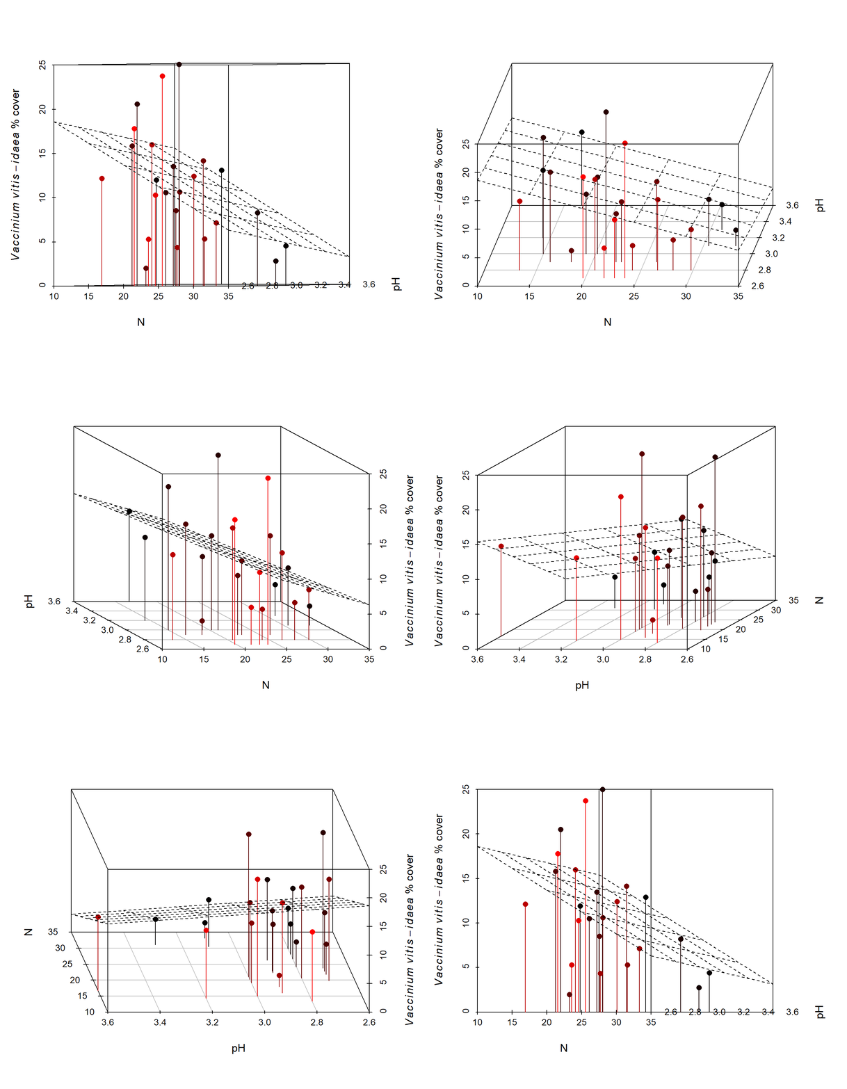
Figure 6.41: Animated version of the 3D scatterplot from Fig 6.40.
\(\blacksquare\)
Working animations generated in R can be placed into HTML documents created under R Markdown, or PDF documents created using Sweave-alike approaches (Section 2.9.2). The former approach currently requires installation of the gifski R package and the specification: animation.hook = "gifski" among the chunk options for the animation. The latter approach requires loading of the animate LaTeX package and using the chunk option fig.show = "animate". PDF animations can viewed using a number of PDF viewers including the Foxit\(^{\circledR}\) and Adobe\(^{\circledR}\) Acrobat Readers.
Example 6.19 \(\text{}\)
We can also create hand-rotatable 3D figures under the rgl real-time rendering system.
expg <- expand.grid(varechem$pH, varechem$N)
subs <- cbind(varechem$pH, varechem$N)
tf <- (expg[,1] == subs[,1]) & (expg[,2] == subs[,2])
y <- ifelse(tf == TRUE, varespec$Vaccviti, NA)
surface <- data.frame(N = expg[,1], pH = expg[,2], vac.vit = y)

library(car)
scatter3d(vac.vit ~ N + pH, data = surface, surface = TRUE, fit = "linear",
zlab = "N", xlab = "pH", ylab = "Vaccinium vitilus (% cover)")
Figure 6.42: A hand rotatable graphics object (within an R interactive or suitable PDF/HTML environment).
In the code above, a initial surface is created that considers all possible combinations of pH and N outcomes (Line 1) and actual occurrences of varespec$Vaccviti at observed combinations (Lines 3 and 4). The function scatter3d() in the package car uses tools from the rgl package to render a three dimensional scatterplot. The scatterplot will be rotatable within an R session, and can be rendered as a rotatable graphic in an R Markdown HTML8. The form of the plot is shown in Fig 6.42, although its rotatability will require an interactive R environment or a ammenable HTML/PDF framework. Plots from rgl can also be rendered and manipulated in Shiny apps (see Ch 11).
\(\blacksquare\)
Exercises
- Consider the variables:
x <- c(1,2,2.5,3,4,3,5)andy <- c(6,4.3,3,3.1,2,1.7,1).- Make a plot with
xdefining the x-axis andyon the y-axis. - Make every point in the scatterplot a different color.
- Make every point a different shape.
- Create a legend describing all the shape and color combinations of all points one through seven (call them Point 1, Point 2, etc.).
- Convert from a point to an overplotted line and point plot.
- Change the label of the x-axis to “Abscissa axis” and the label of the y-axis to be “Ordinate axis” using a
plotmathapproach. This will require use of the functionsexpression(),paste()anditalic(). - Place the text “y = -1.203x + 6.539” at coordinates
x = 2,y = 2.5using the functiontext(). Italicize as indicated. - Place a line with a slope of -1.203 and an y-intercept of 6.539 on the plot using the function
abline().
- Make a plot with
- The
Indomethdataframe from the package datasets describes pharmacokinetics of the drug indomethacin following intravenous injections for six human subjects.- Create a histogram for the variable
conc, which gives plasma concentrations of indomethacin in (mcg/ml) in subjects over time. Use an appropriate x-axis label. - Create a scatterplot of
concas a function oftime(in hours). Create appropriate axis labels. - Change symbols and colors of points in (b) based on levels in
Subject. - Create a wide table format for
Indomethusing:wide <- unstack(Indometh, conc ~ Subject)andnames(wide) <- paste("Subject", c(1,4,2,5,6,3)). - Create a stacked barplot and a side by side barplot based on:
barplot(as.matrix(wide)). - Use appropriate y-axis labels.
- Create a multiple line plot (with a line for each subject) using:
time <- c(0.25, 0.50, 0.75, 1.00, 1.25, 2.00, 3.00, 4.00, 5.00, 6.00, 8.00)andmatplot(x = time, y = wide, type = "l") - Generate appropriate axis labels for the plot.
- Create an appropriate legend for the plot created in (h). The colors and line types used by
matplot()will be 1:6. The order of subjects is 1, 4, 2, 5, 6, 3.
- Create a histogram for the variable
- The dataframe
life.expfrom asbio compares life expectancy of field mice given five different diets.- Make and interpret a boxplot showing
lifespanas a function oftreatment. - Make an interval plot by hand showing
lifespanas a function oftreatmentusing means as measures of location, and standard deviations to generate error bars.
- Make and interpret a boxplot showing
- (Advanced) Conduct an ANOVA and a post hoc pairwise comparison of means with Tukey’s HSD using:
anova(lm(lifespan ~ treatment, data = life.exp)),tukey <- with(life.exp, pairw.anova(lifespan, treatment)).- Create an interval plot summarizing these results using:
plot(tukey). - Interpret (a).
- Create an interval plot summarizing these results using:
- Load the
C.isotopedataframe from the package asbio. Usingpar(mfrow()), create a graphical device holding three plots in a single row, i.e., the three plots will be side by side.- In the first plot, show \(\delta ^{14}\)C as a function of time (
decimal.date) using a line plot. Use appropriate axis labels. - In the second plot, show CO\(_2\) concentration as a function of time in a scatterplot.
- In the third plot, show measurement precision (column four in the dataset) as a function of \(\delta ^{14}\)C.
- In the first plot, show \(\delta ^{14}\)C as a function of time (
- Load the
goatsdataframe from package asbio.- Create a scatterplot of
NO3as a function offeces. - Make a plot showing
NO3andorganic.matteras a simultaneous function offecesby adding a second y-axis. - Change symbol sizes in (a) to reflect the values in organic.matter.
- Create a 3D scatterplot with
scatterplot3d::scatterplot3d, depictingNO3as a function oforganic.matterandfeces.
- Create a scatterplot of
References
An object class resulting from hierarchical agglomerative cluster analyses produced by the function
cluster::agnes.↩︎RStudio has its own native on-screen graphics device. A non RStudio graphics device can be opened (within RStudio) using
dev.new(RStudioGD = FALSE).↩︎Lossless entails data compression without loss of information.↩︎
Lossy refers to data compression in which unnecessary information is discarded.↩︎
A data coding system that uses 16 symbols: the numbers 1-9, and the letters A-F. Hexadecimals are primarily used to provide a more intuitive representation of binary-coded values (see Ch 12).↩︎
The CIELAB color space is defined by three values:
L*for perceptual lightness anda*andb*for the four unique colors of human vision: red, green, blue and yellow. (Schanda 2007). The CIELAB space is intended to be perceptually uniform. CIELAB and several other colors spaces are included in the encompassing CIECAM02 color space (Wikipedia 2024).↩︎Use of
saveGIFrequires installation of open source software ImageMagick or GraphicsMagick (see?saveGIF).↩︎See
rgl::playwidget()if you you are reading this document as a pdf.↩︎